Star Wars Episode IV: the 400-feet-long infographic

swanh-making-of-1

Sometimes you have to admire the amazing creativity and drive of some designers and infographics artists. You may have seen this amazing infographic around already since it’s been out for a while, but we thought it’s worth mentioning it again. It’s that incredible!

SWANH.NET is an adaptation of Star Wars: Episode IV – A New Hope (the iconic 1977 first movie of the series) as a really, really, really long scrolling infographic. It’s 123 meters long! (4,845 inches or over 400 feet). These images don’t make it justice, make sure to visit the site and scroll through it.

It was created with Adobe Illustrator CC in 2015-16 by Martin Panchaud, a graphic artist and Illustrator based in Zurich. Panchaud didn’t plan to plot the entire movie but once he started he couldn’t help himself, and we are glad. He included every single bit of dialogue and the positions of each character in screen for all the scenes, as well as the entire universe of spacecraft and locations. It took him about 1,000 hours to complete it as a personal project. Impressive work.

swanh-0

swanh-6

swanh-9

swanh-5

swanh-4

Vintage cutaways by Frank Soltesz

We love looking at vintage infographics, in particular cutaways and cross-sections (we are in fact working a book about them, we’ll keep you posted very soon!) One of the gems we have found lately is the work of Frank Soltesz. Born in Pennsylvania in 1912 and active from the 30’s to the 60’s, Soltesz was a versatile commercial illustrator who had a love for large cutaways. He spent part of his career working for the BBD&O advertising company.

Among his best work is a series of 29 advertising cross-sections published between 1947 and 1951 to show how the Armstrong Cork Co. company’s products were utilized. We show some of them here. These illustrations appeared in the Saturday Evening Post and show lavishly detailed images of buildings and factories with their walls partially removed. The more you look at the scenes and the tiny human figures as they move about, the more engaging they become. Each illustration has an inset with the key. They had a drawn frame and title and readers could request 21 by 22 inch copy suitable for framing or even a free booklet with some of the illustrations.

soltesz3b

soltesz4 soltesz6 soltesz8 soltesz9 soltesz7

There is remarkable lack of biographical detail about Soltesz. He was a member of the American Watercolor Society as late as 1981. In addition to his commercial work for Armstrong Cork Co., Soltesz worked with accounts of other companies such as TWA (an example below), General Electric, General Motors, Goodyear Tire and Rubber, etc.  Apart from the Saturday Evening Post, his work appeared in many of the great periodicals of his time like Life, Colliers, Esquire, Sports Illustrated, Forbes, Fortune, Time, Business Week, U.S. News and World Report.

soltesz16

Recent work: The National Museum of African American History & Culture

African_American_Musem

The National Museum of African American History & Culture is the newest addition to the Smithsonian Institution. The museum, by lead designer David Adjaye and lead architect Philip Freelon, holds over 35,000 artifacts. It will open its doors on September 24 in the National Mall of Washington, D.C. Like the rest of the Smithsonian museums in D.C., it will be free.

Smithsonian magazine asked us to work on a simple interactive showcasing the building and explaining some of the major features and attractions visitors will encounter throughout the museum. Take a look!

We use vector illustration much more frequently that 3D, but this time we rendered the building using Lightwave and SketchUp in order to animate it and to show the intricate metalwork design of the corona’s 3,600 panels. The metalwork “pays homage to the unheralded ornamental ironworkers, slaves and freedmen who crafted the signature wrought iron of southern towns like Charleston, South Carolina, and New Orleans, Louisiana”. The external shape of the building, a three-tiered bronze trapezoid, wraps around the outside of the glass building. The design is inspired by a sculpture from the early 20th-century Yoruban artist Olowe of Ise that is also shown in the museum.

Teaching Infographics

5W_Academy copy

We’ll be in New York on March 24-25 with our well received workshop on principles of infographics and data visualization. How is it different, and what do our participants learn?

Infographics and data visualization have experienced significant change since we started 5W Infographics back in 2001. And certainly since we published our very first infographics, which takes us all the way to the late 80s! If you were thinking of infographics  and dataviz as a new field, you may want to think again.

Some of these changes are profound, in good and bad ways, and they are a big part of the reason why at 5W Academy (our educational branch) we think infographics and dataviz education are important precisely now.

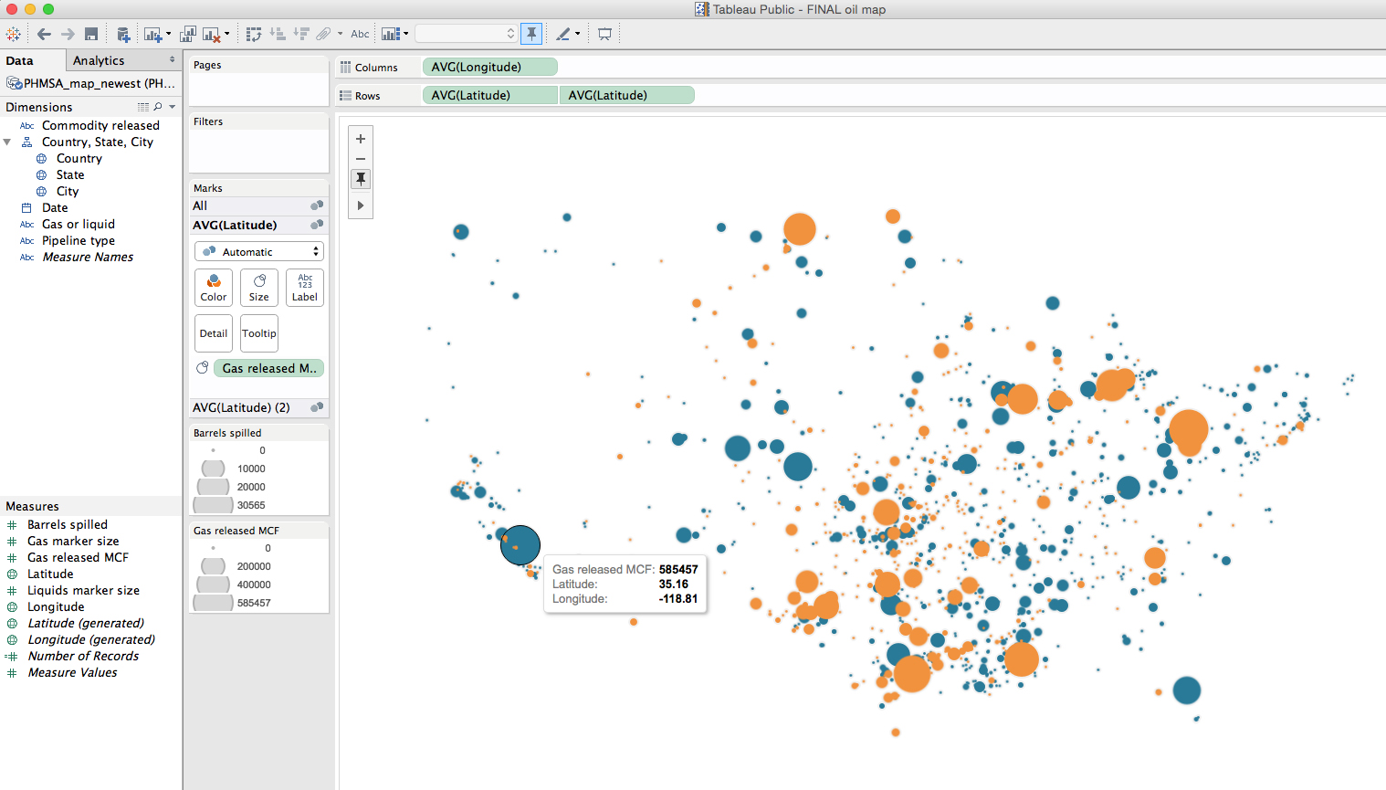
Individuals and corporations have now access to massive public and private data sets, and new software applications allow us to visualize them. But that’s not the same as having the ability to a find relevant story behind the data, and the skill to visualize and design it efficiently.

We also see countless of unfortunate examples of infographics that are little more than empty decorative designs around a few numbers, the product of marketing departments with the only purpose of making content viral. It’s just pretty clickbait that gives a bad name to infographics. These have become so pervasive that sadly, many people think of that type of content first when they think of “infographics”, a trendy word now. But in nearly all cases they offer absolutely nothing in terms of revealing insightful patterns and trends behind numerical or special information.

Data visualization is not new. It’s actually been around us for hundred of years, and many of the principles behind it stand the pass of time. It’s good to look back at some of them.

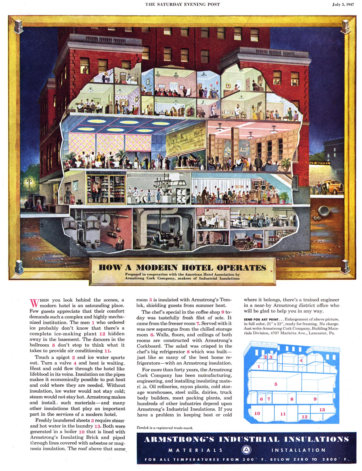
At 5W we started working with infographics in the field of journalism, where focus and accuracy are paramount. During long years as staff members for newspapers like El Mundo (one of the European infographics pioneers) and The New York Times, or magazines such as Fortune and National Geographic, we were trained to seek first and foremost data sets and information that was both accurate and relevant to our readers. To find focus and to visualize that content in a visual way through charts, maps, and illustrated infographics that would offer new visual insights for our readers. With stiff competition for space in the news pages, you need to prove you can inform (not decorate) in a way neither the best writers or photographers can with the tools of their craft alone.

Today it often seems like the word “infographics” has been hijacked by marketers with inadequate understanding of data visualization principles and sometimes dubious or biased agendas; and often the term “data visualization” or dataviz has been appropriated by software wizards and digital designers more fascinated by the fact they can visualize large amounts of data than by how they can extract and explain a revealing story by visualizing the core message behind it. The result is cool but empty data art that tries to pass as information or incomprehensible “data dumps” that look fascinating but lacks proper editing and design basics and just confuse anyone with an honest intent of making sense of it.

The purpose of our workshop is to explain the principles that enable us to create powerful visual stories that illuminate concepts for readers in engaging ways. And to practice them hands-on. We haven’t found a workshop that looks at all the different tools of infographics and dataviz at the same time: the Do’s and Dont’s of plotting numbers and statistics with charts; geographic and thematic cartography; illustrations and pictograms; design, hierarchy and color; and exploring creativity with those tools.

In our next post we’ll look in detail at the content and schedule of the two-day workshop.

New workshops in NYC and Singapore

NYC_Singapore

5W Academy is heading to NYC for our next Infographics and Data visualization workshop in the US. It will be on March 24-25.

We received great feedback from our Washington, D.C. workshop back in October. A combination of local and out-of-state participants from government agencies, design studios, NGOs and other organizations got together for two days.

This two-day workshop is a comprehensive introduction to the creation of infographics and data visualization. With a mix of theory and practice, the workshop is aimed at professionals and students interested in developing the skills to produce engaging, insightful visual storytelling with their content.

We will learn how to gather and prepare data, the Do’s and Dont’s of working with numerical information and charts, and the principles of visual hierarchy, color, typography, illustration, and narrative to create impactful infographics.

5W_Academy copy

Attendees will sketch out infographics, storyboard motion graphics and create / publish their interactive data visualizations and web maps with the help of Tableau Public. The class will discuss award-winning projects and offer an overview of tools and strategies for creating infographics and data visualization.

At the same time, we are keeping busy in Asia. We’ll be back in Singapore on February 18-19 for “The Power of Infographics 4”, the fourth edition of a workshop that has proven really popular. The workshop is organized by Methodology and partnership with German leading art/design book publisher Gestalten.

Also in Singapore, we were invited to do back-to-back workshops on March 8-9, March 10-11 and possibly also March 14-15. The organizer is Maitre Allianz, a leading training services company.

Behind the Art with James Gurney

Tyrannosaur-Gurney

A few weeks back we mentioned in this blog the job we did for Scientific American about  new species of tyrannosaurs that have been discovered in the last few years. That job included the creation of an infographic, and the art direction for the opener spread. In the later, we had the privilege of working with the great painter James Gurney, the creator of the famous Dinotopia series. He also created the impressive illustration shown above for the cover of that SA issue.

Now James has released a fascinating video showing the process of creation for both illustrations. There is a five minute version (below), and a 40 minutes HD version available here and here for purchase. James happens to be, in addition to an incredible painter, an excellent art teacher. If you are interested in painting, you should check out his YouTube channel, chock full of nicely crafted instructional videos.

GurneyOpener

Is Lego the future of infographics?

Probably not. But I just discovered these two videos by Brookings (an influential think tank in DC) that use lego bricks to illustrate the fundamental issue of inequality in the U.S. I couldn’t help thinking how apt a tool lego bricks can be to represent numerical concepts and, being a lifelong lego fan, just how beautiful they look! No, I do not think they are the future or graphics, but I’d love to see more of these!

New graphics for Politico

Screen Shot 2015-04-21 at 5.48.25 PM

One of our latest infographics packages is live online today. Politico have just published an in depth investigation on the safety of America’s oil and gas pipelines: “Pipelines blow up and people die”, by Elana Schor and Andrew Restuccia.

The data that Politico has unveiled reveals an appalling situation: just in the last 13 years pipeline incidents in the U.S. have killed 199 people and injured 799. Just last year 19 people died on pipeline-related incidents, injured 97, and caused more than $300 million in damage. The report goes on to reveal the incompetence of the Pipeline and Hazardous Material Safety Administration, the obscure agency that oversee the immense and outdated network of American oil and gas pipelines. It turns out that the PHMSA is controlled to some degree by (surprise!) the pipeline industry.

We helped Politico to visualize the very revealing data their research unveiled. The map below, created using Tableau Public and Illustrator, shows all the accidents involving oil and gas pipelines in the U.S. during the last five years.

Crime in Milwaukee 3

We are using Tableau lately to help us explore visual possibilities with large sets of data and it truly is a useful tool. Politico is not using interactivity maps and graphics yet, which would be the natural fit when using this interactive graphics tool, but we have found Tableau exports very nicely to PDF, and from there to Illustrator.

Screenshot_Pipelines_Tableau

A series of charts present various aspects of that alarming situation:

Crime in Milwaukee 3Crime in Milwaukee 3


We worked with Art Director Heather Barber and had great ideas and data sets from editor Bob King and writers Elana Schor and Andrew Restuccia.


Tyrannosaurs in Scientific American

dino_spread

Dinosaur and Paleontology stories were always among my favorites to work with at National Geographic. Recently I had a chance to work with Scientific American Magazine on a fun and fascinating story on the rise of Tyrannosaurs. The story, by prominent paleontologist Stephen Brusatte, is on the May ’15 issue.

New discoveries are showing us that tyrannosaurs were a surprisingly diverse bunch that slowly evolved into the gigantic proportions of the iconic Tyrannosaurus Rex. Jen Christiansen, the Art Director of information graphics, asked us to create a spread infographic for the story. We showed the tyrannosaur family tree with amazing illustrations by Todd Marshall. The maps reveal how tyrannosaurs evolved at a time when the continents had yet to fully break apart, so their fossils are now found in very different parts of the world.

The story has a gorgeous cover by James Gurney, the master illustrator you may know from his famous Dinotopia series. We art directed him (which amounts to little since he doesn’t really need much direction!) in a spread illustration for the story.

BrusatteCover

We’ll show you the sketch to final process and a great make-of video by Gurney in a few weeks, in the meantime we don’t want to spoil the issue for you, run to your newsstand or order it online!

By the way Jen Christiansen keeps a really nice blog, SA Visual, with articles on the graphics process at Scientific American and on other graphics-related topics. Highly recommended.

The interactive graphics of The New York Times and The Guardian, in one place

Graphics_collection

Here is a really useful resource I found some time ago, and that I visit often: a site with most of the interactive graphics by The New York Times and The Guardian together. The page was started as a thesis project by Marije Rooze, a Dutch web designer working in information and interaction design, data visualization and coding.

The compilation starts from 2000. It hasn’t been updated very recently, but I’m hopeful it will be because it’s an amazing place to find inspiration from two newspapers that are among the very best in interactive graphics. You can filter by topic, visual form, data type, participation (social data, reader generated, etc), and other useful variables.

By the way, we can expect great new things from The Guardian since they just added Xaquín Gonzalez (ex-NY Times and Nat Geo) to their talented team as Editor of Visuals.