Graphics for UNICEF USA 2020 Annual Report

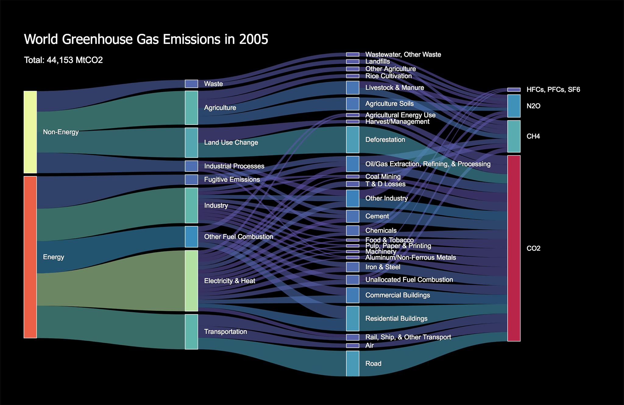
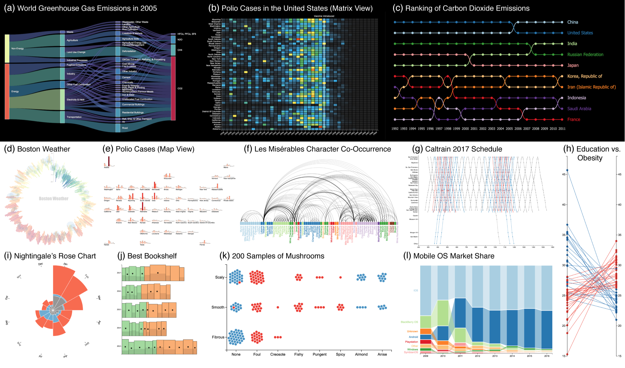
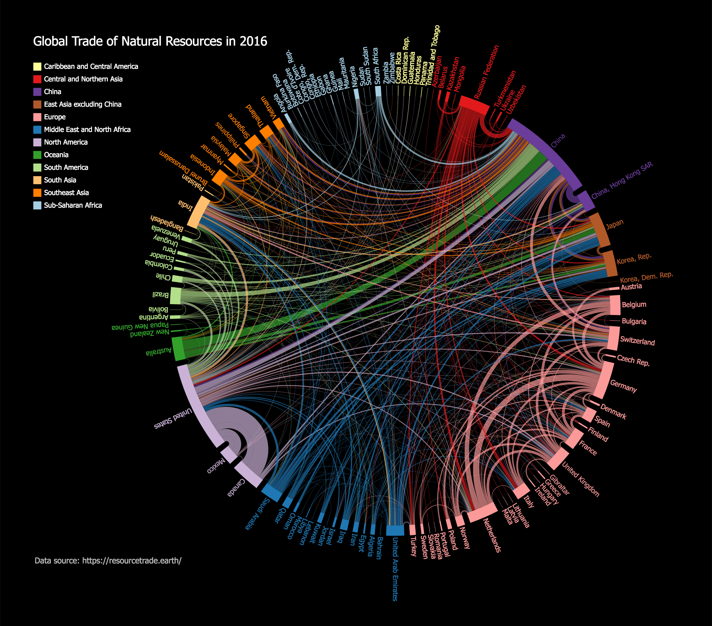
We recently finished creating the infographics and charts for the 2020 Annual Report of UNICEF USA. We worked with UNICEF’s Anna Christian to create a series of simple, bold data and information visual summaries. Some example are shown here.

UNICEF USA helps save and protect the world’s most vulnerable children. Rated one of the best charities to donate to, 90% of every dollar spent goes directly to help children. The United Nations Children’s Fund (UNICEF) is a United Nations programme that provides humanitarian and developmental assistance to children and mothers in developing countries.

In 2020, the world was upended by the COVID-19 pandemic. UNICEF worked to protect children and families from the virus, mitigate its effects and respond quickly to those most in need. At the same time, UNICEF continued its ongoing work for children to help ensure decades of progress were not lost. 

During Fiscal Year 2020, UNICEF USA helped to:

  • Ship 147.9 million gloves, 207.5 million surgical masks, 16.4 million N95 respirators and 6.9 million medical gowns to countries in need around the world.
  • Train 2.4 million+ healthcare providers to detect and treat COVID-19 cases, and disseminated prevention information to 3.1 billion+ people
  • Work to reduce the burden the pandemic put on countries’ health systems and nutrition and vaccination programs. This included providing 4 million children under age five with treatment for severe acute malnutrition, and 39 million children with catch-up campaigns for critical polio vaccinations
  • Respond to 281 humanitarian emergencies in addition to COVID-19—including vaccinating 41.3 million children against measles, providing safe water to 39.1 million people and offering mental health support to 3.7 million children
  • UNICEF USA raised $631 million in support of children, the highest amount it has ever raised.

One Chart at a Time video series

Jonathan Schwabish is the author oh the PolicyViz website and host of the PolicyViz podcast, both excellent resources for anyone interested in Data Visualization. He has also just published the book Better Data Visualizations, which I just received and may review it in the near future. At first look, it’s a really outstanding guide: clear, useful and comprehensive. I’m looking forward to reading it.

To the point of this post: as a companion to the book, Schwabish is producing an interesting series of free videos in which data visualization practitioners explain different types of charts, one at a time. He asked each participant three questions:

  • Describe this chart type. What are things we should know about this particular graph?
  • What should we do and not do when creating this type of chart?
  • Can you share an example you really like?

The series, as Schwabish explains in the first video, will have 50 videos grouped in 8 categories: comparing categories, time series, distribution, geospatial, relationships, part to whole, qualitative data, and tables. A new video will be released every weekday until late March (there are 28 as of this writing). If you’d like to know more about box-and-whisker plots, histograms, streamgraphs, gantt charts, sankey diagrams and the like, take a look. It’s great initiative to help anyone interested to expand their knowledge about options to visualize different types of data, and to expand data visualization literacy in general.

Nightingale in print

Mockup of the printed version of Nightingale, Cover Giorgia Lupi, Article: Bo Plantinga.

If you haven’t had a chance to look at it, Nightingale is a fantastic resource for anyone interested in data visualization. Nithingale is the Journal (published in Medium) of the Data Visualization Society, an organization born in early 2019 to help develop a community for data visualization professionals of all backgrounds, and for anyone interested in the field. It offers an extensive wealth of articles by dozens of contributors, including career advice, “how to” and current topic articles, and a wonderful section on historic data visualizations. Although the quality varies, there is plenty of good content to be found.

The name of the publication is a tribute to Florence Nightingale (1820–1910), a pioneering British social reformer, nurse and statistician. She invented the Nightingale rose chart  (also known as Coxcomb Chart or Polar Area Diagram), which you have most likely seen around. She was the first woman to be voted into the Royal Statistical Society.

Nightingale rose chart. She  famously used it to display data on how many soldiers died in hospitals during the Crimean War (1853-1856).

Nightingale (the journal) just announced that it will begin moving into print soon. It’s an exciting development, if anything because Medium requires a paid subscription after a few free articles (it seems you can skip this by sending yourself a link in a Twitter direct message, provided you have more than one account).

In a time when everyone seems to be in the verge of abandoning print, it would be great to have a nicely printed, collectible journal specialized on data visualization . You can read more about the reasoning behind the idea in their recent article by Jason Forrest and Mary Aviles. It includes some beautiful mockups* showing what the printed Nightingale could look like.

We are wishing the Data Visualization Society good luck with this initiative!

Mockup of the printed version of Nightingale, diagram by Ladislav Sutnar, 1948

*Images from Nightingale website

Science infographics for Frontiers

We have always enjoyed the process of working with researchers and scientists to bring their findings to large audiences. Many of my favorite moments in my previous roles at The New York Times and National Geographic were associated with pouring through research papers and working with experts in archaeology, paleontology, conservation science and so on to try to turn complexity into accessible learning.

Last month we started collaborating with Frontiers, one of the world’s leading and highest-cited publishers of peer-reviewed, open access scientific journals. Frontiers is based in Lausanne, Switzerland, and publishes 105 journals such as Frontiers in Human Neuroscience, Frontiers in Microbiology, Frontiers in Physics, and many more.

Our first couple of infographics are for the journal Frontiers in Ecology and Evolution, and highlight the findings of research papers on the cognitive abilities of birds and the risk of alpine plant extinction due to glacier retreat. The graphics were done to accompany press releases about the papers, and aim to showcase scientific findings for a general audience that would normally not encounter or read the original research papers. From the point of view of design I think they benefit from the clean and restrained color palette and abundant use of white space requested by the Frontiers Design team (props to Caroline Sutter). Here are the two graphics. Looking forward to more!

Open for registration: our next Infographics and Dataviz online workshop

After a great experience last month, we are announcing the next edition of our online Infographics and Data Visualization workshop. Register early and take advantage of our $150 early bird discount.

We are using the same format: the workshop will be split into four 3-hour-long live sessions, on September 17, 18, 24 and 25 (Thursday and Friday over two weeks). The schedule is from 12:30 pm to 3:30 pm, U.S. Eastern Time (9:30 am to 12:30 pm Pacific) to accommodate participants in all U.S. time zones. Participants can join us join via Zoom from PC, Mac or mobile devices.

You can read more about the specific content of the workshop in our previous post, and check the detailed schedule and additional information here. And drop us an email anytime at academy@5w-consulting.com if you have any questions.

http://5w-consulting.com/5w-academy-online-data-visualization-workshop-september-2020.php

Simple explanatory animations

Animation storyboard

In addition to charts, maps, infographics and online data visualization, one of the subjects we discuss in our Infographics and Data Visualization workshop (check out the new online version of the workshop) is simple explanatory animations. Short videos are highly effective, ideal for any device size and easy to share in social media.

During the workshop we look at outstanding examples and discuss the whole process. It starts with writing a concise and effective script, perhaps the most important part of a successful animation. We show how we create storyboards, voiceovers, music and effects, and the importance of hitting the right pace, tone and visual style for your purpose and audience.

The process is not as intimidating as someone looking at starting with animations may think. With simple vector-style art created in Illustrator and using animation software such as After Effects, it’s a simple process.

Many organizations ask us to explain relatively complex topics internally or to the public in short explanatory videos. Here are a few examples of animations we have done recently for the World Bank Group (about disaster risk management and hydrometeorological systems) and for the Pew Charitable Trusts (about new systems to manage fisheries).

Our new virtual workshop

For some time we had been planning on adding a virtual option to our most popular workshop, the 2-day Infographics and Data Visualization event. We had multiple requests for it over time. After more than 30 in-person workshops in Europe, Asia, and the U.S., the coronavirus pandemic has given us the final push to organize an online event.

The new 5W Academy workshop will take place via Zoom. It will be split into four 3-hour-long live sessions, on June 18, 19, 25 and 25 (Thursday and Friday over two weeks). The schedule is from 12:30 pm to 3:30 pm, U.S. Eastern Time (9:30 am to 12:30 pm Pacific) to accommodate participants in all U.S. time zones. Participants can join us join from PC, Mac or mobile devices.

This workshop is a comprehensive overview of infographics and data visualization, and tries to mimic the combination of lectures and practical exercises that we use in the in-person workshops, with great feedback from participants so far. Our two instructors have over 50 years of combined experience in the field, and over 100 international awards. We’ll discuss the role of infographics in visual storytelling and guide you to create your own, in print and online. Attendees will do practical sketching exercises for infographics, charts, diagrams, maps and animation storyboards, and create interactive data visualizations with the help of Tableau Public, Flourish and Datawrapper. We’ll see the process behind the creation of infographics and learn about gathering and preparing data, using hierarchy, color, typography, illustration, and narrative to create effective and impactful visual presentations.

The class will offer an overview of essential tools and strategies for creating engaging infographics and data visualization. Multiple award-winning projects will be explained.

This comprehensive workshop is a very practical guide for working designers, entrepreneurs, journalists, educators, and professionals who are interested in developing the skills to create print and interactive information graphics. It combine lectures and practical exercises.

You can take a look at the workshop’s detailed schedule and additional information here. And don’t hesitate to contact us at academy@5w-consulting.com.

We are looking forward to do more in-person workshops as soon as it’s safe and feasible. Here are some photos of the most recent international workshops we had in Singapore, New Delhi (India) and Beijing (China) for different media and finance clients.

Singapore workshop for DBS Bank (organized by Methodology)
New Delhi workshop for India Today, organized by WAN-IFRA
Beijing workshop for CCTV.com, organized by MediaX

Infovis conference and workshops in Mexico City

I’ll be in Mexico City next November 8 and 9 to give a talk and a one-day workshop in the second edition of the Infovis International Summit of Visual Communication. This event started last year with a star roster of speakers (Alberto Cairo, Fernando Baptista, Jaime Serra and Alberto Lucas, among others) and was very well received. It’s a venue to show the methods of some of the most relevant professionals in infographics, data visualization, interactive graphics and information architecture. The event is organized by Juan Carlos Ramírez and supported/hosted by UAM (Universidad Autónoma Metropolitana) in Cuajimalpa, Mexico City.

This year the invited speakers are Erika Espinosa of Deftly Creative, Lazaro Gamio from Axios, Angel García from Nuestro Diario (Guatemala), Antonio Farach from the Times of Oman, Lauren Tierney from The Washington Post, and myself. There will also be different one-day workshops taught by Angel García, Lazaro Gamio and myself. You can register in this page (prices are in Mexican pesos).

If you follow Infovis in Twitter (@INFOVIS_), it’s a great source for news on infographics and data visualization.

New tools: Data Illustrator and Charticulator

Anyone interested in creating their own data visualizations should be giddy with delight with the quickly growing number of tools available to create them without any need for programming skills, and in most cases for free: Tableau, Flourish, Datawrapper, RawGraphs, Chartbuilder or QGIS (for mapping) are some of the best, and the list goes on and on. I’m convinced in a relatively short time drag and drop tools with be as powerful and flexible as D3.js and other developer tools, making data visualization accesible to everyone.

The exciting news is seeing two software giants entering the field with new web-based tools: Adobe launched Data Illustrator a few months ago in a collaboration with the Georgia Institute of Technology, and Microsoft Research is behind the just released Charticulator. Both work very intuitively, allowing the author to bind multiple attributes of data to graphical elements. They are indeed powered by D3.js, among other libraries.

Both offer introduction videos in their hope pages. Here is Data Illustrator:

And here is Charticulator:


The tools offer tutorial sections and multiple step-by-step videos in their galleries; and they link to the research papers describing the tools, which are worth reading (Data Illustrator, Charticulator).

Creating complex visualizations like the chord diagram below seems ridiculously simple in Charticulator, and the same can be said of Data Illustrator’s visualizations. See the video:

This is not a review as I have just started playing with them, but on first look both tools are impressive. It’s still really early in their development, but if Adobe and Microsoft throw their mighty resources to support and improve them, we can expect great things in the near future. Perhaps one day Data Illustrator could be embedded within Adobe Illustrator, allowing designers to work fluidly and easily between D3 and Illustrator without leaving the graphical interface. And Charticulator could integrate into PowerPoint. Stay tuned!


The Forbidden City: infographics by The South China Morning Post

The always amazing graphics department of the South China Morning Post has been publishing a series of stories about the Forbidden City of Beijing. It’s one of my favorite project this year. The whole package by the Hong Kong newspaper is a great combination of art, simple and elegant explanatory graphics, and engaging, well researched storytelling. It paints a vivid portrait of life inside the palace complex where 24 emperors of the Ming and Qin dynasties ruled China for nearly 500 years (early 15th century to early 20th century). The combination of rich details in the graphics, a loose hand-made illustration style, and the unusual bold color choices in a historical feature make it a visual feast. Here are a few samples. Click for larger images (˙© The South China Morning Post):

The Illustrated opened are really nice as well

The series was created by Marcelo Duhalde and Marco Hernández, in collaboration with Pablo Robles, Alice Tse, Darren Long, and Tom Eves. It has two main chapters with their own illustrated sub-sections:

  1. The Forbidden City’s Unique Architecture

2. Life inside the Forbidden City

It’s a good example of a well integrated package entirely created within a graphics department. The few interactive or animated elements are used judiciously, only when needed.

I’m hoping the series continues with new chapters, and I would bet the authors have thought of compiling the whole package in a book since the design and topic naturally lend to it.

The Forbidden City has always been a favorite topic ever since I created a National Geographic poster on the topic back in 2008, including researching in situ in Beijing. I researched, designed and wrote it, and the illustrations are by the great Bruce Morser, the most precise pencil illustrator I’ve ever worked with.

Here is a page that compiles many of the best online infographics of the South China Morning Post, and this a remarkable compilation of graphics as they were published in print.