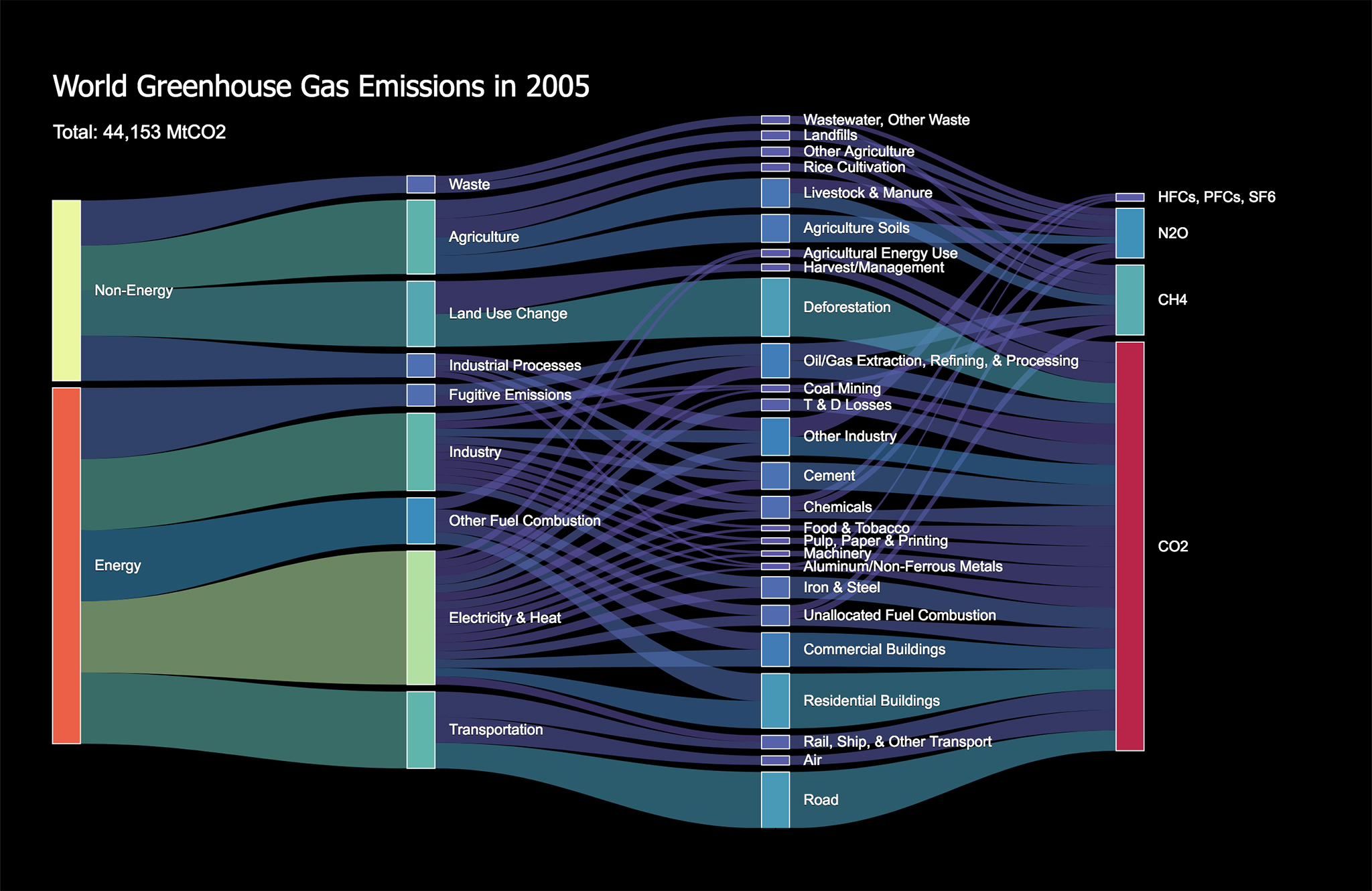
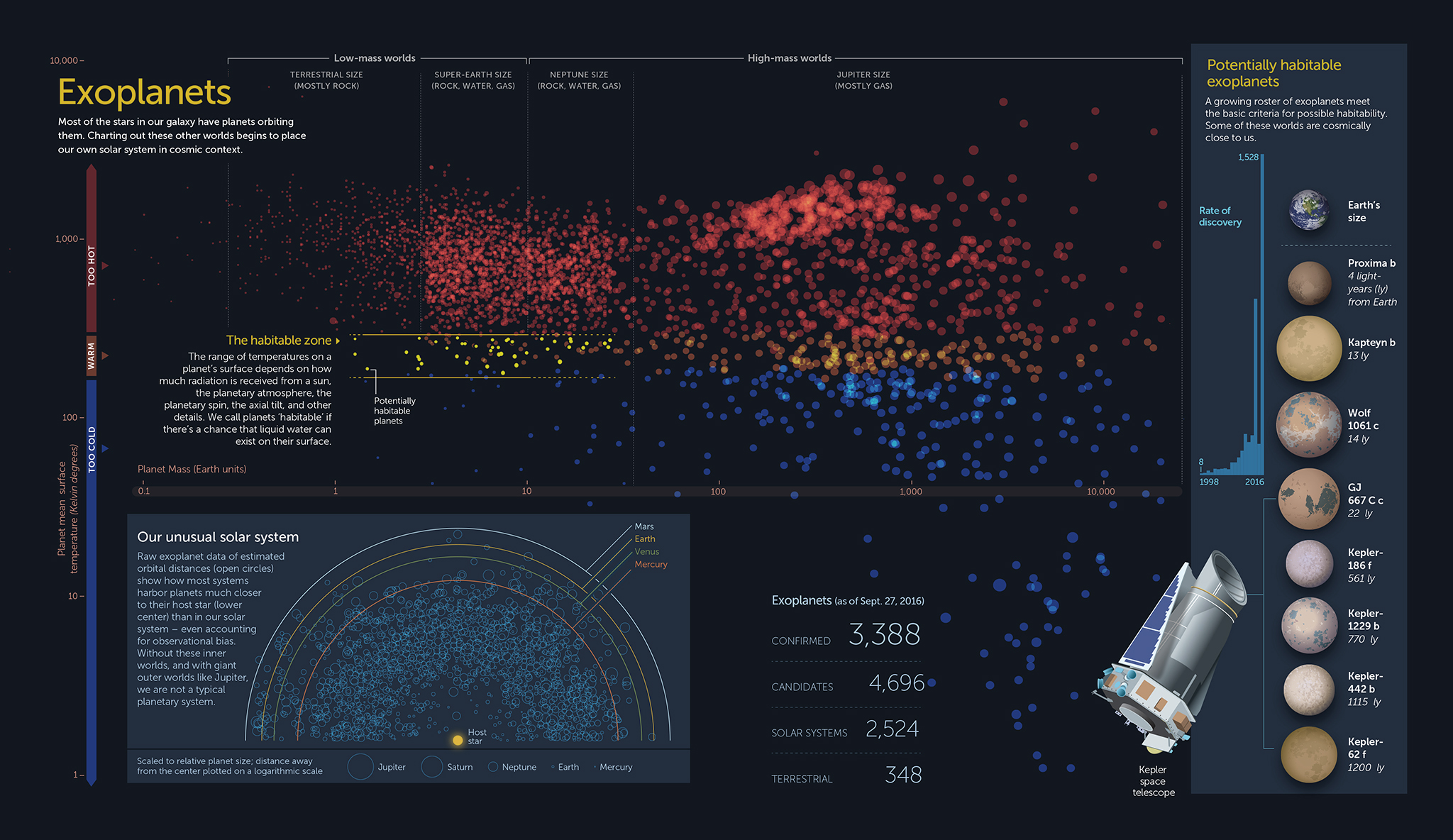
Although we are better known for our infographics and data visualization, 5W works on many other types of projects including graphic design, web design and development, and animations. A good example is the website and logo design we just finished for Harvest Strategies.
Harveststrategies.org serves as a resource for fisheries scientists, managers, and other stakeholders, compiling information about how pioneering management approaches can lead to sustainable, profitable fisheries and successful recovery programs for many species around the world. The site is managed by The Ocean Foundation’s International Fisheries Conservation Project.
We did the website’s design as well as the front-end development, and designed a new logo to accompany all communications by Harvest Strategies. Other past projects with this client include animations, brochures, PowerPoint templates design and a series of specialized data visualizations targeted to fisheries managers and scientists (we’ll show those in this blog in the near future).
After a great experience last month, we are announcing the next edition of our online Infographics and Data Visualization workshop. Register early and take advantage of our $150 early bird discount.
We are using the same format: the workshop will be split into four 3-hour-long live sessions, on September17, 18, 24 and 25 (Thursday and Friday over two weeks). The schedule is from 12:30 pm to 3:30 pm, U.S. Eastern Time (9:30 am to 12:30 pm Pacific) to accommodate participants in all U.S. time zones. Participants can join us join via Zoom from PC, Mac or mobile devices.
You can read more about the specific content of the workshop in our previous post, and check the detailed schedule and additional information here. And drop us an email anytime at academy@5w-consulting.com if you have any questions.
In addition to charts, maps, infographics and online data visualization, one of the subjects we discuss in our Infographics and Data Visualization workshop (check out the new online version of the workshop) is simple explanatory animations. Short videos are highly effective, ideal for any device size and easy to share in social media.
During the workshop we look at outstanding examples and discuss the whole process. It starts with writing a concise and effective script, perhaps the most important part of a successful animation. We show how we create storyboards, voiceovers, music and effects, and the importance of hitting the right pace, tone and visual style for your purpose and audience.
The process is not as intimidating as someone looking at starting with animations may think. With simple vector-style art created in Illustrator and using animation software such as After Effects, it’s a simple process.
Many organizations ask us to explain relatively complex topics internally or to the public in short explanatory videos. Here are a few examples of animations we have done recently for the World Bank Group (about disaster risk management and hydrometeorological systems) and for the Pew Charitable Trusts (about new systems to manage fisheries).
For some time we had been planning on adding a virtual option to our most popular workshop, the 2-day Infographics and Data Visualization event. We had multiple requests for it over time. After more than 30 in-person workshops in Europe, Asia, and the U.S., the coronavirus pandemic has given us the final push to organize an online event.
The new 5W Academy workshop will take place via Zoom. It will be split into four 3-hour-long live sessions, on June 18, 19, 25 and 25 (Thursday and Friday over two weeks). The schedule is from 12:30 pm to 3:30 pm, U.S. Eastern Time (9:30 am to 12:30 pm Pacific) to accommodate participants in all U.S. time zones. Participants can join us join from PC, Mac or mobile devices.
This workshop is a comprehensive overview of infographics and data visualization, and tries to mimic the combination of lectures and practical exercises that we use in the in-person workshops, with great feedback from participants so far. Our two instructors have over 50 years of combined experience in the field, and over 100 international awards. We’ll discuss the role of infographics in visual storytelling and guide you to create your own, in print and online. Attendees will do practical sketching exercises for infographics, charts, diagrams, maps and animation storyboards, and create interactive data visualizations with the help of Tableau Public, Flourish and Datawrapper. We’ll see the process behind the creation of infographics and learn about gathering and preparing data, using hierarchy, color, typography, illustration, and narrative to create effective and impactful visual presentations.
The class will offer an overview of essential tools and strategies for creating engaging infographics and data visualization. Multiple award-winning projects will be explained.
This comprehensive workshop is a very practical guide for working designers, entrepreneurs, journalists, educators, and professionals who are interested in developing the skills to create print and interactive information graphics. It combine lectures and practical exercises.
We are looking forward to do more in-person workshops as soon as it’s safe and feasible. Here are some photos of the most recent international workshops we had in Singapore, New Delhi (India) and Beijing (China) for different media and finance clients.
Singapore workshop for DBS Bank (organized by Methodology)New Delhi workshop for India Today, organized by WAN-IFRABeijing workshop for CCTV.com, organized by MediaX
Anyone interested in creating their own data visualizations should be giddy with delight with the quickly growing number of tools available to create them without any need for programming skills, and in most cases for free: Tableau, Flourish, Datawrapper, RawGraphs, Chartbuilder or QGIS (for mapping) are some of the best, and the list goes on and on. I’m convinced in a relatively short time drag and drop tools with be as powerful and flexible as D3.js and other developer tools, making data visualization accesible to everyone.
The exciting news is seeing two software giants entering the field with new web-based tools: Adobe launched Data Illustrator a few months ago in a collaboration with the Georgia Institute of Technology, and Microsoft Research is behind the just released Charticulator. Both work very intuitively, allowing the author to bind multiple attributes of data to graphical elements. They are indeed powered by D3.js, among other libraries.
Both offer introduction videos in their hope pages. Here is Data Illustrator:
And here is Charticulator:
The tools offer tutorial sections and multiple step-by-step videos in their galleries; and they link to the research papers describing the tools, which are worth reading (Data Illustrator,Charticulator).
Creating complex visualizations like the chord diagram below seems ridiculously simple in Charticulator, and the same can be said of Data Illustrator’s visualizations. See the video:
This is not a review as I have just started playing with them, but on first look both tools are impressive. It’s still really early in their development, but if Adobe and Microsoft throw their mighty resources to support and improve them, we can expect great things in the near future. Perhaps one day Data Illustrator could be embedded within Adobe Illustrator, allowing designers to work fluidly and easily between D3 and Illustrator without leaving the graphical interface. And Charticulator could integrate into PowerPoint. Stay tuned!
The series was created by Marcelo Duhalde and Marco Hernández, in collaboration with Pablo Robles, Alice Tse, Darren Long, and Tom Eves. It has two main chapters with their own illustrated sub-sections:
It’s a good example of a well integrated package entirely created within a graphics department. The few interactive or animated elements are used judiciously, only when needed.
I’m hoping the series continues with new chapters, and I would bet the authors have thought of compiling the whole package in a book since the design and topic naturally lend to it.
The Forbidden City has always been a favorite topic ever since I created a National Geographic poster on the topic back in 2008, including researching in situ in Beijing. I researched, designed and wrote it, and the illustrations are by the great Bruce Morser, the most precise pencil illustrator I’ve ever worked with.
Hereis a page that compiles many of the best online infographics of the South China Morning Post, and this a remarkable compilation of graphics as they were published in print.
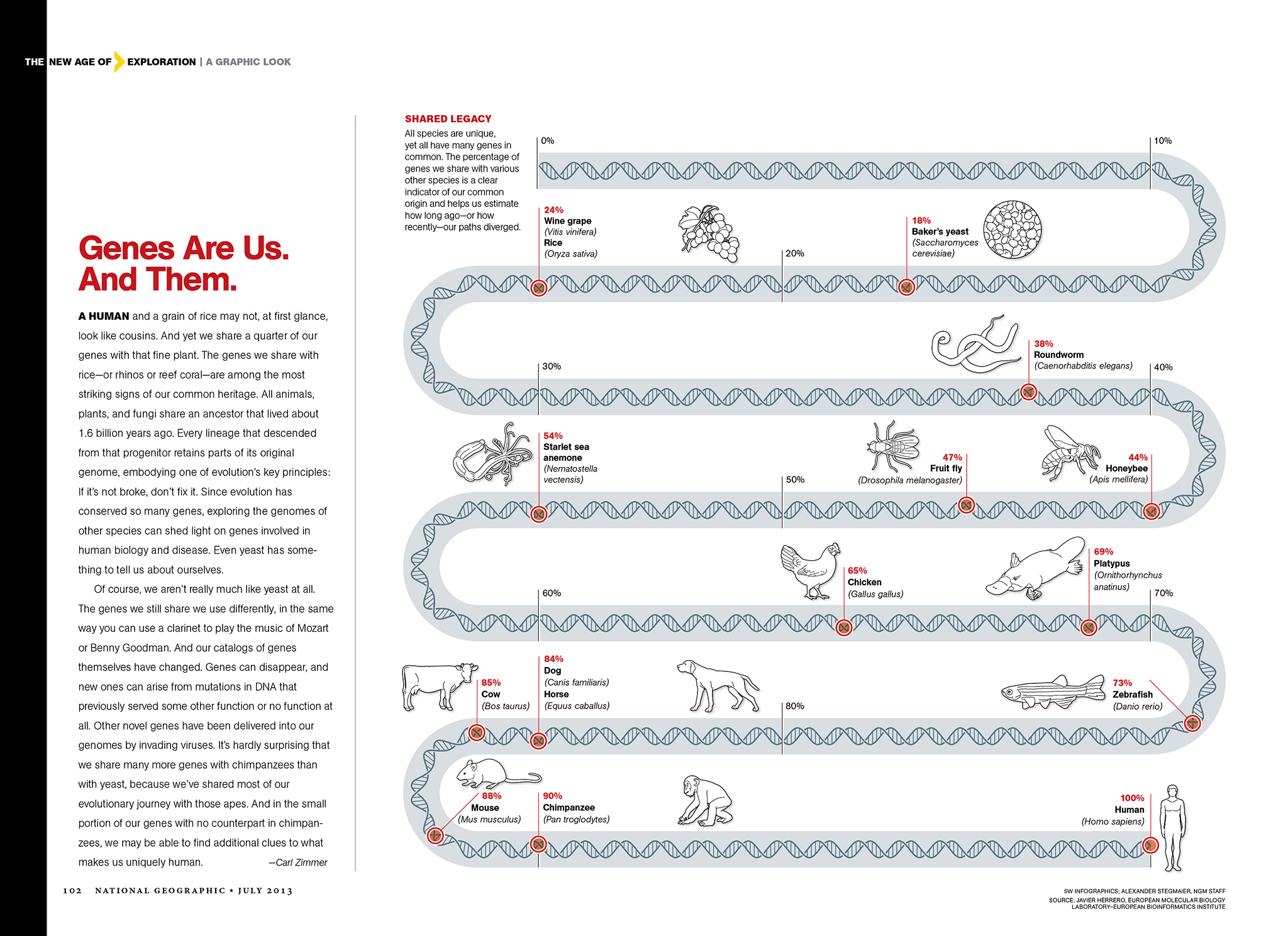
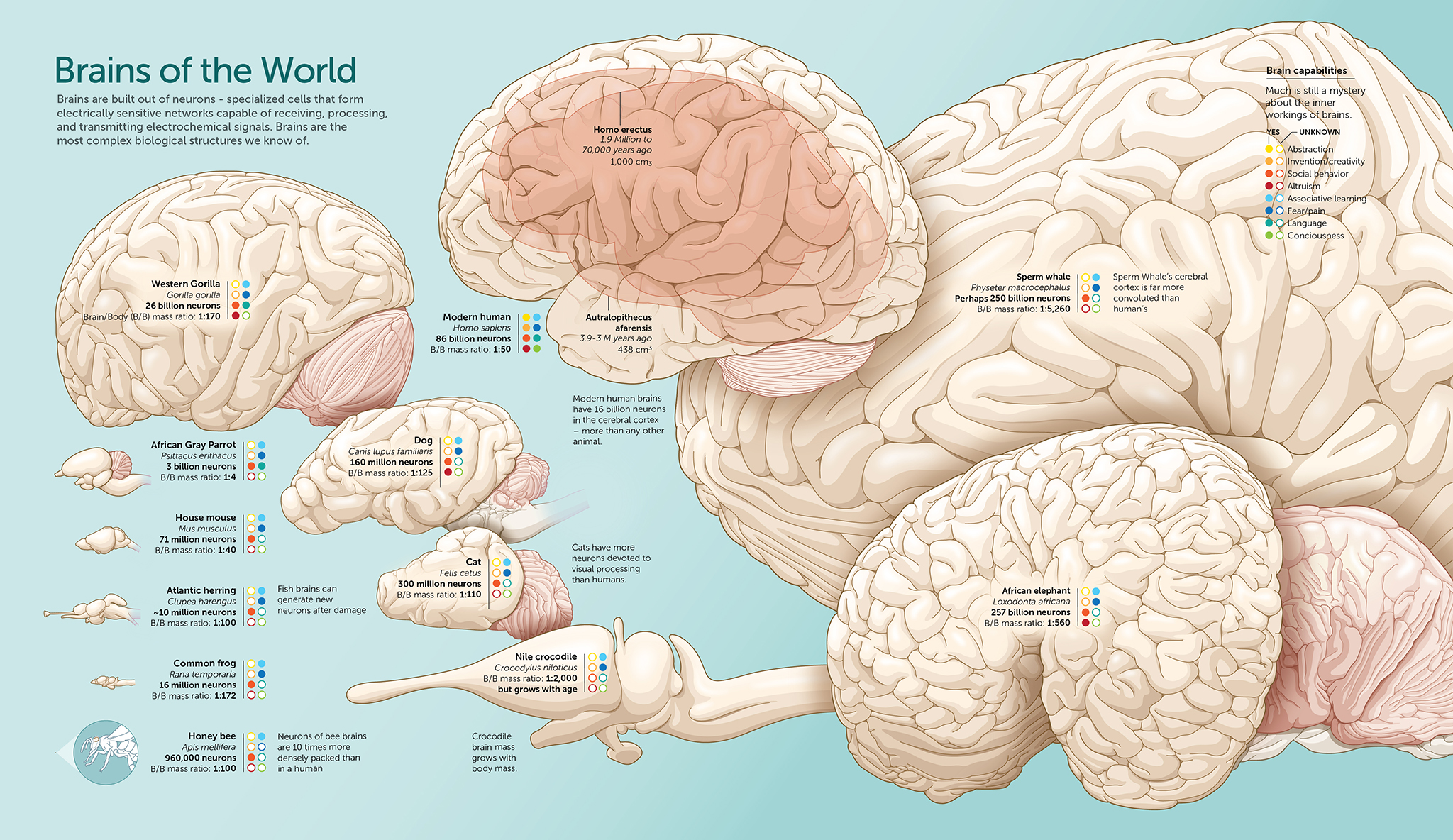
In the last few days we have been busy updating the gallery section of our website with lots of additional samples. It had not been updated in a long time. The new images are a mix of recent and older graphics, including some of the graphics done during my years at National Geographic magazine (For those Nat Geo graphics, sometimes including collaboration with other researchers and artists).
Feel free to navigate to see a range of different types of graphics including charts, diagrams and maps. You can also look by subject or technique, and see examples of branding and graphics style guides from our consulting side. Here are some of the newly uploaded samples, in no particular order (here and on the website, click on any image for a larger version):
We are working on more extensive changes to our website, with a fully responsive and redesigned site coming up before the end of the year. It will include examples of interactive graphics and animations, and this blog will be part of the main site. In the meantime, if you are interested in additional samples or want to get in touch, drop us an email to contact@5wgraphics.com.
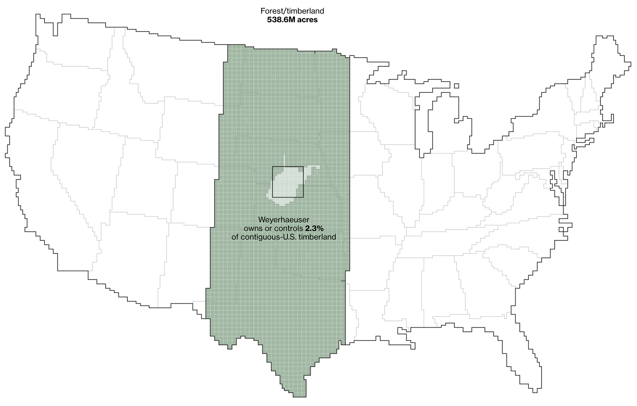
We just came across a really engaging graphics feature by Bloomberg.com. How America Uses Its Land, by Dave Merrill and Lauren Leatherby. It’s well sourced and nicely designed. As the intro states, “The 48 contiguous states alone are a 1.9 billion-acre jigsaw puzzle of cities, farms, forests and pastures that Americans use to feed themselves, power their economy and extract value for business and pleasure.” There are quite a few surprises for the reader, such as the massive amount of land used as cow pasture/range (see map above). 41 percent of U.S. land in the contiguous states is used as pasture or cropland used to produce feed.
Here is the overall distribution of land uses:
Forest and timberland take another large chuck of the space. Did you know a company called Weyerhauser Co. owns or controls an area of timberland equivalent to the size of West Virginia?
Here is an extremely useful resource for anyone interested in graphics and data visualization. Maarten Lambrechts is a data journalist, designer and visualization consultant from Belgium. He creates great visualizations and is a speaker and instructor (check out his free data journalism training videos in Learno.net).
He has compiled a List of 2017 data visualization lists, which links to the best work created in 2017 by many of the newspapers and organizations that are doing the best graphics. It’s great to see the work of the NY Times, Washington Post, Wall Street Journal, NPR, Reuters, The Guardian, The South China Morning Post, and many others in one place. Luckily, more and more news organizations are presenting these compilations at the end of each year. They involve a lot of effort and quality journalism, and its great to discover those we missed when they were first published.
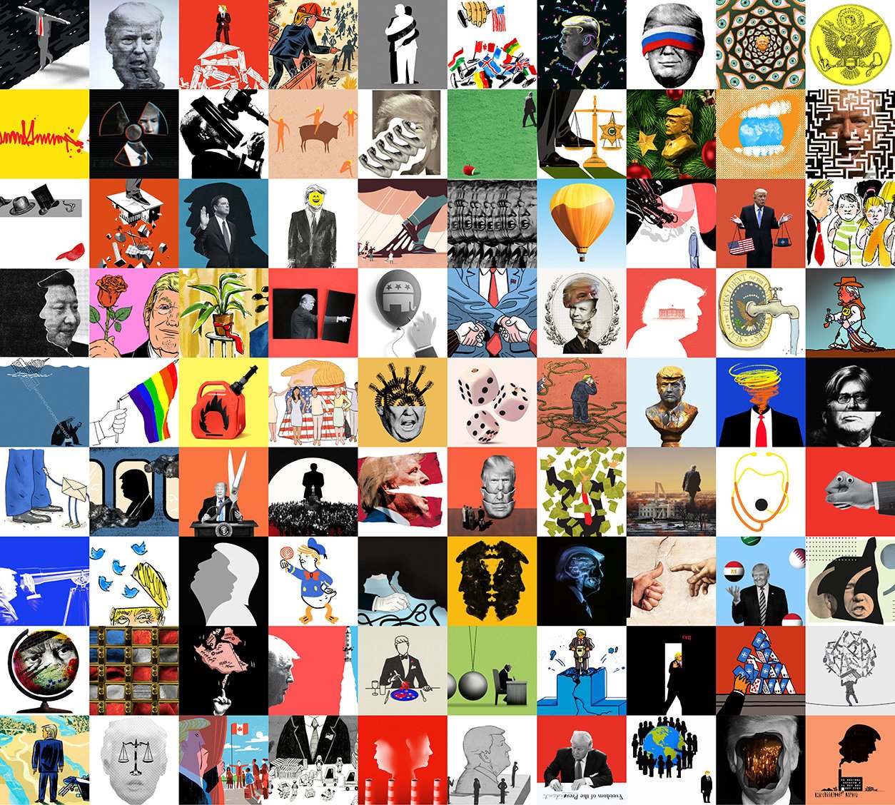
The list also includes examples made with tools like Tableau and Carto, charts from the World Bank, satellite imagery and a wonderful compilation of the best illustration published by The New York Times in 2017.
When it comes to create data-driven interactive infographics, charts and maps for the web our tool of choice is D3. This JavaScript library can connect data to graphic elements in the page and create data-driven, dynamic transformations for them. The possibilities are enormous. D3 was created by Mike Bostock, a computer scientist at Stanford University. Until 2015 he was also working at The New York Times creating some of the best interactive graphics out there. According to Martin Velasco, our Director of Web Development, “D3 is possibly the most powerful and flexible tool out there for creating sleek and precise data visualizations for the web. We really enjoy working with it”.
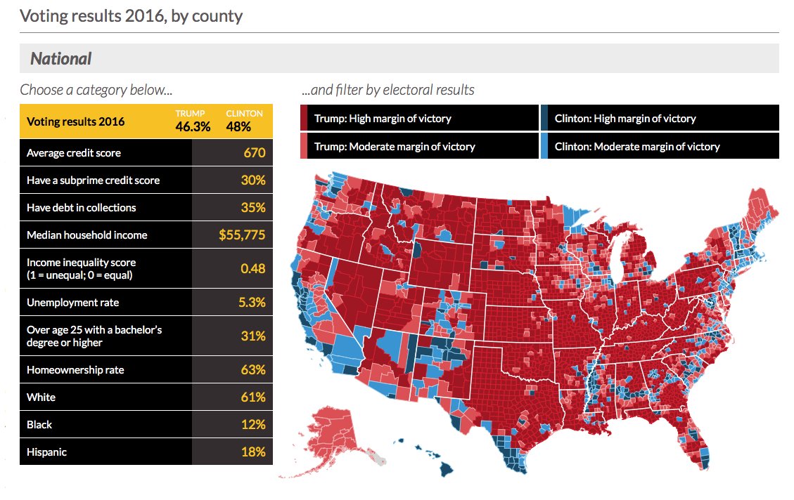
During the last few months we had the opportunity to experience once again the power of D3 while developing several graphics for Urban Institute, a think tank in Washington D.C. that do research on economics and social policy. One of the more interesting is this data-intensive electoral map that connects the recent election of Donald Trump to several social indicators of financial insecurity. It is truly remarkable how D3 allows you to work with massive amounts of data (about 50,000 in this case) and transform them into beautiful rich, smooth-moving graphics. We are looking forward to more D3 work.