Our “Power of Infographics” workshop is back in Singapore

Singapore

Following the success of the previous workshop in January, we are coming back to Singapore on May 21-22 with our Power of Infographics workshop. The event is hosted by Methodology in partnership with Gestalten, the German leading publishers specialized in visual culture.

Banner_WorkshopJVelasco_500x610_2

The two-day workshop by 5W’s co-founder Juan Velasco (ex Graphics Art Director at The New York Times and ex-Art Director of National Geographic magazine) will be a comprehensive review of information graphics and data visualization, both in print and online. We’ll have a chance to create hands-on work running through the entire process: gathering and preparing data, working with statistics in Excel, sketching, storyboarding… By the end of the workshop the attendant wills have a completely sketched-out illustrated infographic with multiple components and a functioning online data visualization including interactive charts and maps. We’ll use the free Tableau Public for our interactive exercises.

Juan_teaching

Juan will also provide numerous lectures on the theory and practice of information graphics showing step-by-step examples of award-winning infographics and covering the latest trends. We’ll learn which charts are best to use for different types of data; what type of maps are useful to give insight into our data sets or to locate stories, and how they are created; the tools and processes for successful motion graphics… We will also experiment with hierarchy, color, typography, illustration, and narrative to create effective infographics that make an impact.

Seats are going fast! Reserve yours now by emailing admin@methodology.sg

Is Lego the future of infographics?

Probably not. But I just discovered these two videos by Brookings (an influential think tank in DC) that use lego bricks to illustrate the fundamental issue of inequality in the U.S. I couldn’t help thinking how apt a tool lego bricks can be to represent numerical concepts and, being a lifelong lego fan, just how beautiful they look! No, I do not think they are the future or graphics, but I’d love to see more of these!

New graphics for Politico

Screen Shot 2015-04-21 at 5.48.25 PM

One of our latest infographics packages is live online today. Politico have just published an in depth investigation on the safety of America’s oil and gas pipelines: “Pipelines blow up and people die”, by Elana Schor and Andrew Restuccia.

The data that Politico has unveiled reveals an appalling situation: just in the last 13 years pipeline incidents in the U.S. have killed 199 people and injured 799. Just last year 19 people died on pipeline-related incidents, injured 97, and caused more than $300 million in damage. The report goes on to reveal the incompetence of the Pipeline and Hazardous Material Safety Administration, the obscure agency that oversee the immense and outdated network of American oil and gas pipelines. It turns out that the PHMSA is controlled to some degree by (surprise!) the pipeline industry.

We helped Politico to visualize the very revealing data their research unveiled. The map below, created using Tableau Public and Illustrator, shows all the accidents involving oil and gas pipelines in the U.S. during the last five years.

Crime in Milwaukee 3

We are using Tableau lately to help us explore visual possibilities with large sets of data and it truly is a useful tool. Politico is not using interactivity maps and graphics yet, which would be the natural fit when using this interactive graphics tool, but we have found Tableau exports very nicely to PDF, and from there to Illustrator.

Screenshot_Pipelines_Tableau

A series of charts present various aspects of that alarming situation:

Crime in Milwaukee 3Crime in Milwaukee 3


We worked with Art Director Heather Barber and had great ideas and data sets from editor Bob King and writers Elana Schor and Andrew Restuccia.


Tyrannosaurs in Scientific American

dino_spread

Dinosaur and Paleontology stories were always among my favorites to work with at National Geographic. Recently I had a chance to work with Scientific American Magazine on a fun and fascinating story on the rise of Tyrannosaurs. The story, by prominent paleontologist Stephen Brusatte, is on the May ’15 issue.

New discoveries are showing us that tyrannosaurs were a surprisingly diverse bunch that slowly evolved into the gigantic proportions of the iconic Tyrannosaurus Rex. Jen Christiansen, the Art Director of information graphics, asked us to create a spread infographic for the story. We showed the tyrannosaur family tree with amazing illustrations by Todd Marshall. The maps reveal how tyrannosaurs evolved at a time when the continents had yet to fully break apart, so their fossils are now found in very different parts of the world.

The story has a gorgeous cover by James Gurney, the master illustrator you may know from his famous Dinotopia series. We art directed him (which amounts to little since he doesn’t really need much direction!) in a spread illustration for the story.

BrusatteCover

We’ll show you the sketch to final process and a great make-of video by Gurney in a few weeks, in the meantime we don’t want to spoil the issue for you, run to your newsstand or order it online!

By the way Jen Christiansen keeps a really nice blog, SA Visual, with articles on the graphics process at Scientific American and on other graphics-related topics. Highly recommended.

Workshops in Malaysia and Indonesia

Workshops

We were back to South East Asia at the end of March to teach information graphics and data visualization workshops in Kuala Lumpur (Malaysia) and Jakarta (Indonesia). Both events were focused on interactive graphics, data visualization and the print-to-web challenge.

The workshops were organized by WAN-IFRA, the World Association of Newspapers and News Publishers. WAN-IFRA is a global organization representing more than 18,000 publications, 15,000 online sites and over 3,000 companies in more than 120 countries.

In Malaysia, we were hosted by Media Prima group, a leading Malaysian publishing company. The participants were designers and editors from The New Straits Times, the group’s English-language newspaper and the oldest newspaper in Malaysia (1845); Berita Harian (BH), a mainstream newspaper in Malay; and Harian Metro, a popular human interest daily and the largest newspaper of Malaysia in any language.

Newspapers

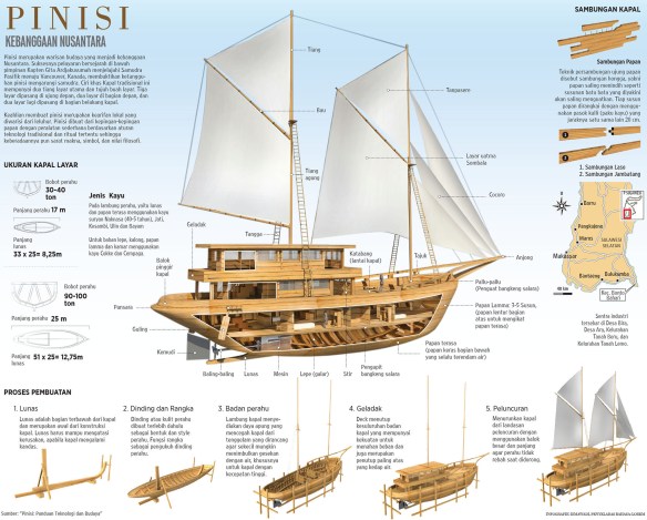
In Jakarta, we worked with Kompas, the largest circulation newspaper in South East Asia, and surely one of the best. Kompas has excellent print design (it was redesigned by Mario Garcia). They have had a digital presence for some time, including nice tablet offerings, and they are now trying to enhance their infographics online. They do plenty of really nice print infographics, like this one about the pinisi, a traditional Indonesian two-masted sailing ship.

Kompas_Pinisi

The interactive graphics of The New York Times and The Guardian, in one place

Graphics_collection

Here is a really useful resource I found some time ago, and that I visit often: a site with most of the interactive graphics by The New York Times and The Guardian together. The page was started as a thesis project by Marije Rooze, a Dutch web designer working in information and interaction design, data visualization and coding.

The compilation starts from 2000. It hasn’t been updated very recently, but I’m hopeful it will be because it’s an amazing place to find inspiration from two newspapers that are among the very best in interactive graphics. You can filter by topic, visual form, data type, participation (social data, reader generated, etc), and other useful variables.

By the way, we can expect great new things from The Guardian since they just added Xaquín Gonzalez (ex-NY Times and Nat Geo) to their talented team as Editor of Visuals.


Data Visualization with D3.js online course


Here is an opportunity you do not want to miss: Alberto Cairo and Scott Murray are co-teaching an online course called Data Visualization and Infographics with D3.js. Alberto, professor of Information Graphics and Visualization at the University of Miami, will be teaching the conceptual part or the course, and Scott, author of Interactive Data Visualization for the Web, will introduce and explain the powerful JavaScript library D3.js.

D3.js is one of the best tools to know if you are serious about interactive data visualization online (The New York Times has done amazing things with it). It is a JavaScript library designed specifically to display and control data visualization on web browsers. The learning curve can be a bit steep if you are completely new to web programming, but it is certainly worth the effort.

The failing promise of GIS mapping in news (and some free maps)

In 1992 the Miami Herald first introduced GIS mapping to journalism in a significant way with their Pulitzer-winning reporting on the damage caused by Hurricane Andrew. A new era in investigative news mapping was beginning… However, fast forward (23 years!) and very few news organizations are taking advantage of modern cartography.

During ten years at National Geographic I was lucky to work with an amazing cartographic department that is highly skilled at using GIS software to produce detailed spatial analysis and (largely) automated mapping. GIS (Geographic Information System) software links location information in the form of databases with latitude and longitude coordinates to different types of information: demographic data to census tracts or divisions, election results to provinces, land use to natural or urban areas, etc. The user decides what layers (which may come from government or private sources) are going to be combined in order to visualize, analyze, and interpret the data to show relationships, patterns, and trends.

All oil and gas platforms, pipelines, leases, wetlands and protected area in the Guld of Mexico, made with GIS layered data. Copyright National Geograpic Society


A dismal state of affairs
During recent workshops in different countries I have been shocked to discover that 95% (if not more) of newspapers and magazines (particularly out of the US) still produce maps at a fairly basic level by taking screen grabs from Google Maps and painstakingly retracing them in Illustrator. Line by line, one push of the mouse after another. This procedure is the general standard today. These are of course simple geographic maps (large areas or cities) rather than the kind of thematic/data mapping that can bring visual insight to a story in a powerful way. I’ve been to a few newspapers that are the leaders in their respective countries and have never even heard the term GIS.

Why is GIS not ubiquitous in journalism in general and graphics departments in particular, as it is in many other industries? (disclaimer: I’m not a GIS user myself but I think it should be part of the skill set of any graphics department).

GIS packages such as ArcGIS or the Illustrator plugin MAPublisher are quite expensive, and the learning curve is high. There are free options such a QGIS (see a terrific tutorial by LA Times’ Len De Groot here), but newspapers rarely commit to diving in or understand its power. It’s amazing since there is so much to gain from GIS to uncover patterns though spatial analysis.


Are web mapping tools the new “GIS”?
Today, free web mapping tools like Tableau Public and Google Fusion Tables allow for easy and free data mapping. In many ways, these tools have somehow replaced the usage of GIS for journalists seeking to simply layer datasets to visualize spatial patterns. The Guardian and other major organizations have used them deftly in the past. But they don’t give the same analytical depth or access to GIS datasets.

D3.js can create nice interactive mapping as well (but you’ll need programming skills). TileMill from Mapbox, CartoDB are good online mapping tools, and you’ll also need some specialized skills.


Free maps!
In any case, for the “99%” out there (the occasional mapper or graphics departments that for whatever reason just need some base maps and can’t use GIS or even pay), here are three useful map sources:

Indiemapper. You can generate vector maps (physical or political), re-center and reproject them (let’s say from a flat world map centered in Europe to a globe centered in Asia) and export them as SVG files that you can open in Adobe Illustrator. Very useful! It can also importing KML (from Google Earth) and Shapefile formats.

Indiemapper

Natural Earth is a fantastic open source raster and vector map dataset at three different scales created by volunteer NACIS members and cartographers around the globe. Nathaniel Vaughn Kelso and Tom Patterson led the effort. In his fantastic Shaded Relief website, Tom Patterson (Chief Cartographer at the U.S. Park Service) offers some nice globes free to download and use (you can overlay the boundaries in Photoshop with a “multiply” effect). But of course, proper GIS software is what you would need to create your own customized visualizations and projections. These globes were create with Natural Scene Designer, a great package (and not that expensive) that is a favorite among National Geographic staff,

OpenStreetMap is less known that I would have expected in newspapers: It’s an open source collaborative effort with really detailed maps down to the street level for most locations in the world. The Wikipedia of mapping, if you will. It’s a fantastic source and free to use (but do give proper attribution), but the export process to Adobe Illustrator is quite cumbersome, with additional software and plugins needed. You’ll need a fair amount of work to fix the ways masks layers and polygons get exported.

Your local government cartographic institutions may be just a click or phone call away with nice vector maps if you try them. If you download from the Internet, remember you can open PDF and SVG files in Illustrator, but make you sure you have the permission/rights to use what you find.

There are many free vector maps sources around that you can use (just Google them) and well as paid collections such as Mountain High Maps Plus, but none that I would recommend without a detailed review.

Note: I don’t endorse any particular program or intend to create a comprehensive review here. The mentioned software are just a few samples and I’m sure there are many other competent mapping solutions out there.


Reclaiming the word “Infographics”, once again

Infographic elements

Recently I rediscovered an old entry in Alberto Cairo’s blog titled “Reclaiming the word “Infographics””. It resonates strongly with my own thoughts on the matter. I have been creating infographics for 25 years now, and the word has always meant to me a blend of information, design and illustration, in which the graphic part’s (the design and the illustration) mission is to convey the information in a more illuminating and revealing way than words alone could accomplish. It is fundamentally a branch of journalism. The work that The New York Times, National Geographic, or Scientific American, among many others, are doing in this respect are prime examples of splendid infographics.

In the last few years “the term “infographics” has been hijacked”, as Cairo puts it. Instead of denoting a branch of journalism, the word is now used more and more often to refer to graphic displays that serve not journalism, but marketing. These “infographics” are often created with the (foolish) declared goal of becoming “viral” online, and, as a rule, the images are used not to convey information, but to decorate. They use graphic resources typical of the more serious, journalistic infographics, such as charts, arrows, and maps, to decorate information often chosen randomly with the only purpose to justify the presence of that very chart, arrow, or map.

You can find online thousands of “infographic elements” packs, collections of predesigned “infographic looking” graphic elements, that allow you to put together an “infographic” with minimal effort. You can (perhaps) find some information later to squeeze into your graphic. This is, almost exactly, the opposite of what I call an infographic. They represent a complete trivialization of the exacting and fascinating craft I have been practicing for many years.

SND Digital Awards and upcoming conferences

Print

The Society for News Design (SND) has just announced some of the winners of their “Best of Digital Design” competition. Stay tuned for a complete database of winners and the nominations for the World’s Best awards (the winners will be announced on April 11 at the SND’s annual workshop in Washington, D.C.

Here is a partial list with the Gold and Silver medals. All the usual suspects are represented, with awards going to The New York Times, ProPublica, National Geographic, Los Angeles Times, NPR and more.

We haven’t had a chance to look at all the winners, but we were really happy to see one of our favorite pieces of the year has been awarded. It was illustrator Christoph Niemann’s very original story on the Brazil World Cup and the famous “Curse of Maracaná” of the 1950 tournament, for The New York Times.

CurseMaracana

We’ll be involved in the judging of the parallel Student Society of News Design competition.

Other important events in media design, graphics and data storytelling are coming up in the next few weeks:

The Tapestry Data Storytelling Conference is a one day event by invitation only in Athens, Georgia. It will take place on March 4. Here are the attendees (they like to keep it to about 100 people) and a link to request an invitation.

The main event in the world of infographics is also just a few days away. The 23rd Malofiej infographics conference and awards will take place at the University of Navarra in Pamplona (Spain) on March 18-20. The conference is preceded by the Show Don’t Tell workshop, led by instructors John Griwmade, Alberto Cairo and Geoff McGhee (I won’t be an instructor this year).

OpenVis, a highly recommended web data visualization conference takes place on April 6-7 in Boston. I was the closing keynote speaker in 2013 and really enjoyed the event.

Finally, the Asian Media Awards 2015 will take place on April 28-30, in Bangkok. They are organized by The World Association of Newspapers and News Publishers (WAN-IFRA). We’ll follow this one closely as we are working more and more with Asian media, and we’ll be involved in the judging as well.