ArcGIS maps in Illustrator and Photoshop

Design and communication professionals should be really excited about a recent development in mapping: ArcGIS maps for the Adobe Creative Cloud.

GIS (Geographic Information System) software links location information in the form of databases with latitude and longitude coordinates to different types of information: demographic data to census tracts or divisions, election results to states, land use to natural or urban areas, etc. The user decides what layers (which may come from government or private sources) are going to be combined in order to visualize, analyze, and interpret the data to show relationships, patterns, and trends. As I mentioned in a previous post, GIS packages such as ESRI’s ArcGIS are rarely used by designers or news infographics departments as they are expensive, difficult to learn specialized tools normally used by GIS analysts and cartographers. With very, very few exceptions, those designers and graphics editors limit themselves to fairly basic mapping techniques that don’t take advantage of the power of GIS to uncover patterns through spatial analysis of large datasets.

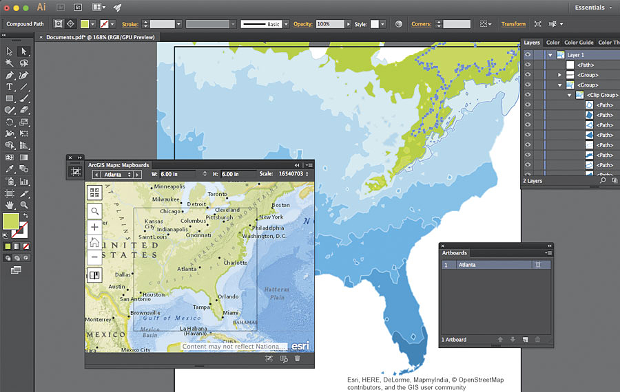
The partnership between ESRI and Adobe offers ArcGIS functions within Adobe Illustrator and Photoshop via an extension or plugin. Designers can access thousands of data-driven map layers inside the Adobe programs as vectors or raster files, and play with colors, layers and styles to customize the maps using the familiar tools of Illustrator and Photoshop.

Creating maps with the extension is fairly straightforward. Without leaving Illustrator and Photoshop you define the area extent, size and scale of the base map, then search for data map layers (street maps, political boundaries, terrain, satellite images, election data, demographic information, economic indicators, environmental, etc), and finally you add/download the map to your Adobe workspace. It’s then already arranged in layers and ready to edit and polish by manipulating colors, appearance and fonts with the usual Illustrator and Photoshop tools.

You can get the beta version here. It has been available for a while, and the first full version is slated for release in the second Quarter of 2017, with no specific date yet (it’s been delayed before). Some of the functions are clunky and/or slow, but it is definitely great news and I can imagine how in few years this may become an essential tool for infographics designers to create and publish advanced data maps. You do require a subscription to ArcGIS Online (pricing info here) to be able to sign in but there is a trial version available.

Here is an introduction showing the capabilities of the plugin and how it works, and a longer, more recent video with added detail:

All images by ESRI


Workshop for New York Life MainStay Investments

We were in New York last week doing a corporate workshop for New York Life MainStay Investments. The investment management company is part of New York Life, the largest mutual life insurance company in the United States, and one of the largest insurers in the world.

As with other clients we work with, New York Life MainStay Investments produces large amounts of complex information that needs to be communicated with efficiency, precision and an attractive design. They market securities and different financial instruments and meed to provide advisors and clients with reliable information about performance, risks and how different investments compare to others though a variety of brochures, factsheets, fund “snapshots”, online dashboards, PowerPoint presentations and so on.

In the two-day workshop we discussed the difference between insightful charts that help clarify information and the decorative presentations that add little value and are commonplace everywhere; content and visual choices, alternative approaches to telling stories visually, overall design issues, achieving style consistency across an organization’s output of charts and graphics, and more. We typically mix presentations with hand-on exercises that emphasize hand sketching, and also introduce participants to the creation of online data visualizations with Tableau.

For information on our corporate workshops, reach us at contact@5wgraphics.com.

New York Life Mainstay Investments is located in Jersey City in an iconic building right across Manhattan:

The views of the Hudson River and the Manhattan skyline are stunning!

Annual report for UNICEF USA

We recently finished a nice project designing the infographics and charts for the 2016 Annual Report of UNICEF USA. We worked under the creative direction of UNICEF’s Anna Christian to create a series of simple, bold data and information visual summaries.

UNICEF USA helps save and protect the world’s most vulnerable children. Rated one of the best charities to donate to, 90% of every dollar spent goes directly to help children. The United Nations Children’s Fund (UNICEF) is a United Nations programme that provides humanitarian and developmental assistance to children and mothers in developing countries.

All the online winners of the Malofiej Infographics Awards

We just found a fantastic site by J. A. Álvarez (@infoiguacel) that compiles all the online winners of the 25th edition of the Malofiej Infographics Awards. You can filter by type of award, country, and readership. What a source of inspiration! Big thanks to @infoiguacel for putting this together.

The winners of the Malofiej Awards were announced a couple of weeks ago. The Malofiej Summit is held every year in Pamplona (Spain) and is still, in my opinion, the best event in the world if you want to know what is happening in the field of information graphics and data visualization. Since they are for the most part journalistic work, the graphics have a strong focused on being clear, explanatory and insightful to clarify news events. They are the “Pulitzer of Infographics”. It includes the competition of print and online infographics (over 1300 entries from 134 organizations in 31 countries participated), a 2-day conference that attracts professionals from all over the world and a three-day workshop called “Show Don’t Tell”. The workshop for professionals is taught by Fernando Baptista of National Geographic, Xaquín Gonzalez from The Guardian and John Grimwade from the University of Ohio. It doesn’t get any better than that! I was fortunate to be an instructor for the workshop for 10 years.

This year there was also a workshop for students, taught by Michael Stoll, Professor of the Augsburg University of Applied Sciences.

There is a special bonus from Malofiej. Every year they publish a fantastic book with all the award winners. There is no better source of inspiration for print and online infographics and to see the state of the art, trends and work from different countries.

This year the top prizes (Best of Show) went to Corriere della Sera (Italy) and The New York Times (USA), for the print and online categories respectively, with the graphics ‘Journey of Foreign Fighters’ (shown below) and ‘Olympic Races Social Series’.

Over the years, we at 5W have been lucky to win a few Malofiej Awards (from our previous jobs at the NY Times, National Geographic, Fortune or directly with 5W’s work. Here is my Terracotta Warriors graphic for National Geographic (in collaboration with Pure Rendering GmbH) that won the Best of Show a few years back:

By the way, everybody asks this: what does Malofiej mean? Alejandro Malofiej was an Argentinian cartographer considered to be a pioneer in infographics, who died in 1987. The event was named after him as a tribute. The 25th anniversary is an important milestone. Here is a video tribute to Javier Errea, the President of the Spanish Chapter of SND, who has been the head of Malofiej for the last 17 years. A well deserved recognition!


Workshops in Singapore and Mumbai

Just a few days ago we came back from another good trip teaching workshops in Asia. We spent the first week in Singapore, our “base” in Asia since we have been there so many times. We keep good clients and friends in the city-state.

The first workshop was the public course we hold every few months in Singapore: The Power of Infographics, hosted by our friends at Methodology. The two-day workshop is a broad overview of the concepts and techniques behind infographics and data visualization, with plenty of hands-on sketching and exercises (including the creation of some online interactives with Tableau). The workshop attendees are public servants from different branches of government, as well as designers, students and educators.

The next two workshops were private two-day courses for one of the largest banks in Asia. We did the first one in Singapore and the second one in their offices in Mumbai, India. They have previously invited us to Jakarta and Kong Kong as well.

Large organizations have to deal with massive amounts of data, written reports and presentations, for internal communications or for public outreach. There is a growing interest in learning about how infographics can help find insight and reveal the key messages in a visual and more effective way.

To know more about our workshops visit our website or send us an email to contact@5wgraphics.com

By the way, we found a nice surprise while browsing at Kinokuniya, a great bookstore in Singapore: our book “Look Inside” was in the shelves! It’s exciting to see that is well distributed and selling well.

Infographic on billionaires for The New York Times

billionaires_map

How many billionaires there are in the world, and where are they? Where do they fortunes come from, and what are their hobbies? We just published a nice full-page infographic at The New York Times’ Sunday edition answering those and more questions. It’s based on research by Wealth-X, a firm that maintains a regularly updated database of information on the superrich.

By the end of 2015, there were 2,473 people with more than a billion dollars in wealth. If we compare the combined wealth of this select group with that of entire countries (measured by G.D.P as a proxy) they would be only behind the U.S. and China, and ahead of Japan, Germany and all other nations on the world. New York, Hong Kong and Moscow top the list of billionaires by city.

The U.S. has the most billionaires with 585 followed by China with 260. Looking at continents, Europe has the largest number with 806, but Asia (645) is showing the fastest growth.

The main visual in the infographic is an stylized cartogram with the size of countries (shown by squares) representing the number of billionaires in those countries that have at least one.

The are 8.4 billionaire men for each woman. 60 percent of the men’s fortunes are self-made but only 16.5 percent of billionaire women have self-made fortunes.

It was a nice project art directed by Corinne Myller and published on a special section on Wealth on Sunday February 26.

billionaires_print

The Art of Design in Netflix

abstract2


A little break from infographics with something that will appeal to anyone who loves design in all its manifestations: Netflix has just announced a new documentary series about design. Abstract: The Art of Design will premiere on Netflix on February 10. The 8-episode series highlights the work of leading designers that shape the world around us. Scott Dadich, Editor-in-Chief of Wired, is the executive producer of the project. He says:

If we’ve done it right, Abstract will help you understand the future by seeing the intent behind the objects that surround us—and the beauty in the decisions that led to them.

The series will explain the creative process behind Bjarke Ingels (architect), Christoph Niemann (illustrator. I’m especially looking forward to this one), Es Devlin (stage designer), Ilse Crawford (interior designer), Paula Scher (graphic designer), Platon (photographer), Ralph Gilles (automobile designer) and Tinker Hatfield (Nike shoe designer). You can watch the trailer below. We are looking forward to it!.

Latest D3 Work

C0NIeg-XcAQtL6C.jpg-large.jpeg

When it comes to create data-driven interactive infographics, charts and maps for the web our tool of choice is D3. This JavaScript library can connect data to graphic elements in the page and create data-driven, dynamic transformations for them. The possibilities are enormous. D3 was created by Mike Bostock, a computer scientist at Stanford University. Until 2015 he was also working at The New York Times creating some of the best interactive graphics out there. According to Martin Velasco, our Director of Web Development, “D3 is possibly the most powerful and flexible tool out there for creating sleek and precise data visualizations for the web. We really enjoy working with it”.

During the last few months we had the opportunity to experience once again the power of D3 while developing several  graphics for Urban Institute, a think tank in Washington D.C. that do research on economics and social policy. One of the more interesting is this data-intensive electoral map that connects the recent election of Donald Trump to several social indicators of financial insecurity. It is truly remarkable how D3 allows you to work with massive amounts of data (about 50,000 in this case) and transform them into beautiful rich, smooth-moving graphics. We are looking forward to more D3 work.

Our book LOOK INSIDE featured in Fast Company’s Co.Design

article_fastco

CO.DESIGN is great website about the intersection of business and design created by the team of FastCompany  magazine. They just published a nice review of our book Look Inside, by Meg Miller, including some nice samples. You can read it here.


lookinside_side_rgb-small

Our new book about cutaways, LOOK INSIDE: Cutaway Illustrations and Visual Storytelling is a showcase of the best, most beautiful and fascinating cutaway illustrations ever created, from historical times to now. Cutaways, exploded views, and cross sections, are explored across a wide range of applications and disciplines. Architectural renderings, anatomical illustrations, machine diagrams, and even fantasy illustrations are just a few of the various subjects presents in this compilation.

LOOK INSIDE is published worldwide by Gestalten and can be ordered in Amazon, at the Gestalten online store or wherever books are sold.

Workshops in Singapore, Jakarta and Hong Kong

Hong Kong

Hong Kong

We have just returned from a two-week trip teaching infographics and data visualization workshops in Asia, where we are traveling more and more often. There is tremendous energy, and a strong interest in infographics and dataviz. We started in Singapore with the sixth (I think. Lost count!) edition of our Power of Infographics public workshop. The event is hosted and organized by our friends at Methodology and this time we added a third day focused on hands-on practice with Adobe Illustrator and Tableau. Our regular two-day workshop includes theory/lectures and lots of hand sketching, and there had been interest in spending time getting to know some of the tools used in print and online infographics.

We also conducted two in-house workshops for DBS Bank in Jakarta and Hong Kong. We had two previous runs in Singapore, the home country of  DBS. The bank is the largest in South East Asia and one of the largest in Asia. DBS does a great job of offering training opportunities to its workforce (their headquarters in each country has a full floor dedicated to training). The ability to communicate information visually and to bring insight and clarity to data with infographics and data visualization, both internally and externally, is critical for large organizations. We are regularly involved in helping corporate clients with workshops tailored to their specific needs and goals. If it’s your case, find us at contact@5wgraphics.com.