Our new workshop: Freelancing Bootcamp, the Business of Art

Getting started as a a freelancer in the creative field is as rewarding as it is difficult. For most people, it comes with a lot of surprises in terms of having to negotiate contracts, set up realistic pricing, marketing your work and finding clients, networking, tax and legal considerations, etc. It’s often hard to know how to get started. We have seen quite a few small companies and freelancers fail due to all those things that had nothing to do with their excellent work.

With that in mind, we are launching a new one-day workshop: Freelancing Bootcamp, in NYC on January 24th, 2018. Early bird discounts of $100 are available until November 30.

Our instructor is Anna Christian, an award-winning graphic designer with an impressive resume and more than 20 years of successful freelance experience. Read more about Anna in our workshop page.

This intensive workshop will provide you with the core fundamentals needed to start your own freelance business in the creative field. Whether you are a graphic designer, illustrator, digital designer, painter, or any variation of these, the workshop will provide you with the essential tools you need to start your own freelance business. By attending this workshop, you will have an understanding of business finances, how best to set up your business from a tax and legal standpoint, have the background and resources to effectively market your business, as well as have a file cabinet of useful contracts, agreements and forms needed to get on your way to building a successful freelance business.

The workshop will also cover methods of marketing and includes the vital pieces you will need to get your business running. We will cover how to best market your work, how to get set-up in social media marketing, and how to best promote your work via a promotional website. Getting work is the first step. Building a strong business of repeat clientele will make your business thrive. This workshop will offer strategies to retain and build your client-base so that you thrive as a creative freelancer.

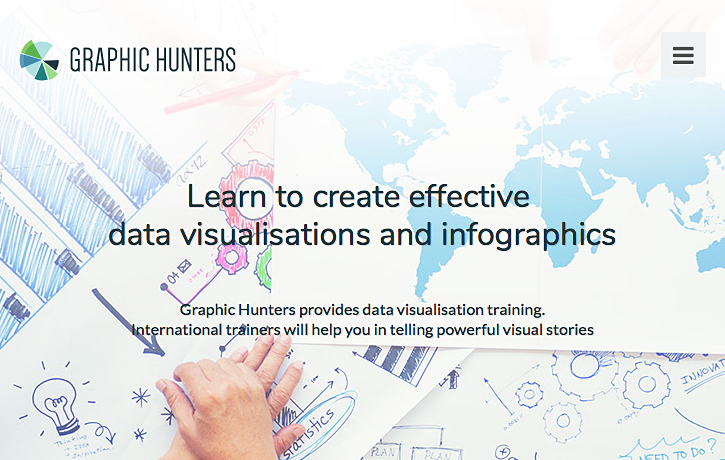
Freelancing Bootcamp is one of three workshops we’ll have in January, with the other two focused in Infographics and data visualization: a two-day workshop in NYC on January 22-23, and a one-day worksop in Chicago on January 26.

Register soon to take advantage of the discount, and feel free to contact us with questions at academy@5w-consulting.com or contact@5wgraphics.


Infographics workshop in Amsterdam

We’ll probably have workshops in Taiwan and Singapore before the end of the year, but it’s never too soon to announce the next one in Europe: next February I’ll be again in Amsterdam (Netherlands) teaching a two-day workshop on infographics for print and online. It’s organized by Graphic Hunters, an initiative by Goof van de Winkel that provides training on graphical literacy, infographic storytelling, online data visualization and more in the Netherlands with international trainers.

Here is some additional information on the workshop, which will take place on February 8 and 9, 2018. No previous experience is required. The course is suited to anyone who’s interested in learning how to communicate effectively through data visualization and infographics. It could appeal to graphic designers, editors, communications or marketing professionals, data analysts and/or researchers. It’s a mix of theory and lots of hands-on exercises where we’ll look at some principles of visual storytelling, design, best practices with charts and maps, tools and key concepts in interactive and data visualization, and more.

The class is taught in a beautiful location (Mmousse) in a downtown canal house on one of Amsterdam’s most beautiful canals, around the corner of the central station. The idea is to have a relatively small group. I did a version of the workshop in the same space two years ago (photo below).

Here is a testimonial (translated from Dutch)

The two day workshop Information Graphics For Print and Online was very inspiring and helped us (myself and my colleagues) very much. The organization of the workshop was excellent. In a nice location with a nice working environment and good lunches! The group of students was great. Large enough to have many different angles. And small enough to have a lot of personal interaction. Additionally, it is very nice to get in touch with people with similar interests (dataviz!), but completely different backgrounds. The course leader provided a wealth of experience and knowledge, and offered space to mess as a group with the matter. In addition to the inspiration, we learned to work with different visualization tools and get better visualizations. The extra that the course leader, Juan Velasco, added, were the aspects of dataviz that make it a classic craft. Or even an art form. Rid of all the fancy tools you can use today, and then you come back to the essence again. I recommend it to everyone!”

If you are interested in attending, please contact Goof van de Winkel at info@graphichunters.nl.

Finally, you’ll find a cool note on Graphic Hunters’ website: since they work with trainers from abroad who travel by plane to the Netherlands specifically for the training, CO2 emissions from these trips are compensated by Graphic Hunters by contributing to Trees for All. Great idea!


Catalogs of chart types

The Data Viz Project is a new online catalog of different types of charts created by Ferdio, an infographics studio in Denmark. It’s a useful resource to help decide appropriate types of visualization for any given dataset (another thing is to decide which one will be the most insightful and revealing when you have multiple options). You can view and sort by type, function or shape.

Each type of chart includes a description, a good gallery of real-life examples, and a very simple description of the type of data input needed to create that type of chat, in a table format (what you would input in Excel, for instance).

The Data Viz Project is the latest of many efforts to classify and catalog different ways of visualizing data. Another excellent online resource is the Data Visualization Catalogue, developed by Severino Ribecca, which we often show in our workshops.

Ribecca teamed up with Jon Schwabish in another project to create the Graphic Continuum, a nicely designed poster taxonomy of different types of charts, and how they all relate to each other. You can read more about it here.

The Graphic Continuum

And here is yet another similar effort by Andrew Abela, which shows different possibilities depending on your purpose when showing the data.

Here is one by Anna Vital that is not strictly about charts but is interesting because it looks at visual analogies and metaphors that can help us think of ideas to visualize information.

If you are looking for a truly comprehensive reference guide on different types of visualization with charts and maps, our hands-down favorite is still the book Information Graphics: A Comprehensive Illustrated Reference, by Robert L. Harris. The 450-pages book is a massive reference encyclopedia with hundreds of entries, examples and cross-references about different chart, map and diagram types, as well as statistical and visualization methods. The latest edition is from 2000 but it’s still the “Bible” of reference on visualization.


Workshops and speaking in Beijing, Shanghai and Singapore

Last month I had a great long trip to Asia with some speaking engagements and workshops.

The first destination was Beijing. My friend Ying Wu, Visual Director at People’s Daily Media Innovation (PDMI) and an internationally recognized designer (formerly of the Boston Globe) invited me to speak about infographics and data visualization at People’s Daily headquarters. People’s Daily is the largest newspaper of China, and the official newspaper of the Chinese Communist Party, providing direct information on government policies and viewpoints.

I was struck at how technologically advanced People’s Daily and PDMI are. The new headquarters of People’s Daily in Beijing’s Chaoyang District are one of the most modern newsrooms I’ve had the pleasure to visit. I had a video interview and then a nice talk and conversation with staffers discussing infographics, data, the challenges of their work and where they are headed.

The following day I visited the Communication University of China (CUC), the top journalism school in China. Students there had great interest in news infographics and data journalism, and they asked really good questions.

After Beijing, I traveled to Shanghai to conduct a two-day workshop for DBS Bank staff. We had been working with DBS with similar workshops in Singapore, Hong Kong, Jakarta, and Mumbai before. The idea is to show the value of infographics and data visualization as a tool to bring insight, clarity and communicate complex information and data in a visually engaging and revealing way, both to internal stakeholders and to the general public.

The last stop was in Singapore. We were there once again (9th time, I think) teaching a public workshop on infographics hosted by our friends of Methodology (they also organize the DBS workshops). Methodology develops great education programs, workshops, conference and media about creative ideas and design processes.

The final two days in Singapore I had the opportunity to conduct a workshop on interactive  /mobile infographics for staff working at the different media publications of Singapore Press Holdings (SPH). SPH is the publisher of The Straits Times, Singapore’s largest newspaper (founded in 1845) and clearly one of the best in South East Asia. They do excellent infographics and dataviz both in print and online. It was great to spend time with them as well as with members of Lianhe Zaobao (the flagship Chinese newspaper in Singapore), The Business Times, AsiaOne and other SPH media organizations. The workshop was organized by WAN-IFRA, the World Association of Newspapers and News Publishers


Free data journalism courses in Learno

Here is a very useful quality resource for anyone interested in data journalism, data visualization and journalism on the web. LEARNO.NET is a website with free video courses for media professionals, journalism students and “anyone with a public-interest mission and a journalistic mindset”. LEARNO.NET is an initiative of the European Journalism Centre (EJC), a non-profit foundation dedicated to strengthen journalism by providing tools and resources, including training.

EJC also runs DataDrivenJournalism.net, a hub for news, resources and networking in data journalism.

Many of the available courses are related to data visualization and infographics, with a focus on how to effectively work with data and produce compelling data stories. They range from simple introductions to advanced skills. Instructors are among the very best in their specialties, including Alberto Cairo, Maarten Lambrechts, Simon Rogers and more.

The list of available courses is short but very compelling. Three are very recent:
Cleaning Data in Excel, by Maarten Lambrechts
Data visualization, journalism and the web: mistakes we made so you don’t have to, by Jonathon Berlin
Going viral using using social media analytics, by Stijn Debrouwere

And these are the rest:
Doing journalism with data: first steps, skills and tools, by Paul Bradshaw, Alberto Cairo, Steve Doig, Simon Rogers and Nicolas Kayser-Bril
Charting tools for the newsroom, by Maarten Lambrechts (upcoming)
Verification: the basics, by Craig Silverman and Claire Wardle
Managing data journalism projects, by Jacopo Ottaviani
Google search for journalists, by Nicholas Whitaker
– Bulletproof data journalism, by Stijn Debrouwere

It’s great initiative and we are hoping to see more courses in the near future.


Turning doodles into drawings with Google’s AutoDraw


Many people who get interested in infographics ask us if you can create them without knowing how to draw. Definitely yes! Or at least the vast majority of infographics (data visualizations and charts, maps, timelines, graphics with schematic illustrations, and many others) don’t require strong drawing skills.

Something that is more difficult you would actually think is drawing simple icons or pictograms. They are invaluable to add some visual interest and to summarize categories and groups in tables, text-based designs and different kinds of infographics. They must be simple yet elegant and recognizable.

And speaking about icons here is something interesting from Google’s AI labs. AutoDraw is a web-based tool that turns your quick doodles into nice and elegant pictograms you can use with your designs and infographics. As you start drawing, the application will start matching your doodles to its library of objects, in a similar fashion to the auto-correct feature we are familiar with when we type text. It’s pretty accurate!

Objects can be colored, resized, rotated and moved. At the end, you can download a png file with your drawing or share it with other people.

The app is free and it works on any phone, computer or table. Google calls it “fast drawing for everyone”, and it’s one of their several machine learning experiments. You may chuckle a little at the simplicity of the drawings and yes, the tools is still pretty basic. But it’s not hard to imagine that with the current strong push in artificial intelligence and machine learning in few years we’ll see pretty amazing things in this field. Hopefully AI won’t put us out of business!. You can contribute to the growing collection of AutoDraw drawings here.

Here is video explain AutoDraw:

ArcGIS maps in Illustrator and Photoshop

Design and communication professionals should be really excited about a recent development in mapping: ArcGIS maps for the Adobe Creative Cloud.

GIS (Geographic Information System) software links location information in the form of databases with latitude and longitude coordinates to different types of information: demographic data to census tracts or divisions, election results to states, land use to natural or urban areas, etc. The user decides what layers (which may come from government or private sources) are going to be combined in order to visualize, analyze, and interpret the data to show relationships, patterns, and trends. As I mentioned in a previous post, GIS packages such as ESRI’s ArcGIS are rarely used by designers or news infographics departments as they are expensive, difficult to learn specialized tools normally used by GIS analysts and cartographers. With very, very few exceptions, those designers and graphics editors limit themselves to fairly basic mapping techniques that don’t take advantage of the power of GIS to uncover patterns through spatial analysis of large datasets.

The partnership between ESRI and Adobe offers ArcGIS functions within Adobe Illustrator and Photoshop via an extension or plugin. Designers can access thousands of data-driven map layers inside the Adobe programs as vectors or raster files, and play with colors, layers and styles to customize the maps using the familiar tools of Illustrator and Photoshop.

Creating maps with the extension is fairly straightforward. Without leaving Illustrator and Photoshop you define the area extent, size and scale of the base map, then search for data map layers (street maps, political boundaries, terrain, satellite images, election data, demographic information, economic indicators, environmental, etc), and finally you add/download the map to your Adobe workspace. It’s then already arranged in layers and ready to edit and polish by manipulating colors, appearance and fonts with the usual Illustrator and Photoshop tools.

You can get the beta version here. It has been available for a while, and the first full version is slated for release in the second Quarter of 2017, with no specific date yet (it’s been delayed before). Some of the functions are clunky and/or slow, but it is definitely great news and I can imagine how in few years this may become an essential tool for infographics designers to create and publish advanced data maps. You do require a subscription to ArcGIS Online (pricing info here) to be able to sign in but there is a trial version available.

Here is an introduction showing the capabilities of the plugin and how it works, and a longer, more recent video with added detail:

All images by ESRI


Workshop for New York Life MainStay Investments

We were in New York last week doing a corporate workshop for New York Life MainStay Investments. The investment management company is part of New York Life, the largest mutual life insurance company in the United States, and one of the largest insurers in the world.

As with other clients we work with, New York Life MainStay Investments produces large amounts of complex information that needs to be communicated with efficiency, precision and an attractive design. They market securities and different financial instruments and meed to provide advisors and clients with reliable information about performance, risks and how different investments compare to others though a variety of brochures, factsheets, fund “snapshots”, online dashboards, PowerPoint presentations and so on.

In the two-day workshop we discussed the difference between insightful charts that help clarify information and the decorative presentations that add little value and are commonplace everywhere; content and visual choices, alternative approaches to telling stories visually, overall design issues, achieving style consistency across an organization’s output of charts and graphics, and more. We typically mix presentations with hand-on exercises that emphasize hand sketching, and also introduce participants to the creation of online data visualizations with Tableau.

For information on our corporate workshops, reach us at contact@5wgraphics.com.

New York Life Mainstay Investments is located in Jersey City in an iconic building right across Manhattan:

The views of the Hudson River and the Manhattan skyline are stunning!

Workshops in Singapore and Mumbai

Just a few days ago we came back from another good trip teaching workshops in Asia. We spent the first week in Singapore, our “base” in Asia since we have been there so many times. We keep good clients and friends in the city-state.

The first workshop was the public course we hold every few months in Singapore: The Power of Infographics, hosted by our friends at Methodology. The two-day workshop is a broad overview of the concepts and techniques behind infographics and data visualization, with plenty of hands-on sketching and exercises (including the creation of some online interactives with Tableau). The workshop attendees are public servants from different branches of government, as well as designers, students and educators.

The next two workshops were private two-day courses for one of the largest banks in Asia. We did the first one in Singapore and the second one in their offices in Mumbai, India. They have previously invited us to Jakarta and Kong Kong as well.

Large organizations have to deal with massive amounts of data, written reports and presentations, for internal communications or for public outreach. There is a growing interest in learning about how infographics can help find insight and reveal the key messages in a visual and more effective way.

To know more about our workshops visit our website or send us an email to contact@5wgraphics.com

By the way, we found a nice surprise while browsing at Kinokuniya, a great bookstore in Singapore: our book “Look Inside” was in the shelves! It’s exciting to see that is well distributed and selling well.

Infographic on billionaires for The New York Times

billionaires_map

How many billionaires there are in the world, and where are they? Where do they fortunes come from, and what are their hobbies? We just published a nice full-page infographic at The New York Times’ Sunday edition answering those and more questions. It’s based on research by Wealth-X, a firm that maintains a regularly updated database of information on the superrich.

By the end of 2015, there were 2,473 people with more than a billion dollars in wealth. If we compare the combined wealth of this select group with that of entire countries (measured by G.D.P as a proxy) they would be only behind the U.S. and China, and ahead of Japan, Germany and all other nations on the world. New York, Hong Kong and Moscow top the list of billionaires by city.

The U.S. has the most billionaires with 585 followed by China with 260. Looking at continents, Europe has the largest number with 806, but Asia (645) is showing the fastest growth.

The main visual in the infographic is an stylized cartogram with the size of countries (shown by squares) representing the number of billionaires in those countries that have at least one.

The are 8.4 billionaire men for each woman. 60 percent of the men’s fortunes are self-made but only 16.5 percent of billionaire women have self-made fortunes.

It was a nice project art directed by Corinne Myller and published on a special section on Wealth on Sunday February 26.

billionaires_print