Our updated Pinterest and Instagram pages

It’s been a while since we last updated our samples online, so we thought this would be a good time to do it. Check out our Pinterest page for a more complete set of samples of our infographics (including recent ones). You’ll also find a few additional boards with other infographics and images we like.

pinterest5w2

pinterest5w

We also have a new account in Instagram (@5winfographics) where we plan to add not only our infographics but other images from our workshops, trips, process, etc.

To complete the roundup of our social media presence, you can follow us on Twitter (@5Winfographics), Facebook and Linkedin

As for our main site, we are planning to update the samples section in the next few weeks as well. If you are looking for news about our infographics / data visualization workshops and training, please visit our 5W Consulting page, or email us: contact@5wgraphics.com.

instagram

Our Infographics and Data Visualization Workshop in Washington D.C. (Dec 1-2)

dc

slideshow-5w-academy-washington

5W Academy is heading to Washington, D.C. soon for our next Infographics and Data visualization workshop in the US. It will be on December 1-2.

We received great feedback from our D.C. workshop back in October 2015. A combination of local and out-of-state participants from government agencies, design studios, NGOs and other organizations got together for two days.

Workshop2

Our previous workshop in Washington, D.C.

The two-day workshop is a comprehensive introduction to the creation of infographics and data visualization. With a mix of theory and practice, the workshop is aimed at professionals and students interested in developing the skills to produce engaging, insightful visual storytelling with their content. No previous experience with infographics or specialized software is required.

We will learn how to gather and prepare data, the Do’s and Dont’s of working with numerical information and charts, and the principles of visual hierarchy, color, typography, illustration, and narrative to create impactful infographics.

Attendees will sketch out infographics, storyboard motion graphics and create / publish their interactive data visualizations and web maps with the help of Tableau Public. The class will discuss award-winning projects and offer an overview of tools and strategies for creating infographics and data visualization.

Infographics are a universal language. Our most recent workshops in NYC (March), Amsterdam (June, hosted by Graphic Hunters) and Singapore (July, hosted by our friends at Methodology) were great experiences and it seems the demand keeps increasing.

Workshop n Amsterdam, June 2016

Workshop n Amsterdam, June 2016

Workshop in Singapore, July 2016

Workshop in Singapore, July 2016

Learn more about the instructors and schedule in our page or register directly here. We hope we’ll see you soon in DC!

The incredible map collection of David Rumsey

drumsey4

A map of the wondrous Isle of Manhattan, by Charles Vernon Farrow. 1926

Here is one of our favorite resources, a site you could browse for hours at a time and always discover something amazing. Over several decades, David Rumsey has patiently amassed the most impressive private collection of maps in the world, with around 150,000 historical maps and cartographic artifacts. The former real estate developer and investor, retired at the age of 50, has a passion for cartography and believes in making his collection available to the public as a free resource. He created a website, the David Rumsey Map Collection, that houses over 71,000 maps and images online (a bit less than half his collection). It’s an incredible resource (Click on any of the images in this post for a larger view).

Universale Descrittione Di Tutta la Terra Conosciuta Fin Qui, by Donato Bertelli. 1568

Universale Descrittione Di Tutta la Terra Conosciuta Fin Qui, by Donato Bertelli. 1568

drumsey2

Novissima, et Accuratissima Leoni Belgici. 1611. Claes Janszoon Visscher.

drumsey5

360 panorama from the summit of Gross Inselsberg peak, Germany. By Paul Ahrens. 1860.

San Francisco, the Exposition City, by the North American Press Association. 1912

San Francisco, the Exposition City, by the North American Press Association. 1912

drumsey7

Map of New York City for the Herald Square Hotel, by Richard Edes Harrison. 1932

drumsey1

Feltrino and Bellunese, by Heinrich Caesar Berann. 1936

The Collection covers cartography from rare 16th century maps to present. In addition to classic maps, it includes thousands of pictorial maps and other types of images including some charts and diagrams. For example, you can find over 100 beautiful timelines, ranging in date from 1770 to 1967.

drumsey3

The Histomap of Evolution, by John B. Sparks. 1942

Viewers have access to high resolution images of maps that are extensively cataloged, and free to use for non-commercial purposes (and for commercial use, typically is enough to email them, most files are in the public domain anyway). The site also has a tool for georeferencing (correlating points in different maps, which is useful to compare and even overlay old maps that were not standardized or entirely correct with new maps).

To digitize and display the maps at high resolution, Rumsey developed a new company, Luna Imaging. The company’s software, which offered a new way to display large images, is still used by libraries and museums around the world today.

Rumsey donated his entire physical and digital map collections to Standford University in 2009. Last April the David Rumsey Map Center opened at Stanford in the Bing Wing of the Green Library. The online library at www.davidrumsey.com continues to operate in parallel to and integrated with the resources available at the Stanford Rumsey Map Center.
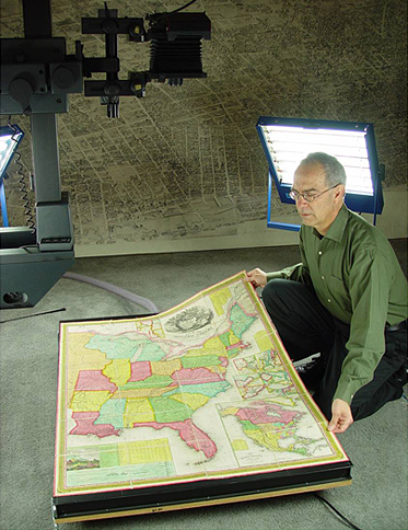
david

David Rumsey

(All images from the David Rumsey Map Collection, www.davidrumsey.com)


Star Wars Episode IV: the 400-feet-long infographic

swanh-making-of-1

Sometimes you have to admire the amazing creativity and drive of some designers and infographics artists. You may have seen this amazing infographic around already since it’s been out for a while, but we thought it’s worth mentioning it again. It’s that incredible!

SWANH.NET is an adaptation of Star Wars: Episode IV – A New Hope (the iconic 1977 first movie of the series) as a really, really, really long scrolling infographic. It’s 123 meters long! (4,845 inches or over 400 feet). These images don’t make it justice, make sure to visit the site and scroll through it.

It was created with Adobe Illustrator CC in 2015-16 by Martin Panchaud, a graphic artist and Illustrator based in Zurich. Panchaud didn’t plan to plot the entire movie but once he started he couldn’t help himself, and we are glad. He included every single bit of dialogue and the positions of each character in screen for all the scenes, as well as the entire universe of spacecraft and locations. It took him about 1,000 hours to complete it as a personal project. Impressive work.

swanh-0

swanh-6

swanh-9

swanh-5

swanh-4

Vintage cutaways by Frank Soltesz

We love looking at vintage infographics, in particular cutaways and cross-sections (we are in fact working a book about them, we’ll keep you posted very soon!) One of the gems we have found lately is the work of Frank Soltesz. Born in Pennsylvania in 1912 and active from the 30’s to the 60’s, Soltesz was a versatile commercial illustrator who had a love for large cutaways. He spent part of his career working for the BBD&O advertising company.

Among his best work is a series of 29 advertising cross-sections published between 1947 and 1951 to show how the Armstrong Cork Co. company’s products were utilized. We show some of them here. These illustrations appeared in the Saturday Evening Post and show lavishly detailed images of buildings and factories with their walls partially removed. The more you look at the scenes and the tiny human figures as they move about, the more engaging they become. Each illustration has an inset with the key. They had a drawn frame and title and readers could request 21 by 22 inch copy suitable for framing or even a free booklet with some of the illustrations.

soltesz3b

soltesz4 soltesz6 soltesz8 soltesz9 soltesz7

There is remarkable lack of biographical detail about Soltesz. He was a member of the American Watercolor Society as late as 1981. In addition to his commercial work for Armstrong Cork Co., Soltesz worked with accounts of other companies such as TWA (an example below), General Electric, General Motors, Goodyear Tire and Rubber, etc.  Apart from the Saturday Evening Post, his work appeared in many of the great periodicals of his time like Life, Colliers, Esquire, Sports Illustrated, Forbes, Fortune, Time, Business Week, U.S. News and World Report.

soltesz16

The Ultimate Book on Bread

110 Hydration Crumb2.jpg

A few years ago we had the honor to participate in the making of the most beautiful cook book ever made. It was called Modernist Cuisine: The Art and Science of Cooking, by Nathan Myhrvold, Chris Young and Maxime Biletand. It consist of 2,430 pages divided into five massive volumes that weigh a total of 43 pounds (including 4 pounds of ink). It includes thousands of gorgeous photographs, and 36 of them are annotated cutaways. The authors actually cut through pans, barbecues, ovens and pressure cookers (just to name a few) and photograph them beautifully. We helped make the photographs into annotated infographics.

Toaster Cutaway2.jpg

Now Nathan Myhrvold is doing it again. A new book, titled Modernist Bread: The Art and Science will hit the bookstores in March 2017, and will include some of our graphics. Four years in the making, the company’s website cites some impressive stats:

“The culinary team has developed more than 1,200 recipes from around the world that are both traditional and avant-garde. At over a million words so far, Modernist Bread will total over 2,000 pages and feature more than 3,000 new photos”.

It will be, we think, the definitive book about bread.

Superbad Infographics

It is a nice late-summer morning. You wake up, make yourself a nice cup of coffee, sit down at your computer (or lay down with your iPad), and navigate to your usual news outlets to see what’s new with the world today. Then you see it, just there, staring right back at you, the cup of coffee stopped in mid-air in its trajectory to your lips: an infographic so massively bad, so wrong, so ignorant of the most elementary principles of information design, it defies your sense or reality.

It is amazing how in some organizations and newsrooms the idea is still alive that anyone that can more or less use a drawing program on a computer can do an infographic, despite a complete lack of training and experience in the field. The results, often ignoring even the most fundamental principles, are sometimes unintendedly funny.

In our workshops we show a few superbad graphics in order to illustrate some basic principles (the lack of). We thought it would be interesting to show here some of them, perhaps as a public service, in the hope we will be able in the future of having our morning coffee in peace, free of disturbing infographical surprises.

Enjoy!

iPhone math blackhole:Screen Shot 2016-08-29 at 9.35.53 AM.png

Wait, what?:US.jpg

The infinity pie:DNR-StatewideByCounty copy.jpg

This is not going to end well:Screen Shot 2016-08-29 at 11.00.06 AM.png

I think I am going blind:nytznn0asixruen3v2p8.jpg

Nice (insane) metaphor:rbm9porvnyd6wtsen23l.png

Obviously:Screen Shot 2016-08-29 at 11.40.34 AM.png

Agreed:Screen Shot 2016-08-29 at 9.36.23 AM.png

Even the Masters:20080406_METRICS_SUB_GRAPHI.jpg

These are just a few random examples. There are so many bad infographics out there a simple Google search produce thousands of them. Here and here are other compilations of horrible infographics you may enjoy.


We are going to Las Vegas!

Historic Las Vegas sign with retro tone

That’s right: following the success of previous workshops in Washington, D.C. and New York City, we are pleased to announce two new 5w ACADEMY workshops in Las Vegas!

Our first two-day workshop is a comprehensive introduction to the creation of infographics and data visualization. With a mix of theory and practice, the workshop is aimed at professionals and students interested in developing the skills to produce engaging, insightful visual storytelling with their content.

Our second workshop is an introduction to the creation of interactive data visualizations with Tableau. This workshop is aimed to anyone that wants to explore and learn the possibilities of this amazing software, and no previous experience with Tableau is necessary.

Finally, we are offering a great discount for those who take BOTH workshops. And don’t miss the early bird discount! It is valid until May 31st.

See you in las Vegas!


New workshops in NYC and Singapore

NYC_Singapore

5W Academy is heading to NYC for our next Infographics and Data visualization workshop in the US. It will be on March 24-25.

We received great feedback from our Washington, D.C. workshop back in October. A combination of local and out-of-state participants from government agencies, design studios, NGOs and other organizations got together for two days.

This two-day workshop is a comprehensive introduction to the creation of infographics and data visualization. With a mix of theory and practice, the workshop is aimed at professionals and students interested in developing the skills to produce engaging, insightful visual storytelling with their content.

We will learn how to gather and prepare data, the Do’s and Dont’s of working with numerical information and charts, and the principles of visual hierarchy, color, typography, illustration, and narrative to create impactful infographics.

5W_Academy copy

Attendees will sketch out infographics, storyboard motion graphics and create / publish their interactive data visualizations and web maps with the help of Tableau Public. The class will discuss award-winning projects and offer an overview of tools and strategies for creating infographics and data visualization.

At the same time, we are keeping busy in Asia. We’ll be back in Singapore on February 18-19 for “The Power of Infographics 4”, the fourth edition of a workshop that has proven really popular. The workshop is organized by Methodology and partnership with German leading art/design book publisher Gestalten.

Also in Singapore, we were invited to do back-to-back workshops on March 8-9, March 10-11 and possibly also March 14-15. The organizer is Maitre Allianz, a leading training services company.

5W in South Korea

Bongeunsa Temple in Seoul, Korea.

We arrived in Seoul on Monday. It’s 5W’s seventh trip to Asia in the last year, but our first time in South Korea. The Government has invited us to participate as one of a small handful of foreign companies to participate in the Korea Design Businees Fair, one of the largest design events in Asia. It includes several hundred exhibitors, and also features the winners of the Red Dot Design Awards, Design Excellence Awards, and Good Design Awards, among others. It’s open to both the general public and product design buyers (largely from China, Korea and Japan).

The Fair is mostly dedicated to industrial and product design, but this year the organization was interested in bringing in a firm specialized in information design. Its a great opportunity to witness the design boom in Korea, a highly developed market with a tech-savvy public and an interest in quality design products. Korea is quickly changing from follower to trend-setter in the design world, finding and showcasing its unique sensibility. We are looking forward to seeing and learning more.

FullSizeRender 2

IMG_5344