The infographics of Times of Oman

Nizwa Fort (English)

A few years ago, anyone interested in news infographics started to notice the work of a newspaper doing really smart and creative infographics. And it came from the unlikeliest of places: the Sultanate of Oman, an Arab country on the southeastern coast of the Arabian Peninsula. The Times of Oman (in English) and its sister publication Al Shabiba (in Arabic) have been winning every important award in the field for years. Led by Design Director Adonis Durado and Graphics Director Antonio Farach, they have assembled a multinational and multitalented team that is is comfortable mixing data visualization, superb hand-made and digital illustrations and a unique mastery of graphic design.

dresses

37@19347_TOO_15-12-2013_p08-p09(1).indd

Beekeeping (English) 51@114823_Sup_20-11-2016_p06-p07(3).indd 51@114823_Sup_20-11-2016_p06-p07(3).indd 51@114819_Sup_20-11-2016_p02-p03(1).indd 1523520_645431735497860_1061389252_o 8d899e25882035-5634c391b516d Untitled-4

Their original thinking gives fruits like the three-dimensional World Cup Dataviz Ball published ahead of the last World Cup. Here is a great explanation of the process to create it by Antonio Farach.

3d-world-cup-dataviz-ball-inner-ball-4

128-pages-1-2

As of late 2014, the team included three illustrator-designers (Winie Ariany, Lucille Umali and Isidore Vic. Carloman), one graphic designer (Sreemanikandan Satheendranathan), and two graphic editors (Antonio Farach and Marcelo Duhalde).

The New Tableau 10

exoplanets

Our Infographics and Data Visualization workshops always include spending a few hours using the free Tableau Public software to create interactive data visualizations with charts and maps on the web. Tableau is a great first step for those interested in data visualization online since it’s fairly easy to learn. The newest version (Tableau 10) was released three months ago and has really nice improvements including a long overdue addition of device responsiveness to visualize data across multiple devices.

We use Tableau during the workshop because it doesn’t require the coding skills necessary to use sophisticated tools such as D3.js, the tool behind many of those amazing interactives of The New York Times and others (although today you can code a nice data visualization in R, for example, with just a few lines of code). Tableau is a great exploratory tool that lets you quickly evaluate different options to visualize you data. We actually use it for print graphics as well after saving files as PDFs.

Tableau is a powerful tool but also a great way of starting to think about key concepts in interactivity: about how to use filters, buttons, navigation tool tips or exploratory dashboards to let readers dive deep in your content. It’s used by thousands of corporations as a Business Intelligence/Analytics tool to visualize their data. The free version is a useful tool for individuals and organizations interested in making data public (remember that with Tableau Public you can’t save files locally, they are all saved to Tableau server and available for anyone to see and to download, including the datasets used. You may prefer the Tableau Desktop version but it’s not cheap).

Some of the new features in Tableau 10 include:

  • Device responsiveness. You can now generate visualizations optimized for desktop, tablet, and mobile phones. Although far from perfect, it’s a big step forward in Tableau.
  • Ability to connect to data stored in Google Sheets. You can set to your visualization to refresh automatically every day, if the underlying data in your Google Sheets file changes.
  • A “highlighter” feature gives users added possibilities to sort, find and highlight specific data for ad hoc views and comparisons.
  • Cross-database joins: you can join different data sources within the program.
  • Custom Territories: Create custom areas in maps using the data built into the geocoding database.
  • And finally, a cleaner interface with new iconography, fonts and colors, sporting a cleaner, less cluttered look that I find much nicer.

In addition, the just released Tableau 10.1 includes:

  • JSON support. JSON is common file format for web based data, widely used for API-returned data. This means you can download web-based JSON files and start to visualize them right away.
  • Automatic clustering is very interesting. Tableau helps identifying interesting patterns from the data by automatically generating clusters based of the groupings/categories specified by the user.
clusterinvestigate

Clustering feature. GIF from Tableau Public website

Tableau’s website include great learning resources. If you are looking for a good book to learn it, here is the one I found most useful.

Crime in Milwaukee 3


The 800-year-old Cutaway Graphics of Ismail Al-Jazari

Al-Jazari2.jpg
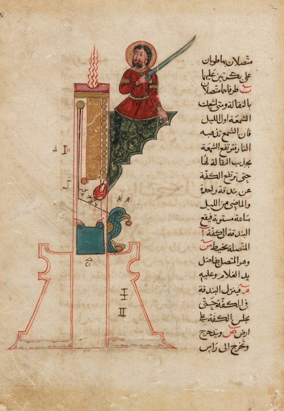
Al-Jazari’s automaton musical band

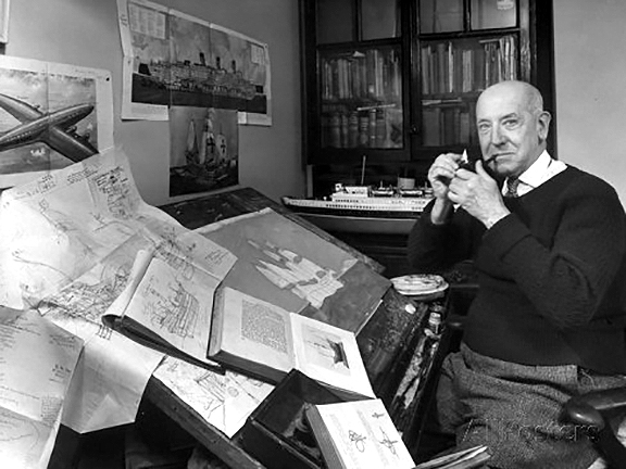
In the introduction to LOOK INSIDE we mention the mechanical engineer, artist, inventor, mathematician, artisan and scholar Ismail Al-Jazari (1136-1206) as the first person in history to make extensive use of cutaways with the clear intention of revealing how something works. In the book we mentioned him briefly, and did not have the chance to show any of his illustrations. We will do so here.

Badīʿ az-Zaman Abū l-ʿIzz Ismāʿīl ibn ar-Razāz al-Jazarī (Ismail Al-Jazari for short) lived in what is today Turkey. Very little is known about his life beyond the fact that he belonged to a family of artisans and engineers, and that he served as the chief engineer for the local ruler, just as his father did before him. His fame rests mostly in a book he wrote and illustrated in 1206 titled “Book of Knowledge of Ingenious Mechanical Devices”. In this book Al-Jazari describes many machines, often of his own invention, with instructions on how to built them. More than an engineer in the modern sense he was a mechanical artisan that assembled his machines by trial and error, rather than by mathematical calculation.

Al-jazari6_elephant_clock.pngElephant clock

 Al-jazari5_water_device.jpg
Hydropowered perpetual flute

Al-Jazari8.jpg
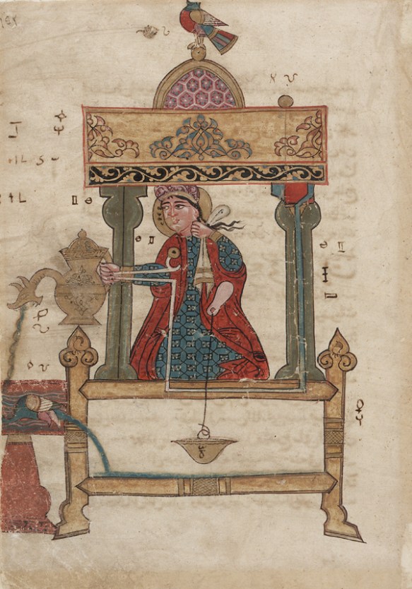
Mechanical peacock fountain

The machines described in his books include several automata, such as drink-serving waitress, a hand-washing servant, and a musical robot band, and many types of clocks and several pumps and water-rising mechanisms. In his book Al-Jazari cites the previous authors that have inspired several of his machines, and how he improved them. Many of the machines though are original inventions than employ novel techniques and mechanisms.

Al-Jazari4_A_Candle_Clock.jpg
Candle clock

Al-Jazar7i_-_The_Basin.jpg
Hydraulic mechanism

Al-Jazari1.jpg
Water-serving automaton

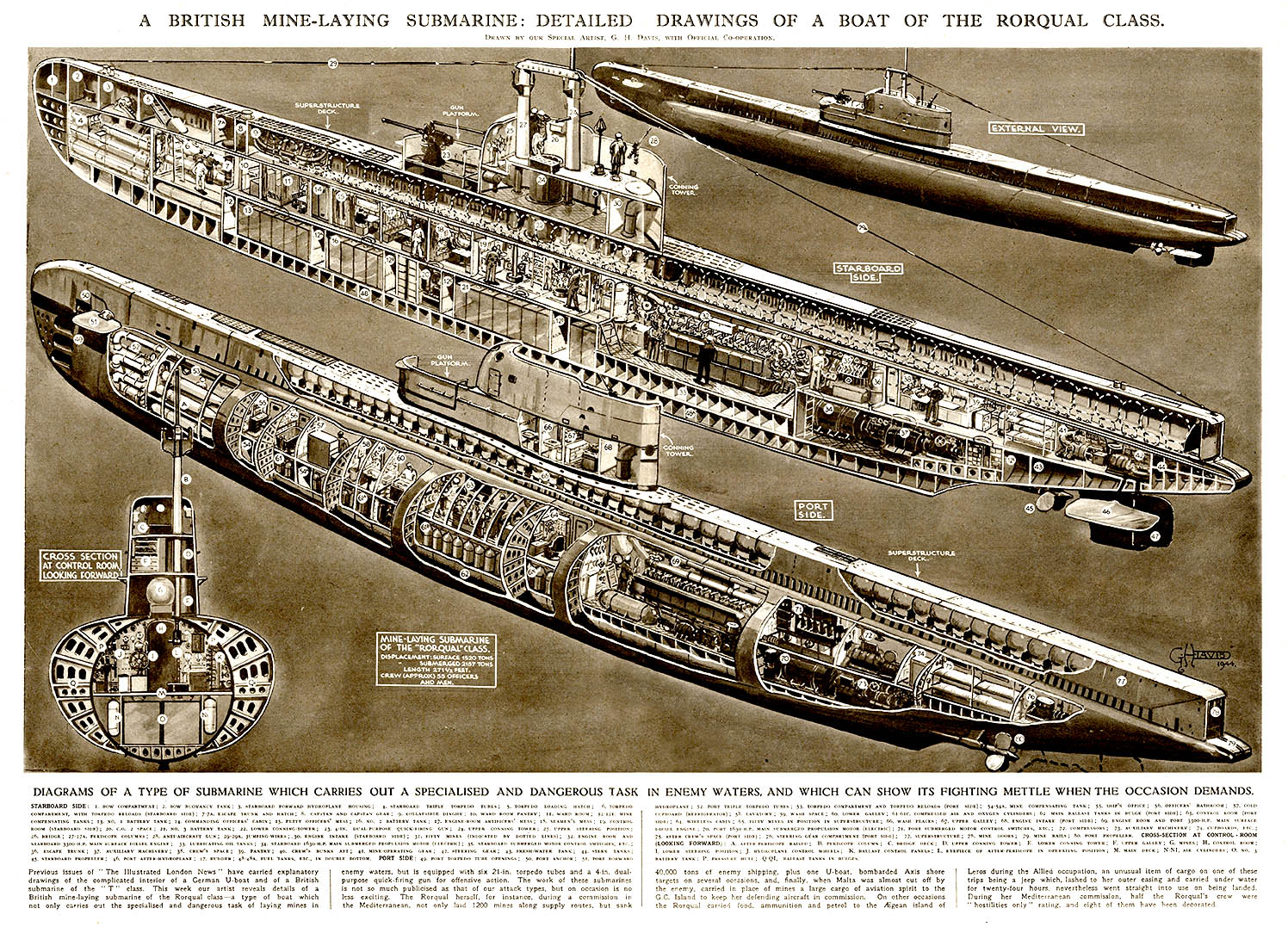
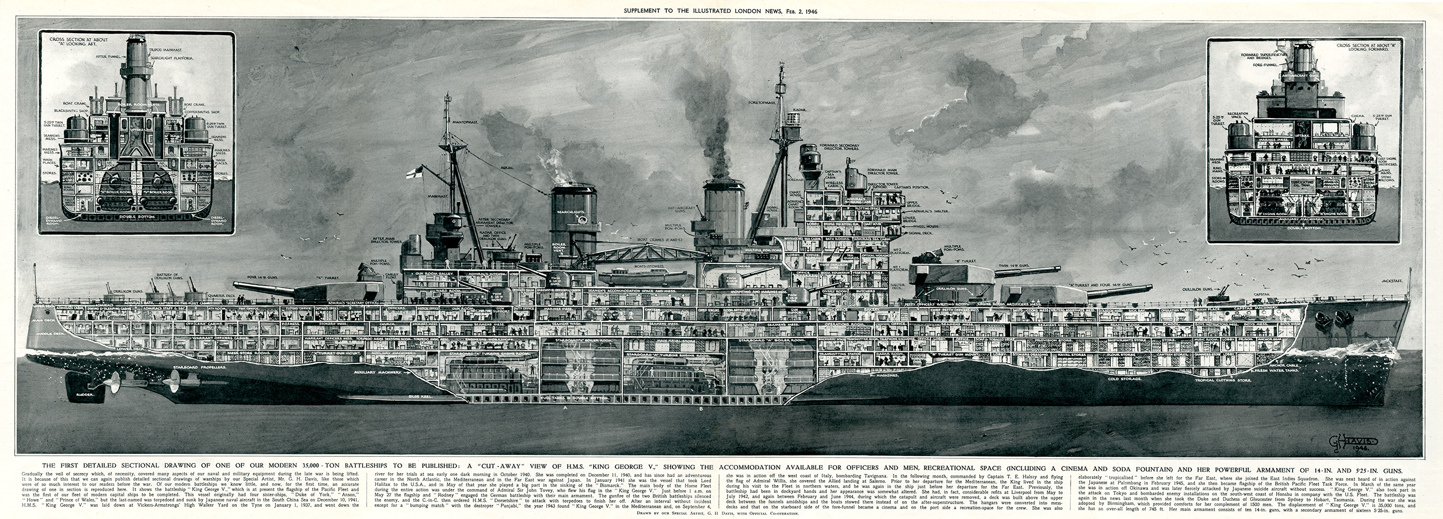
Most importantly for us, wonderful cutaway drawings in color illustrate the functioning for most of the machines. The precise and beautiful diagrams look remarkably modern, and are drawn in a clean lineal style, and include labels indicating the name for each part of the mechanism.

There are many good articles online about Ismail Al-Jazari. This one include extensive references and is a great place to start if you want to lean more about this medieval genius.


lookinside_side_rgb SMALL.jpg
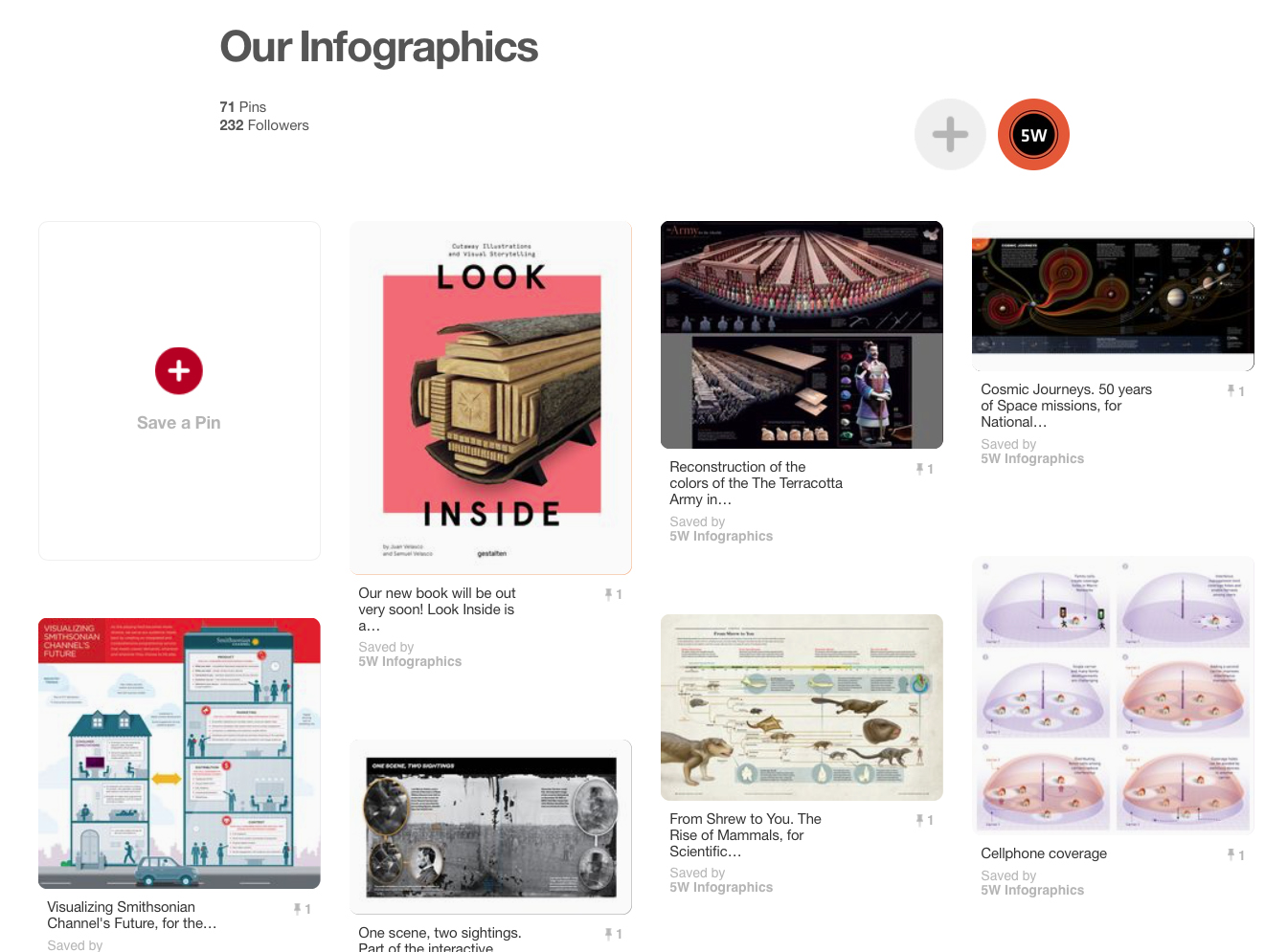
Our new book about cutaways, LOOK INSIDE: Cutaway Illustrations and Visual Storytelling is a showcase of the best, most beautiful and fascinating cutaway illustrations ever created, from historical times to now. Cutaways, exploded views, and cross sections, are explored across a wide range of applications and disciplines. Architectural renderings, anatomical illustrations, machine diagrams, and even fantasy illustrations are just a few of the various subjects presents in this compilation.

LOOK INSIDE is published by Gestalten and will be released in the U.S. in November 21st. It can be preorder in Amazon, or, if you are in Europe, can be ordered at the Gestalten online store.

G.H. Davis: a Master of the Cutaway

G.H. Dvis.jpg

In our new book LOOK INSIDE, dedicated to cutaway infographics, there are only two examples (due to space constrains) of the work of one of the most prolific cutaway artists of all time, and perhaps the first to concentrate most of his efforts in this particular kind of explanation graphics: George Horace Davis. Regrettably, he is almost completely forgotten today, and we feel he deserves to be better known.

G.H. Davis was born in London in 1881. He received a formal art education and was already working as a freelance artist before World War I. He served on the Royal Air Force putting his talent to good use creating aerial diagrams for pilot training. After the war he continued his career as a freelance artist specialized on military subjects, and in 1923 he started his 40-year collaboration with the Illustrated London News. By his own estimate he created more than 2,500 pages of illustrations over a 40-year span, many of them consisting of very detailed technical cutaways of military planes, ships, submarines, and tanks.

image-1

image-5

A British mine-laying submarine: detailed drawings of a boat of the Rorqual Class, in use during the Second World War. It carried out a specialised and dangerous task in enemy waters. Date: 1944

A British mine-laying submarine: detailed drawings of a boat of the Rorqual Class, in use during the Second World War. It carried out a specialised and dangerous task in enemy waters. Date: 1944

Most of his illustrations for ILN are black and white paintings, occupying  a full-page or a spread, and sometimes a four-page gatefold. During World War II he created hundreds of paintings revealing the inner workings of about every single plane, ship and tank used by both sides during the conflict.

Besides his work in ILN he collaborated with other British magazines such as Flight and Modern Wonders. In the U.S. Popular Mechanics published his work regularly. He died at age 82 in 1963, and many of his original pieces are preserved in the Imperial War Museum, in London.

image-4

A British mine-laying submarine: detailed drawings of a boat of the Rorqual Class, in use during the Second World War. It carried out a specialised and dangerous task in enemy waters. Date: 1944

A British mine-laying submarine: detailed drawings of a boat of the Rorqual Class, in use during the Second World War. It carried out a specialised and dangerous task in enemy waters. Date: 1944

There is not a lot of information about Davis online. There are good articles about him  here and here. For those interested, It is still possible to find original copies of his illustrations for ILN in Ebay.

LOOK INSIDE will be released this month in the U.S. In Europe it can be ordered already on Gestalten, and in the U.S. can be preordered in Amazon.

The Cutaway Illustrations of Fred Freeman

Collier 3.22.1952-p.30-31-Space Station.jpg
During the two-year research
for our book LOOK INSIDE we discovered many amazing illustrations and artists that, for one reason or another, did not make it into the final version of the book. It would be a pity to leave these forgotten on a drawer, so during the next few weeks we will present here some of these masters of the cutaway.

A while ago we wrote here about Frank Soltesz, an American illustrator active from the 30’s to the 60’s, and author of a marvelous series of architectural cutaways appeared in the Saturday Evening Post. Today we want to pay homage to another artist of the same epoch: Fred Freeman.

Fred Freeman started his career in the 30’s. By this time cutaway illustrations were becoming a tool that popular magazine would often use to covey to their readers detailed information about technical topics. Commercial illustrator were often asked to produce cross-sections and cutaways for various publications, sometimes with striking results.

collier-3-7-1953-p61-training-simulated-space-station-copy

Collier 3.14.1953-Cover-Emergency in space travel.jpg

Fred Freeman was an accomplished American illustrator who designed and illustrated books on naval history, space exploration and other technical subjects. What impressed us most during our research was the wonderful series of cutaway illustrations he created for Collier’s magazine between 1952 and 1954, all of them for the series “Man Will Conquer Space Soon”. The spectacular, full color, spread or full-page illustrations depict in stunning detail cutaways of space stations, spacecraft, space emergency devices, and other aspects of the future of space exploration. The images illustrate the ideas of the then director of the Marshall Space Flight Center, at NASA, Wernher von Braun, a space travel visionary who was already insisting by then on a manned mission to Mars.

It is surprising and disappointing how little information is out there about such a wonderful artist as Fred Freeman. Please let us know if you have any more information about him and we will publish it as an update here.

Collier 3.14.1953-p.43-Emergency in space travel.jpg

Collier 10.18.1952-p57-Spaceship for he Moon-2.jpg

Collier 6.27.1953-p.35-Monkeys in Space.jpg.jpg

Collier 3.7.1953-p62-Training simulated space station.jpg


Our book LOOK INSIDE in Wired.com

Screen Shot 2016-10-18 at 10.02.41 AM.png©Nick Kaloterakis / Collected


Margaret Rhodes has written a great review of our book LOOK INSIDE at Wired.com, and we can’t be more pleased with it. The article, titled LOOK INSIDE: A SPECTACULAR COLLECTION OF CUTAWAY INFOGRAPHICS, includes a nice gallery of images from the book.

Margaret called us a few days ago and we talked a few minutes about the book:

“From the beginning the idea was to make not only a collection of scientific infographics, but show the whole range of how different artists are using these types of illustrations,” says designer Juan Velasco, who curated the book with his brother, Samuel. (The two also co-founded information design studio 5W Infographics.) Together, the pair began collecting visualizations for the book two years ago, after realizing no such compilation existed.

The result is an exquisite assortment of cross sectional, transparent, and exploded-view cutaways that crisscrosses both history and subject matter. The book traces the earliest evidence of the genre to the Arnhem Land region in northern Australia. There, 28,000 years ago, Aboriginal inhabitants painted diagrams of humans and animals on cave walls, deconstructing their subjects into bones, organs, and muscles. “They are most certainly the first cutaway illustrations ever created,” the Velascos write.

BOOK IMAGE.jpg©Gestalten


Screen Shot 2016-10-18 at 9.41.31 AM.png©Nychos


Screen Shot 2016-10-18 at 9.42.01 AM.png©National Geographic


LOOK INSIDE  is ready to ship in Europe in the Gestalten’s website. It will be available in the U.S. in November 21 and can be preordered already in Amazon.com.

Thanks Margaret!

Our updated Pinterest and Instagram pages

It’s been a while since we last updated our samples online, so we thought this would be a good time to do it. Check out our Pinterest page for a more complete set of samples of our infographics (including recent ones). You’ll also find a few additional boards with other infographics and images we like.

pinterest5w2

pinterest5w

We also have a new account in Instagram (@5winfographics) where we plan to add not only our infographics but other images from our workshops, trips, process, etc.

To complete the roundup of our social media presence, you can follow us on Twitter (@5Winfographics), Facebook and Linkedin

As for our main site, we are planning to update the samples section in the next few weeks as well. If you are looking for news about our infographics / data visualization workshops and training, please visit our 5W Consulting page, or email us: contact@5wgraphics.com.

instagram

Our new book: “LOOK INSIDE” coming out this month


Cover.jpg

Two years ago, we had the idea of putting together a book about cutaway illustrations, one of our favorite kind of infographics. It would be a showcase of the best, most beautiful and fascinating cutaway illustrations ever created, from historical times to now. It would include not only cutaways, but also cross sections, and exploded views. We pitched the idea to Gestalten, a leading international publisher of graphic books in Germany. We had contributed with a few infographics to some of their books before, and we thought they may be interested. They loved the idea!. We have been working together with Gestalten for the last two years putting together this book. Its title is “LOOK INSIDE: Cutaway Illustrations and Visual Storytelling“, and we are proud to announce it will be released this month in Europe, and in November in the U.S. It is, we believe, the first of its kind, showcasing exclusively cutaways, cross sections and exploded views.

lookinside4Cross Section of the SS Bessemer


Lookinside1.pngFender Jaguar, exploded view, by Vladimir Andreev


Lookinside2.png
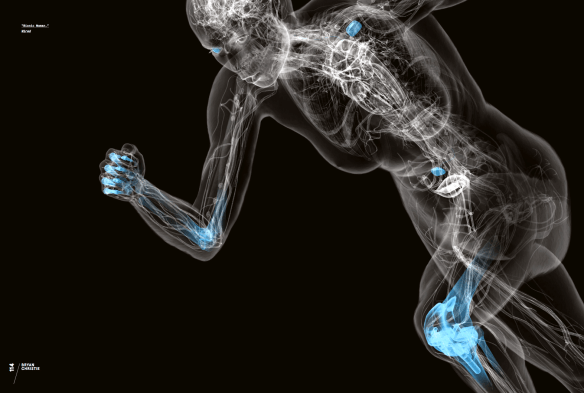
Bionic Woman, by Bryan Christie


Lookinside3.pngFeline Anatomy, by Raymond Biesinger

All images from Look Inside, Copyright Gestalten 2016


Gestalten did a fantastic design job and the book itself looks great. It is a large (9.6 x 13 inches) hardcover volume, 256 pages long, choke-full of gorgeous illustrations, and includes several spectacular gatefolds. As for the contents, the book celebrate cutaways in all their variety and richness, from the renaissance engravings of the mystic-scientist Athanasius Kircher, to today’s 3D, X-Ray-like anatomical views of Bryan Christie. Cutaways, exploded views, and cross sections, are explored across a wide range of applications and disciplines. Architectural renderings, anatomical illustrations, machine diagrams, and even fantasy illustrations are just a few of the various subjects presentes in this compilation.

We are so excited about this! We hope you have as much fun with this book as we had making it. The book will be ready for preorder in a few days in Gestalten’s website.

The fantasy maps of Martin Vargic

Literature 2.png
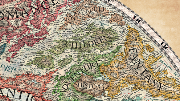
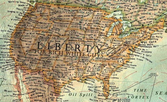
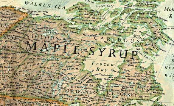
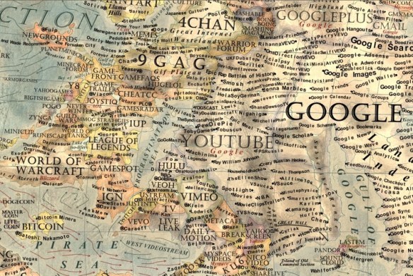
Martin Vargic is an 18-year-old graphic artist from Slovakia that has created some of the most interesting, intricate and beautiful fantasy maps we have seen lately. Martin focuses on cultural and popular issues and represents them as very complex maps, using all the graphical and typographical resources of traditional cartography. The results are as beautiful as they are entertaining. Take for example his Map of Literature. In his website Martin says:

“The Map of Literature is a graphical visualization of how the world’s literature evolved from the ancient era to the present day. Different periods and genres of literature are represented by distinct entities (‘countries’) on the map, that unfold from the centre and show the gradual evolution of the various genres. The map is divided into four distinct continents that symbolize the different literary forms: drama, poetry, prose fiction, and prose nonfiction”.

Literature.pngLiterature 1.png

The amount of data crammed into this map is staggering, and the necessary research very extensive, and yet it took Martin only three weeks to finish it (“however I often worked more than 15 hours a day on it.”).

Equally fascinating are his Map of Stereotypes, his Map of the Internet, and many others. Martin’s website, Halcyon Maps, has a great gallery with all his maps. You can even buy prints there.

From the Map of Stereotypes:Stereotypes2.jpgStereotypes3.png
From the Map of the Internet:Internet2.jpgInternet4.jpg

Martin has published a book with his maps called Vargic’s Miscellany of Curious Maps: Mapping out the Modern World, and he is working on a new book of infographics about astronomy and space exploration.

Randall Munroe’s infographics

Munroe 1.png

Randall Munroe left his job as a NASA roboticist in 2006, proceed to create xkcd.com, and became famous drawing funny and very smart stick figure web comics. He even won the Hugo award for Best Graphic Story in 2014. Very often his comics reveal his scientific background and frequently take the form of witty infographics. These can use humor to take on very serious subjects. Just a few days ago he posted a very interesting infographic on climate change. It is a huge timeline charting Earth’s average temperature for the last 20,000 years. You can scroll for a good while seeing the temperature slowly rising for millennia, and then rocketing up in the last few years.

Thing Explainer.jpg.jpg

Last year Munroe published a wonderful book of infographics called Thing Explainer. It is not your typical “how it works” book. First, all the graphics are done in Munroe’s charming hand-drawn style. Second, he uses only the 1,000 more frequent words in the English language. This is a brilliant idea: the results are often hilarious, and sometimes curiously revealing. A look at the table of contest gives you the tone of the book: “Tiny bags of water you’re made of” (cells); “Sky boat with turning wings” (helicopter); “Lifting room” (elevator); “Bending computer” (laptop); “The pieces everything is made of” (periodic table). Brilliant!