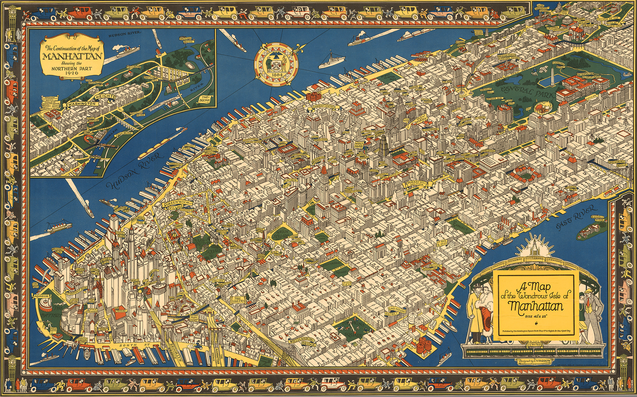
A map of the wondrous Isle of Manhattan, by Charles Vernon Farrow. 1926
Here is one of our favorite resources, a site you could browse for hours at a time and always discover something amazing. Over several decades, David Rumsey has patiently amassed the most impressive private collection of maps in the world, with around 150,000 historical maps and cartographic artifacts. The former real estate developer and investor, retired at the age of 50, has a passion for cartography and believes in making his collection available to the public as a free resource. He created a website, the David Rumsey Map Collection, that houses over 71,000 maps and images online (a bit less than half his collection). It’s an incredible resource (Click on any of the images in this post for a larger view).

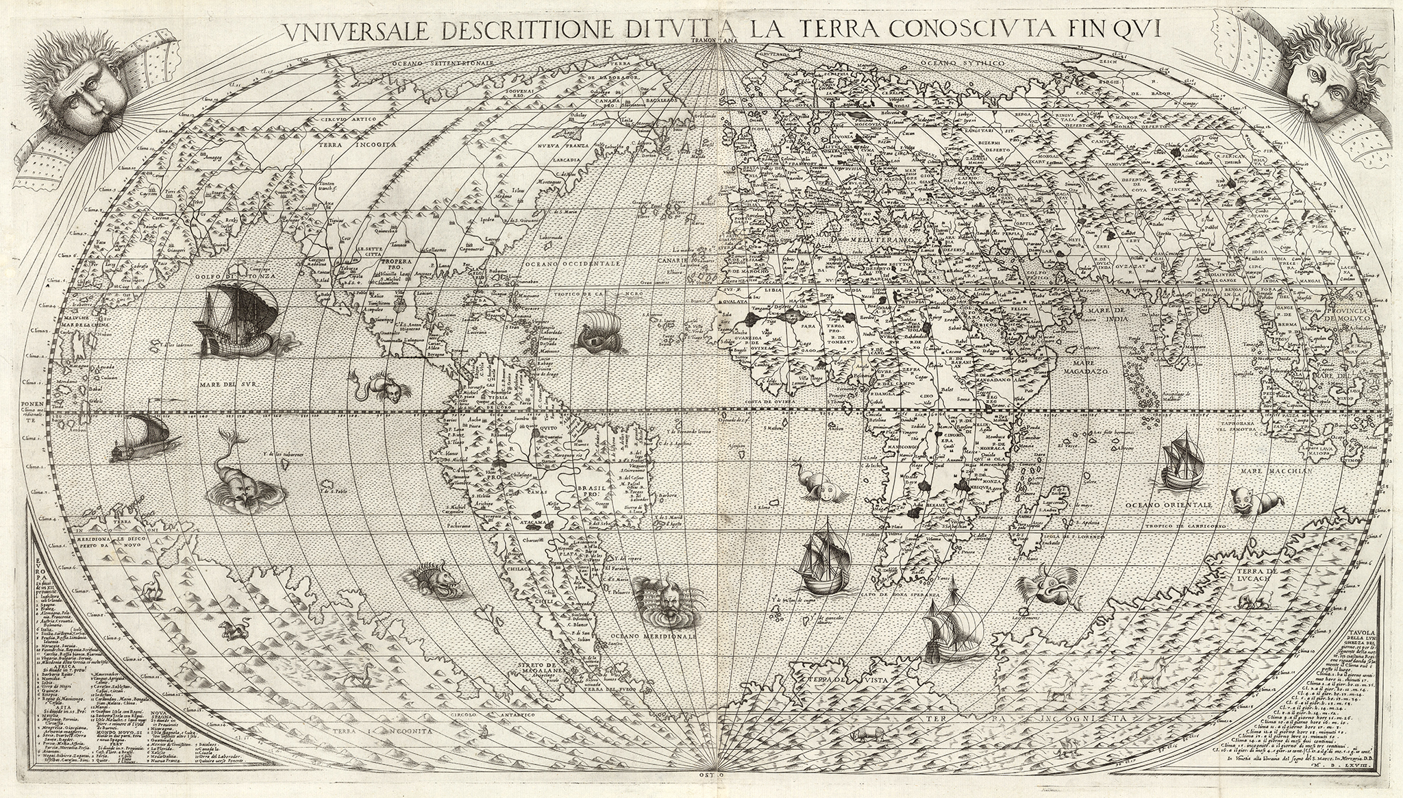
Universale Descrittione Di Tutta la Terra Conosciuta Fin Qui, by Donato Bertelli. 1568

Novissima, et Accuratissima Leoni Belgici. 1611. Claes Janszoon Visscher.

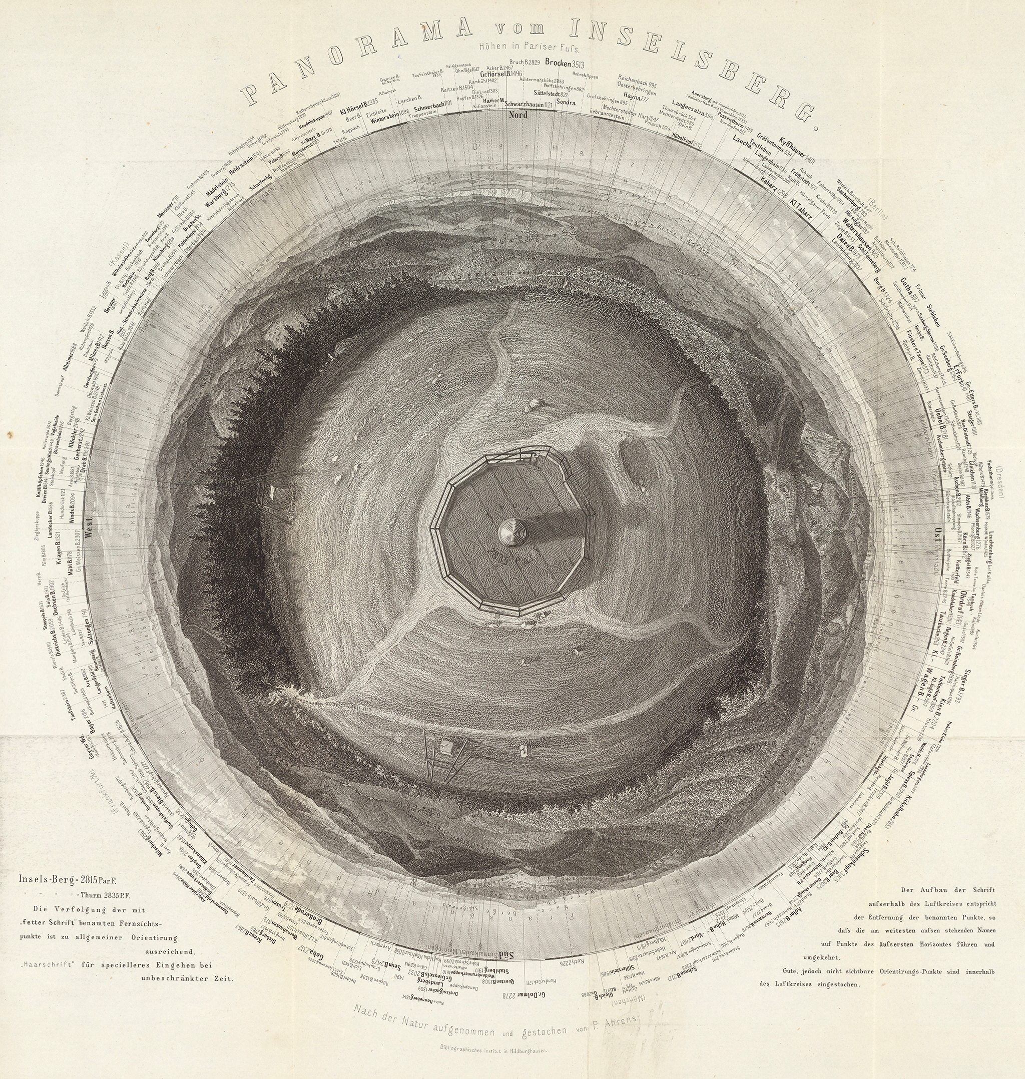
360 panorama from the summit of Gross Inselsberg peak, Germany. By Paul Ahrens. 1860.

San Francisco, the Exposition City, by the North American Press Association. 1912

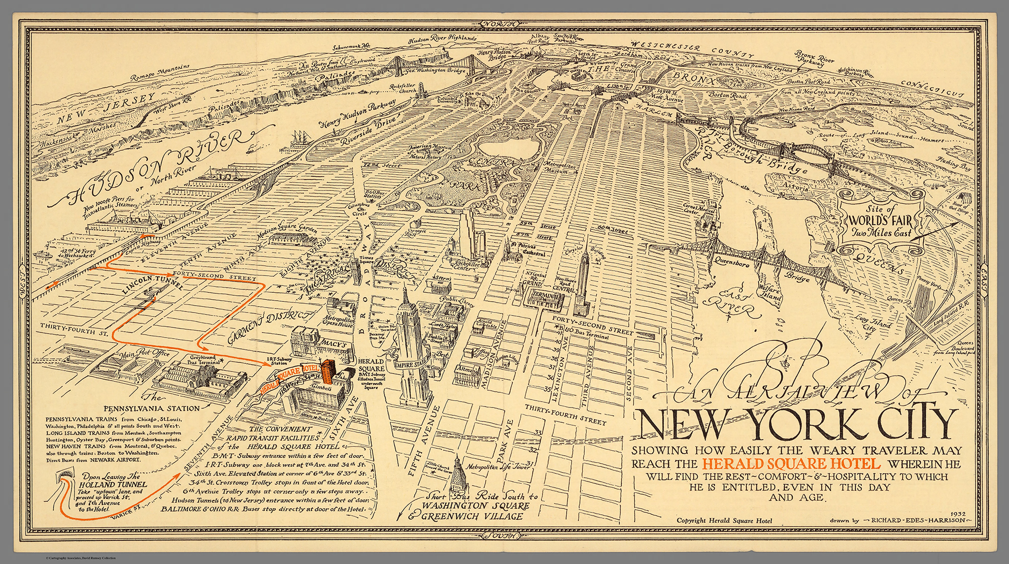
Map of New York City for the Herald Square Hotel, by Richard Edes Harrison. 1932

Feltrino and Bellunese, by Heinrich Caesar Berann. 1936
The Collection covers cartography from rare 16th century maps to present. In addition to classic maps, it includes thousands of pictorial maps and other types of images including some charts and diagrams. For example, you can find over 100 beautiful timelines, ranging in date from 1770 to 1967.

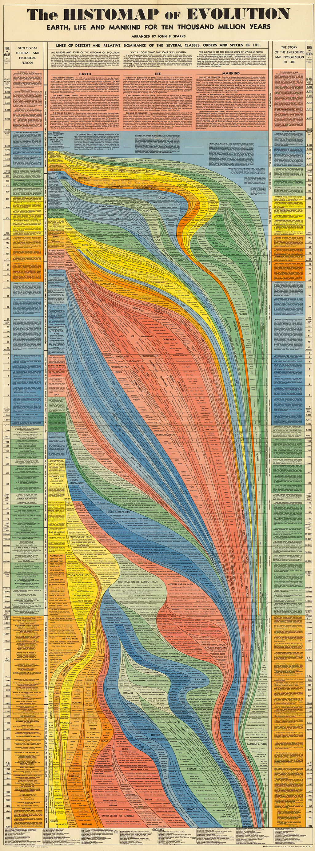
The Histomap of Evolution, by John B. Sparks. 1942
Viewers have access to high resolution images of maps that are extensively cataloged, and free to use for non-commercial purposes (and for commercial use, typically is enough to email them, most files are in the public domain anyway). The site also has a tool for georeferencing (correlating points in different maps, which is useful to compare and even overlay old maps that were not standardized or entirely correct with new maps).
To digitize and display the maps at high resolution, Rumsey developed a new company, Luna Imaging. The company’s software, which offered a new way to display large images, is still used by libraries and museums around the world today.
Rumsey donated his entire physical and digital map collections to Standford University in 2009. Last April the David Rumsey Map Center opened at Stanford in the Bing Wing of the Green Library. The online library at www.davidrumsey.com continues to operate in parallel to and integrated with the resources available at the Stanford Rumsey Map Center.
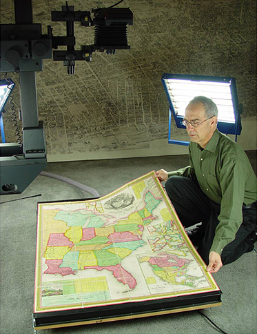
David Rumsey
(All images from the David Rumsey Map Collection, www.davidrumsey.com)


 Cross Section of the SS Bessemer
 Fender Jaguar, exploded view, by Vladimir Andreev
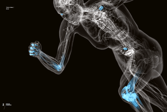 Bionic Woman, by Bryan Christie
 Feline Anatomy, by Raymond Biesinger


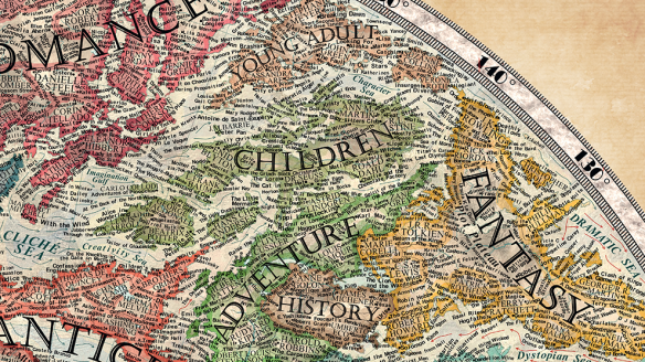
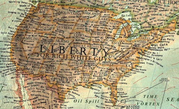
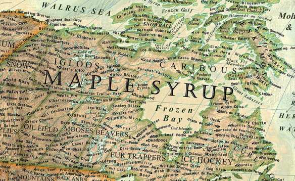
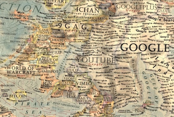
 Martin Vargic is an 18-year-old graphic artist from Slovakia that has created some of the most interesting, intricate and beautiful fantasy maps we have seen lately. Martin focuses on cultural and popular issues and represents them as very complex maps, using all the graphical and typographical resources of traditional cartography. The results are as beautiful as they are entertaining. Take for example his Map of Literature. In