Unknown's avatar

About 5wgraphicsblog

Founder and Creative Director of The 5W Velasco Design Group

Recent work: The National Museum of African American History & Culture

African_American_Musem

The National Museum of African American History & Culture is the newest addition to the Smithsonian Institution. The museum, by lead designer David Adjaye and lead architect Philip Freelon, holds over 35,000 artifacts. It will open its doors on September 24 in the National Mall of Washington, D.C. Like the rest of the Smithsonian museums in D.C., it will be free.

Smithsonian magazine asked us to work on a simple interactive showcasing the building and explaining some of the major features and attractions visitors will encounter throughout the museum. Take a look!

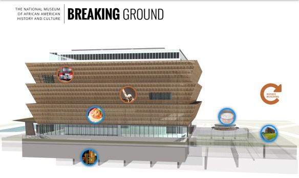
We use vector illustration much more frequently that 3D, but this time we rendered the building using Lightwave and SketchUp in order to animate it and to show the intricate metalwork design of the corona’s 3,600 panels. The metalwork “pays homage to the unheralded ornamental ironworkers, slaves and freedmen who crafted the signature wrought iron of southern towns like Charleston, South Carolina, and New Orleans, Louisiana”. The external shape of the building, a three-tiered bronze trapezoid, wraps around the outside of the glass building. The design is inspired by a sculpture from the early 20th-century Yoruban artist Olowe of Ise that is also shown in the museum.

A new blog by John Grimwade

John_Grimwade

For all those who (like us) are tired of seeing a lot of dataviz that is as fancy-looking as it is imcomprehensible and obtuse, we are really delighted to see that John Grimwade has a new blog on infographics. It’s called Infographics for the People. John is a necessary reference for anyone practicing information graphics or just interested in them. For decades, he’s been a master of clean, well explained and sophisticated information graphics that illuminate complex subjects for readers. John’s career includes the Times of London, Condé Nast Traveler, and a long list of freelance projects. He is also a great teacher and mentor, having taught infographics at the School of Visual Arts in NYC, at the annual “Show Don’t Tell” workshop (part of the Malofiej conference in Pamplona), and as a terrific speaker. He is currently teaching at the School of Visual Communication in Ohio University. The are plenty of interesting blogs around on data visualization, and some on infographics in general, but none that we are more excited about reading.

His mission statement summarizes the purpose nicely, and we couldn’t agree more:

“I’m trying to promote infographics that engage the general public. There is a trend towards elitist visualizations, that seem like they might be designed for data geeks. Of course, visual communication is a powerful way to help people understand, but first we have to get people on our side. Be inclusive, not exclusive. And never forget that a sense of fun is an important component in getting our message across. Infographics for the People!”

Check it out! Also, here is John’s website.


New workshops in NYC and Singapore

NYC_Singapore

5W Academy is heading to NYC for our next Infographics and Data visualization workshop in the US. It will be on March 24-25.

We received great feedback from our Washington, D.C. workshop back in October. A combination of local and out-of-state participants from government agencies, design studios, NGOs and other organizations got together for two days.

This two-day workshop is a comprehensive introduction to the creation of infographics and data visualization. With a mix of theory and practice, the workshop is aimed at professionals and students interested in developing the skills to produce engaging, insightful visual storytelling with their content.

We will learn how to gather and prepare data, the Do’s and Dont’s of working with numerical information and charts, and the principles of visual hierarchy, color, typography, illustration, and narrative to create impactful infographics.

5W_Academy copy

Attendees will sketch out infographics, storyboard motion graphics and create / publish their interactive data visualizations and web maps with the help of Tableau Public. The class will discuss award-winning projects and offer an overview of tools and strategies for creating infographics and data visualization.

At the same time, we are keeping busy in Asia. We’ll be back in Singapore on February 18-19 for “The Power of Infographics 4”, the fourth edition of a workshop that has proven really popular. The workshop is organized by Methodology and partnership with German leading art/design book publisher Gestalten.

Also in Singapore, we were invited to do back-to-back workshops on March 8-9, March 10-11 and possibly also March 14-15. The organizer is Maitre Allianz, a leading training services company.

5W in South Korea

Bongeunsa Temple in Seoul, Korea.

We arrived in Seoul on Monday. It’s 5W’s seventh trip to Asia in the last year, but our first time in South Korea. The Government has invited us to participate as one of a small handful of foreign companies to participate in the Korea Design Businees Fair, one of the largest design events in Asia. It includes several hundred exhibitors, and also features the winners of the Red Dot Design Awards, Design Excellence Awards, and Good Design Awards, among others. It’s open to both the general public and product design buyers (largely from China, Korea and Japan).

The Fair is mostly dedicated to industrial and product design, but this year the organization was interested in bringing in a firm specialized in information design. Its a great opportunity to witness the design boom in Korea, a highly developed market with a tech-savvy public and an interest in quality design products. Korea is quickly changing from follower to trend-setter in the design world, finding and showcasing its unique sensibility. We are looking forward to seeing and learning more.

FullSizeRender 2

IMG_5344

First 5W Academy workshop in Washington, D.C.


“Really good overall. A strong alternative to Tufte and Few.”


Earlier this week we hosted the first 5W Academy event in Washington, D.C. The two-day workshop’s aim was to serve as an introduction to the creation of infographics and data visualization, with a combination of theory and practice.

The brand-new Marriott Marquis Washington hotel was a terrific setting for the event (thank you to all involved for the great quality of service and responsiveness).

Workshop_Hotel

We had a great turnout with a combination of local and out-of-state participants from government agencies, design studios, NGOs and other organizations interested in producing visual storytelling. With such a broad topic, it can be challenging finding a path and focus that works for the whole group in a public workshop, but the feedback was really positive.


“It was a great course and made what for me was a moderately interesting topic into a fascinating one”.


Workshop2

Workshop3

The participants practiced their hand at researching, conceptualizing and sketching out infographics with multiple components, taking decisions on narrative focus, hierarchy and design balance. For future workshops, quite a few people pointed out they would welcome a third day in the workshop to have more time with hands-on exercises and Tableau software practice. It’s something we are seriously considering for future events.

Workshop1

Workshop8

Workshop7

We are looking at the possibility of having the workshop in NYC very soon and, if the interest keeps rising, you may have a 5W Academy event near you in the near future! Our goal is to cover not only infographics and data visualization but all topics relevant to information design and visual storytelling.

The Power of Infographics 3 workshop in Singapore

Banner_JuanVelasco

Our Power of Infographics two-day workshop in Singapore proved so popular in January and May that we are coming back for the third time on September 29 and 30. The event is hosted by our friends at Methodology in partnership with Gestalten, the German publishers and specialists in visual culture. 5W’s co-founder Juan Velasco (ex Graphics Art Director at The New York Times and ex-Art Director of National Geographic magazine) will offer a comprehensive review of information graphics and data visualization, both in print and online. The hands-on experience will involve gathering and preparing data, working with statistics in Excel, sketching, storyboarding… By the end of the workshop the attendants will have a completely sketched-out illustrated infographic with multiple components and a functioning online data visualization including interactive charts and maps. We’ll use the free Tableau Public for our interactive exercises.The theory and practice of information graphics will be covered in multiple lectures. We’ll discuss step-by-step examples of award-winning infographics and the latest trends. We’ll learn which charts are best to use for different types of data; what type of maps are useful to give insight into our data sets or to locate stories, and how they are created; the tools and processes for successful motion graphics… We will also experiment with hierarchy, color, typography, illustration, and narrative to create effective infographics that make an impact. If the previous workshops are any indication, seat will go fast! Reserve yours now by emailing admin@methodology.sg

Singapore_Bay

The brilliance of 8 by 8 magazine

88_05_Cover 2

Editors and designers of large, well established icons of magazine design like Wired and New York were stunned a few days ago when the SPD (Society of Publication Designers) gave its prestigious Magazine of the Year award to a little magazine produced by a few volunteers.

Eight by Eight is a wonderful quarterly publication dedicated to global football (soccer for U.S. followers) that has been consistently delivering beautiful design and great stories. They use a lot of illustration and striking typography. It’s refreshing to see it now that magazines hardly use great Illustration anymore. They are beautiful and add a layer of commentary on the topics and personalities involved that a photo would never achieve.

Pirlo

With our friend John Grimwade as contributing Graphics Director, you can always expect brilliant, clear infographics with original ideas. Regardless of whether you enjoy the sport, the work of Editor in Chief Robert Priest and Creative Director Grace Lee (the founding partners of design studio Priest+Grace, who also designed Howler, more focused on North American soccer) and the rest of the team deserved such recognition. Congratulations! Here a few nice pages.

8by8_Marked Men

8by8_Trophies

Referee

8by8_pitch_size

RoyKeane

88_04_Yedlin_Opener_lores

88_05_Mourinho

Our “Power of Infographics” workshop is back in Singapore

Singapore

Following the success of the previous workshop in January, we are coming back to Singapore on May 21-22 with our Power of Infographics workshop. The event is hosted by Methodology in partnership with Gestalten, the German leading publishers specialized in visual culture.

Banner_WorkshopJVelasco_500x610_2

The two-day workshop by 5W’s co-founder Juan Velasco (ex Graphics Art Director at The New York Times and ex-Art Director of National Geographic magazine) will be a comprehensive review of information graphics and data visualization, both in print and online. We’ll have a chance to create hands-on work running through the entire process: gathering and preparing data, working with statistics in Excel, sketching, storyboarding… By the end of the workshop the attendant wills have a completely sketched-out illustrated infographic with multiple components and a functioning online data visualization including interactive charts and maps. We’ll use the free Tableau Public for our interactive exercises.

Juan_teaching

Juan will also provide numerous lectures on the theory and practice of information graphics showing step-by-step examples of award-winning infographics and covering the latest trends. We’ll learn which charts are best to use for different types of data; what type of maps are useful to give insight into our data sets or to locate stories, and how they are created; the tools and processes for successful motion graphics… We will also experiment with hierarchy, color, typography, illustration, and narrative to create effective infographics that make an impact.

Seats are going fast! Reserve yours now by emailing admin@methodology.sg

Tyrannosaurs in Scientific American

dino_spread

Dinosaur and Paleontology stories were always among my favorites to work with at National Geographic. Recently I had a chance to work with Scientific American Magazine on a fun and fascinating story on the rise of Tyrannosaurs. The story, by prominent paleontologist Stephen Brusatte, is on the May ’15 issue.

New discoveries are showing us that tyrannosaurs were a surprisingly diverse bunch that slowly evolved into the gigantic proportions of the iconic Tyrannosaurus Rex. Jen Christiansen, the Art Director of information graphics, asked us to create a spread infographic for the story. We showed the tyrannosaur family tree with amazing illustrations by Todd Marshall. The maps reveal how tyrannosaurs evolved at a time when the continents had yet to fully break apart, so their fossils are now found in very different parts of the world.

The story has a gorgeous cover by James Gurney, the master illustrator you may know from his famous Dinotopia series. We art directed him (which amounts to little since he doesn’t really need much direction!) in a spread illustration for the story.

BrusatteCover

We’ll show you the sketch to final process and a great make-of video by Gurney in a few weeks, in the meantime we don’t want to spoil the issue for you, run to your newsstand or order it online!

By the way Jen Christiansen keeps a really nice blog, SA Visual, with articles on the graphics process at Scientific American and on other graphics-related topics. Highly recommended.

Workshops in Malaysia and Indonesia

Workshops

We were back to South East Asia at the end of March to teach information graphics and data visualization workshops in Kuala Lumpur (Malaysia) and Jakarta (Indonesia). Both events were focused on interactive graphics, data visualization and the print-to-web challenge.

The workshops were organized by WAN-IFRA, the World Association of Newspapers and News Publishers. WAN-IFRA is a global organization representing more than 18,000 publications, 15,000 online sites and over 3,000 companies in more than 120 countries.

In Malaysia, we were hosted by Media Prima group, a leading Malaysian publishing company. The participants were designers and editors from The New Straits Times, the group’s English-language newspaper and the oldest newspaper in Malaysia (1845); Berita Harian (BH), a mainstream newspaper in Malay; and Harian Metro, a popular human interest daily and the largest newspaper of Malaysia in any language.

Newspapers

In Jakarta, we worked with Kompas, the largest circulation newspaper in South East Asia, and surely one of the best. Kompas has excellent print design (it was redesigned by Mario Garcia). They have had a digital presence for some time, including nice tablet offerings, and they are now trying to enhance their infographics online. They do plenty of really nice print infographics, like this one about the pinisi, a traditional Indonesian two-masted sailing ship.

Kompas_Pinisi