Unknown's avatar

About 5wgraphicsblog

Founder and Creative Director of The 5W Velasco Design Group

The New Tableau 10

exoplanets

Our Infographics and Data Visualization workshops always include spending a few hours using the free Tableau Public software to create interactive data visualizations with charts and maps on the web. Tableau is a great first step for those interested in data visualization online since it’s fairly easy to learn. The newest version (Tableau 10) was released three months ago and has really nice improvements including a long overdue addition of device responsiveness to visualize data across multiple devices.

We use Tableau during the workshop because it doesn’t require the coding skills necessary to use sophisticated tools such as D3.js, the tool behind many of those amazing interactives of The New York Times and others (although today you can code a nice data visualization in R, for example, with just a few lines of code). Tableau is a great exploratory tool that lets you quickly evaluate different options to visualize you data. We actually use it for print graphics as well after saving files as PDFs.

Tableau is a powerful tool but also a great way of starting to think about key concepts in interactivity: about how to use filters, buttons, navigation tool tips or exploratory dashboards to let readers dive deep in your content. It’s used by thousands of corporations as a Business Intelligence/Analytics tool to visualize their data. The free version is a useful tool for individuals and organizations interested in making data public (remember that with Tableau Public you can’t save files locally, they are all saved to Tableau server and available for anyone to see and to download, including the datasets used. You may prefer the Tableau Desktop version but it’s not cheap).

Some of the new features in Tableau 10 include:

  • Device responsiveness. You can now generate visualizations optimized for desktop, tablet, and mobile phones. Although far from perfect, it’s a big step forward in Tableau.
  • Ability to connect to data stored in Google Sheets. You can set to your visualization to refresh automatically every day, if the underlying data in your Google Sheets file changes.
  • A “highlighter” feature gives users added possibilities to sort, find and highlight specific data for ad hoc views and comparisons.
  • Cross-database joins: you can join different data sources within the program.
  • Custom Territories: Create custom areas in maps using the data built into the geocoding database.
  • And finally, a cleaner interface with new iconography, fonts and colors, sporting a cleaner, less cluttered look that I find much nicer.

In addition, the just released Tableau 10.1 includes:

  • JSON support. JSON is common file format for web based data, widely used for API-returned data. This means you can download web-based JSON files and start to visualize them right away.
  • Automatic clustering is very interesting. Tableau helps identifying interesting patterns from the data by automatically generating clusters based of the groupings/categories specified by the user.
clusterinvestigate

Clustering feature. GIF from Tableau Public website

Tableau’s website include great learning resources. If you are looking for a good book to learn it, here is the one I found most useful.

Crime in Milwaukee 3


The best world map projection ?

authamap4-1024x767

One of the most prestigious design awards, the GOOD DESIGN Grand Award from Japan, was awarded a few days ago to something quite unexpected: a new world map projection. The winning projection is called AutaGraph and its creator is Japanese designer and architect Hajime Narukawa, who leads a company with the same name. Here is his site.

The new projection (it’s actually over a decade old, but the prize has brought it to fame) is being labeled by news organizations as “the most accurate ever” or “finally faithful” with great hyperbole.

  • Projections

The representation of the world on a flat surface is a problem that has always challenged cartographers. It’s impossible to project a spherical object accurately on a flat surface and every single projection in existence has to make some trade-offs. The ubiquitous Mercator projector, created by Gerardus Mercator in 1569 is very accurate in the representation of shapes and small-area angles (this is what we call a conformal projection) so it was widely used by explorers and sea merchants. But as you move towards the poles areas are greatly distorted. Greenland appears larger than Brazil when it’s several times smaller in reality. It’s an old and inaccurate projection but a variation of it, the Web Mercator is actually the de facto standard for Web mapping applications as it keeps north up, and meridians are equally spaced vertical lines, preserving shapes and angles well. It’s what you want when you zoom into small areas like you would do in a city map with Google Maps or similar tools.

Mercator Projection

Mercator Projection

Many other projections more accurate than Mercator are used today. The Mollweide protection, for instance, is a well balanced one. In 1998, the Winkel Triple projection replaced the Robinson projection as the standard projection for world maps made by the National Geographic Society.

Winkel Triple Proction

Winkel Triple Proction

Using the right projections is always important. Smaller areas often require different projections that are most accurate for that view. Official United States maps, for instance, are often represented with the Albers equal-area projection. It’s used by the United States Geological Survey, the Census Bureau and many good news organizations. It’s a conicequal-area map projection (equal-area projections are those where areas are well preserved) that works well for extended areas in mid-latitudes.

In a conic map we choose two lines that frame the area of interest. It’s derived from the projection of the globe onto a cone placed over it. The cone intersects the globe at the standard lines (parallels) Distortion is minimal between the standard parallels, but increases away from them.

albers

Albers Projection

From GISlounge.com

From GISlounge.com

  • How AutaGraph was made

Going back to the AutaGraph map, it was made by equally dividing a sphere into 96 triangles, transferring it to an inflated tetrahedron while maintaining areas proportions and unfolding it to the rectangle. Here is the step-by-step process:

ag_en_02

And a TED Talk where Narukawa explains it:


The Autograph projection resembles the Dymaxion map invented in 1946 by Buckmisnter Fuller. The shapes and sizes of continents are fairly accurate, but the oceans are interrupted.

Dymaxion Projection

Dymaxion Projection

“AuthaGraph faithfully represents all oceans and continents including the neglected Antarctica,” says Narukawa. “These fit within a rectangular frame with no interruptions. The map can be tessellated without visible seams.”

Although conceptually it’s in the category of equal-area maps, Narukawa admits it needs more work (further subdivisions) to be a true equal-area map. According to his website, the mapping projection was selected by the Japanese National Museum of Emerging Science and innovation (Miraikan) as it official mapping tool and is used in official Japanese high school text books.

  • Our take

If the accuracy claims are true (no way these humble bloggers can verify it) it’s a remarkable achievement. As Narukawa points out, it’s less western centric and calls more attention to the poles in light of global warming and future issues like the exploration of Arctic resources, a major geopolitical concern.

But… It’s not a map we can expect will be widely used in the future. We wouldn’t. The orientation and shape is simply too unfamiliar and any thematic content you may display on it would be obscured by the distraction. Among other oddities, the gridlines take odd changes in direction, some shapes (such as Brazil or Alaska’s) seem severely distorted, and Australia appears to be as far from Antarctica as it is from Europe. Good information design is always the one where the content holder (the base map, in this case) recedes and remains invisible to bring forward the content with greater clarity.

16g141127_03_880x660


FAQ: Our Infographics and Data Visualization workshop

Juan_teaching

Our next infographics and Data Visualization workshop will take place in Washington D.C. on December 1-2, and it’s still open for registration (sign up before November 24 and you’ll get our book Look Inside free!). We are often asked about the content of the workshop (see a complete schedule by clicking on the “schedule” tab here), whether participants need previous experience, and a few other things. Here are some quick answers:

  • What will I learn?

You keep hearing about the power of infographics and data visualization, and wonder how you can use them with your content. The purpose of our 2-day workshop is to explain the principles and practical guidelines that will enable you to create powerful visual stories that illuminate concepts for your readers. And to practice them hands-on. The workshop is not about designing pretty decorative presentations but rather about discovering insightful stories hidden behind your text and data, and telling relevant stories with them with high visual impact and accuracy.

Infographics and data visualization are broad fields and we’ll cover all the most important aspects to give you the whole picture:

  • Finding the visual potential hidden in written reports
  • The Do’s and Dont’s of accurately plotting numbers and statistics
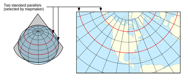
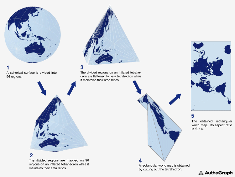
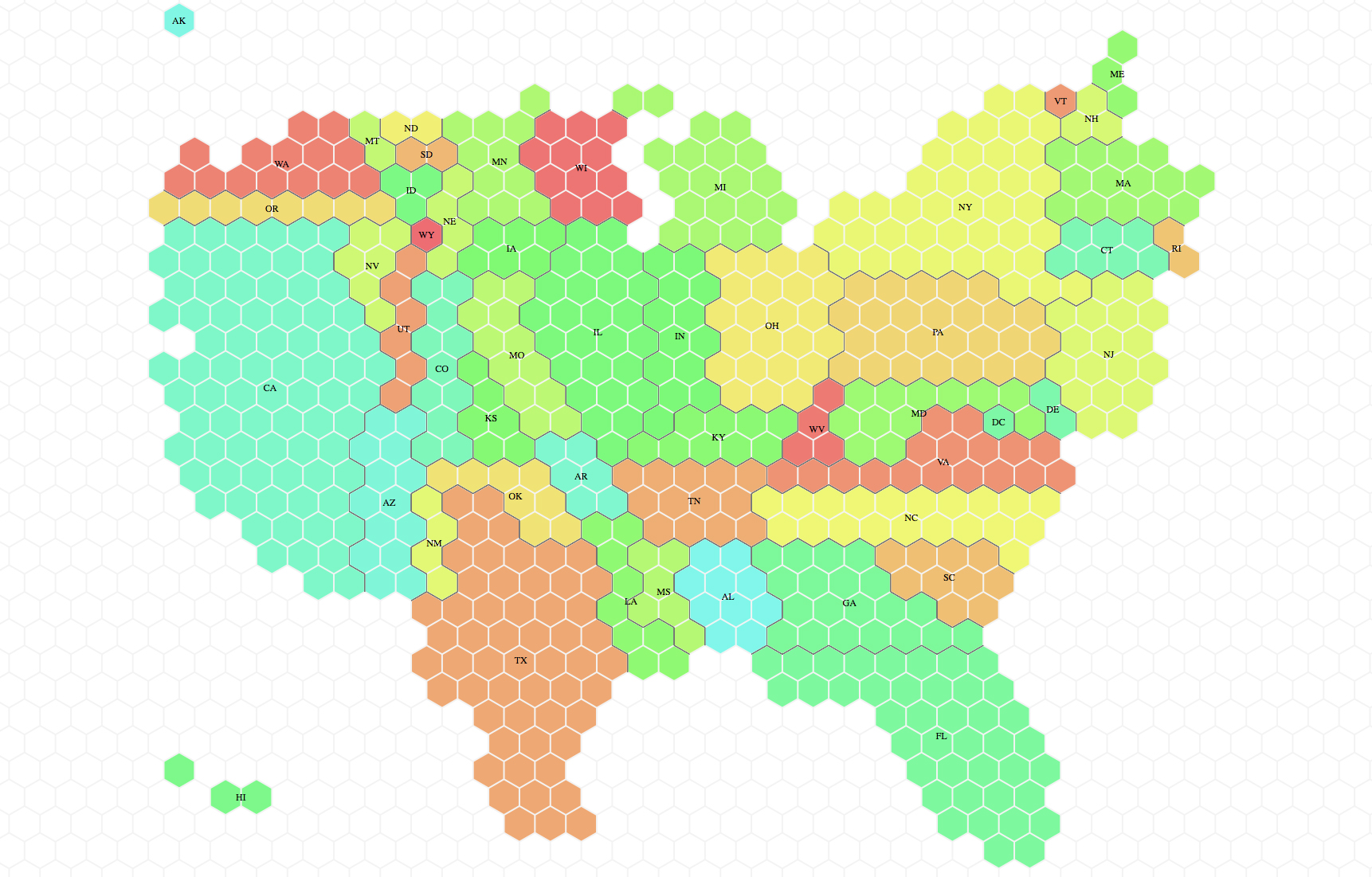
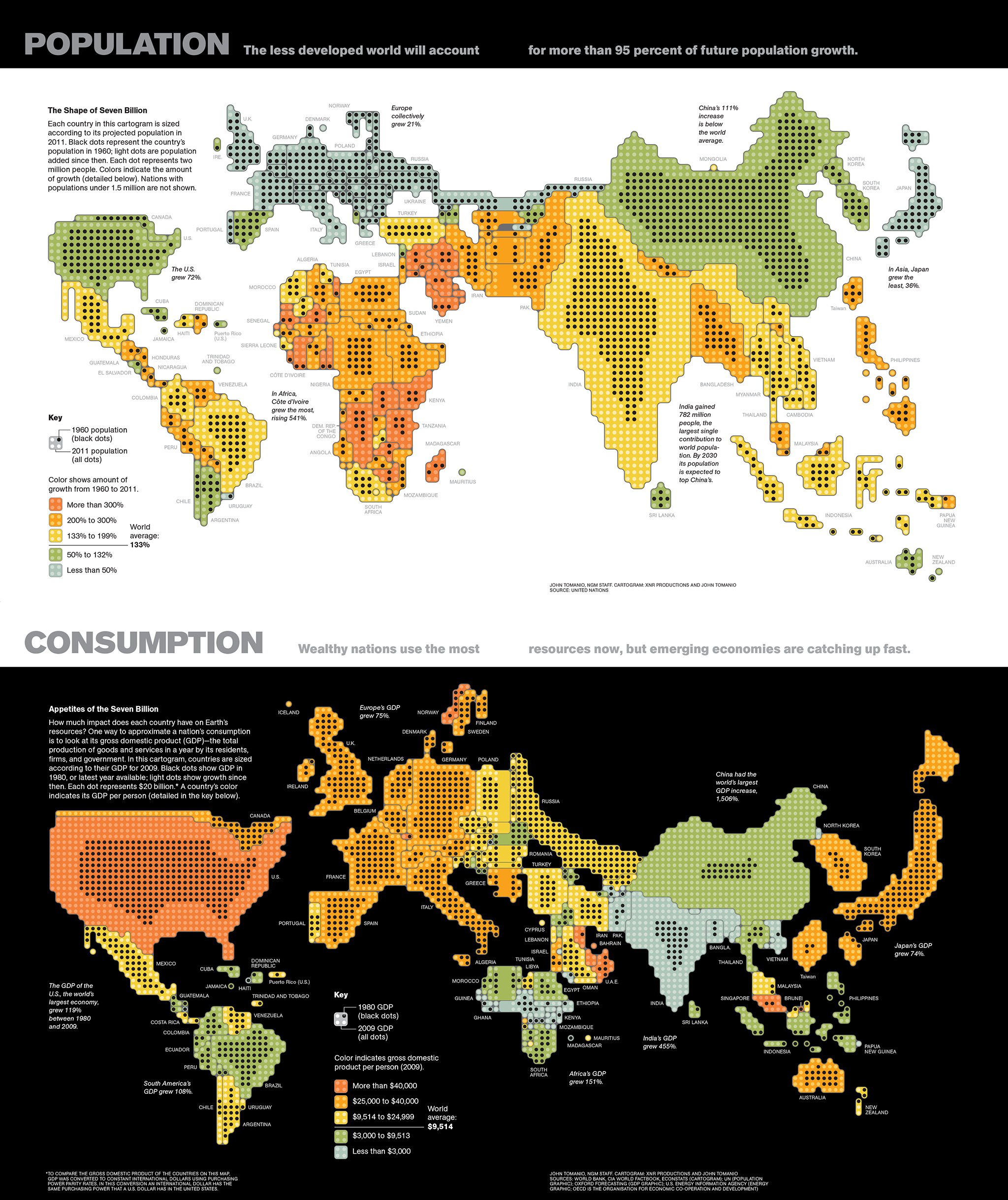
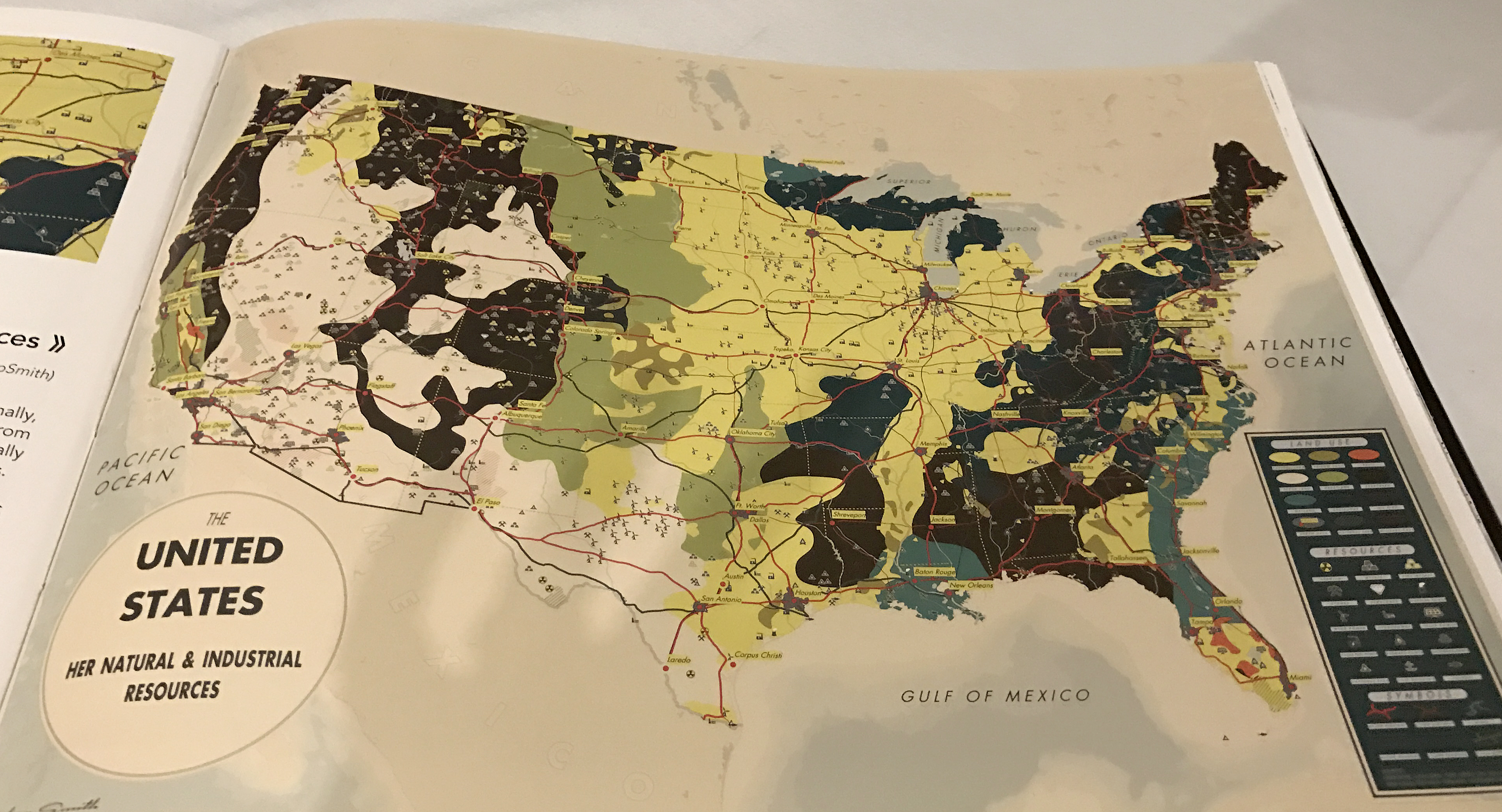
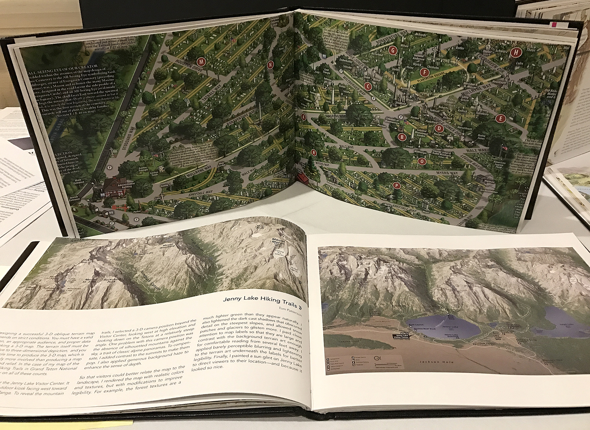
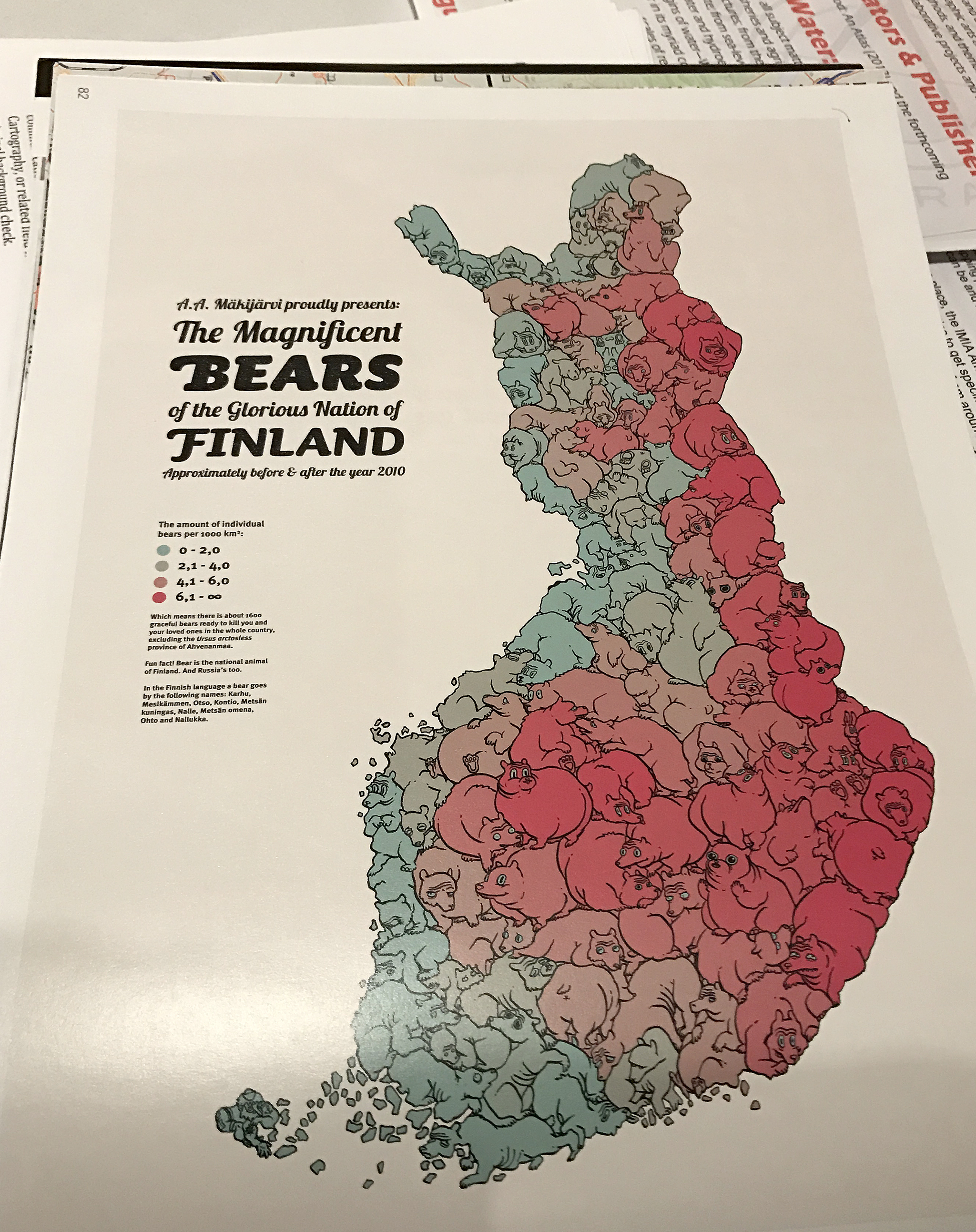
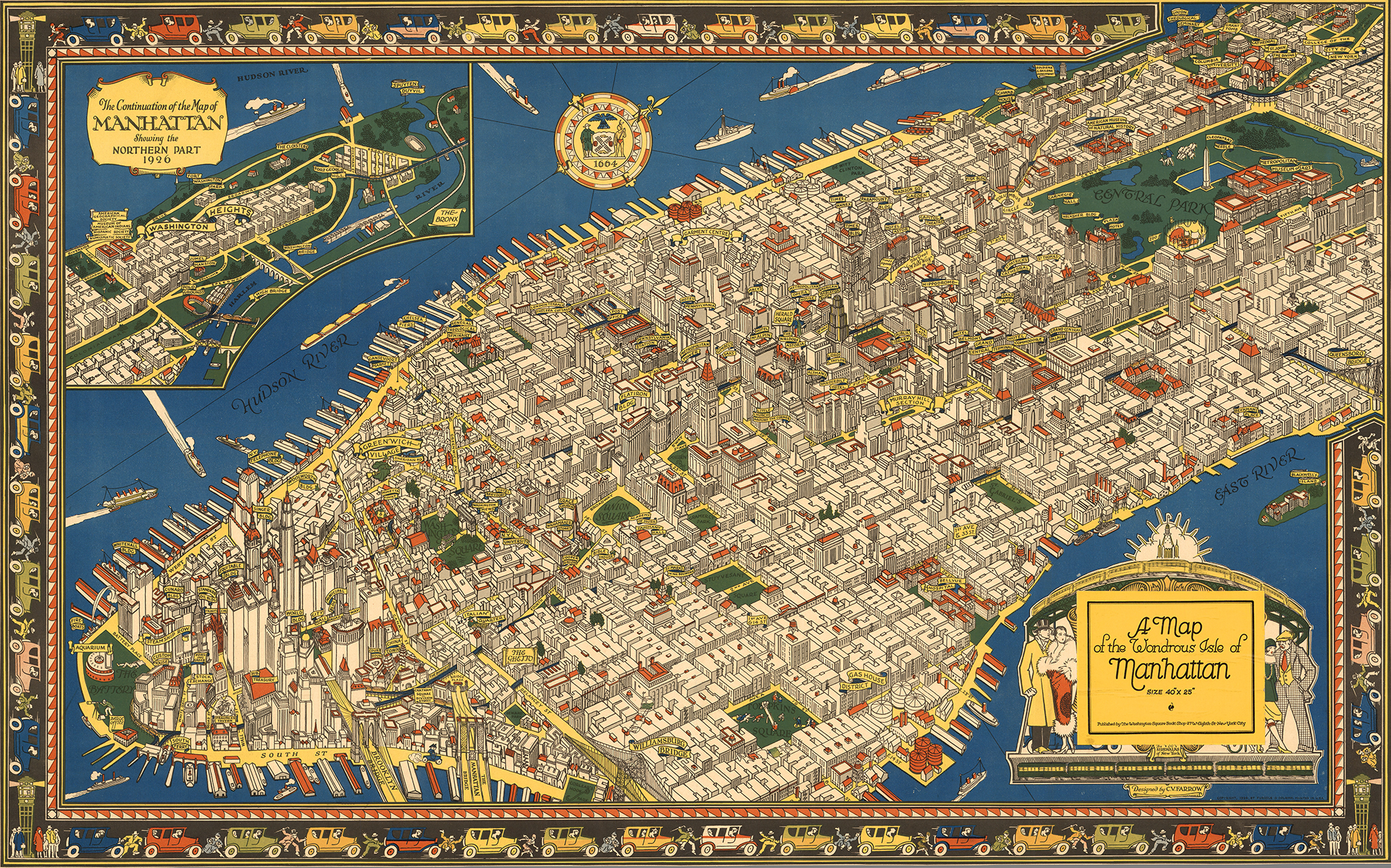
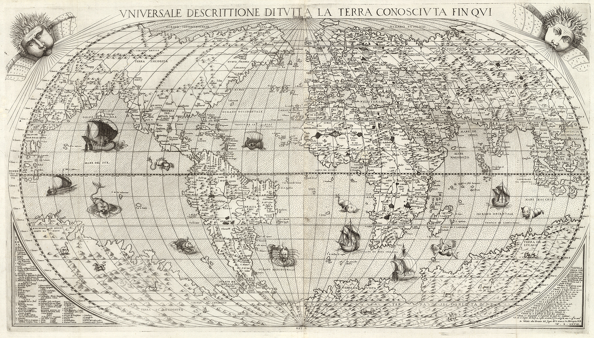
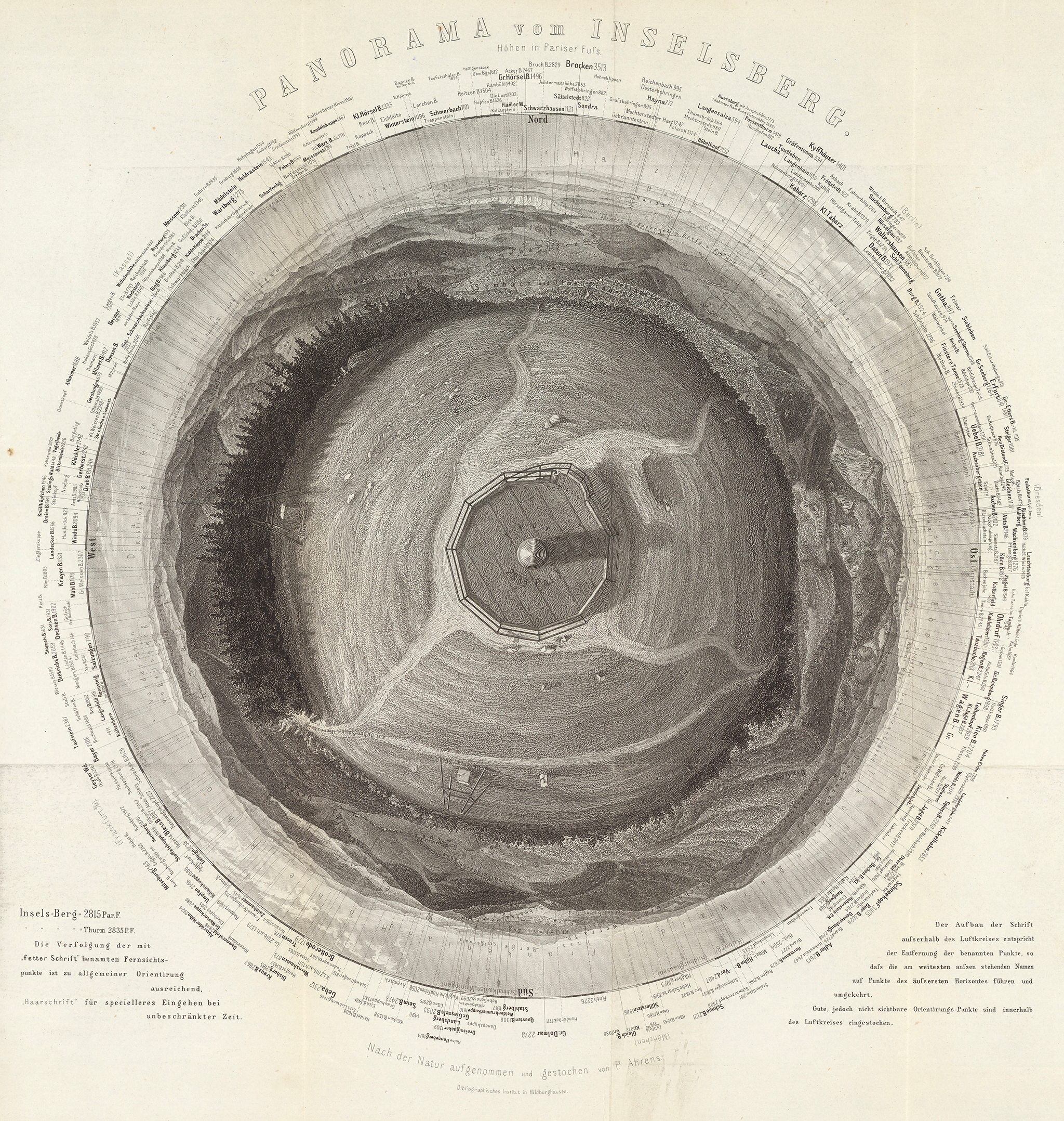
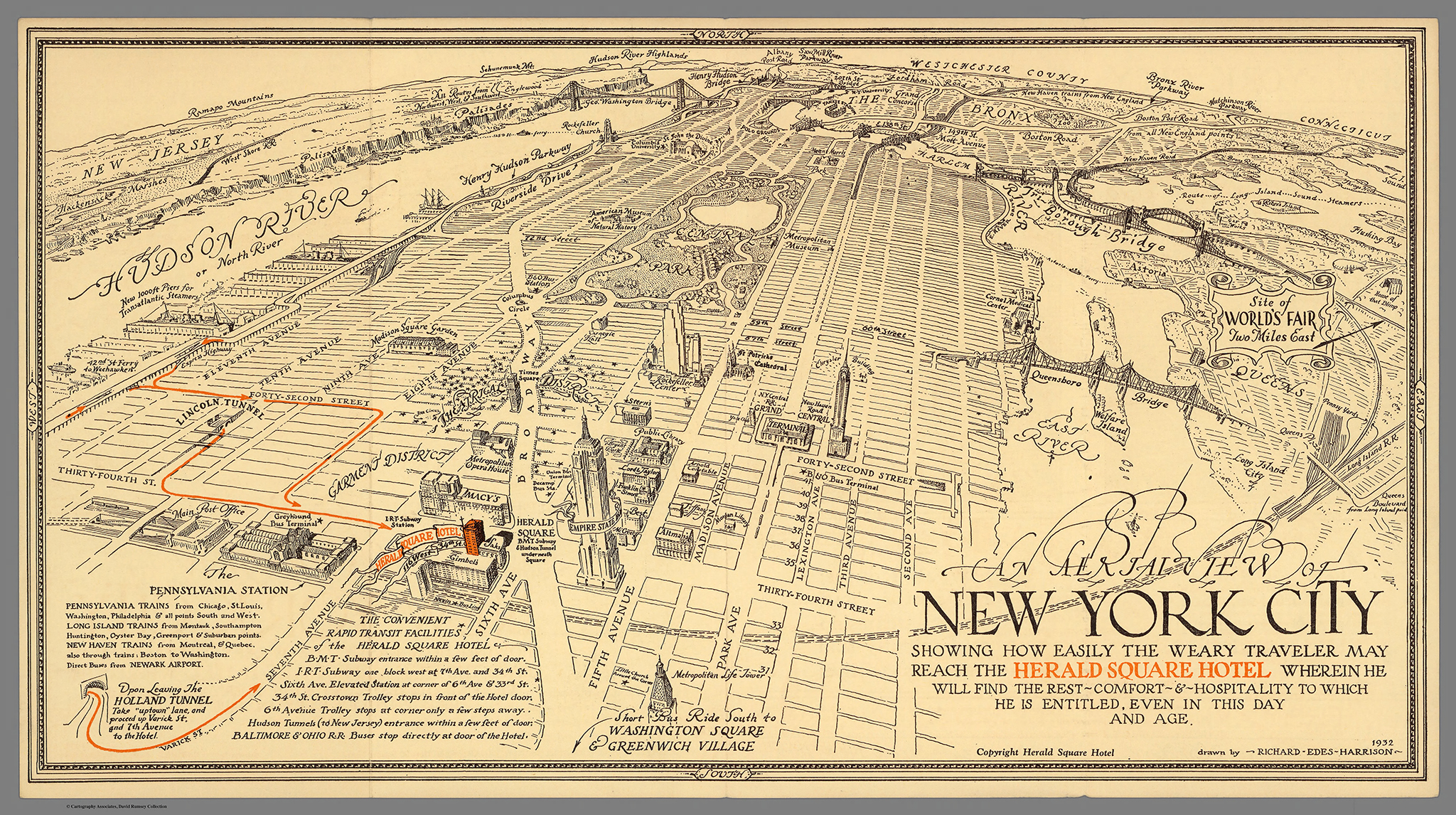
  • Telling stories with maps: types and uses of geographic and thematic cartography
  • Sketching and planning explanatory diagrams
  • Design principles: hierarchy, color, type, narrative flow and page integration
  • Storyboarding efficient motion graphics
  • Key concepts in interactive data visualization on the web, including mobile
  • Overview of tools and available resources
  • Who should attend?

Anyone interested in knowing how infographics and data visualization can help transform their stories to make them engaging and insightful through the use of images, maps and data. Graphics designers, journalists, editors, researchers, marketing specialists; professionals of NGOs, Government, Finance, PR working in public outreach to explain initiatives and programs, or seeking to improve the efficiency and creativity of their internal or external communications.

  • Is it theory or practice?

The workshop is a mix that includes presentations on all the different aspects of infographics/dataviz, discussion, and group practice. There will be short exercises scattered throughout the workshop, and a larger project where groups will put together detailed sketches for a large infographic containing multiple elements.

Throughout the exercise the participants will experience the entire workflow of a typical infographic:

  • Brainstorming for editorial and presentations ideas
  • Data collection
  • Making visual choices
  • Designing an effective narrative
  • Putting it all together and making final choices on editing and presentation.

On the first day, the goal of the group exercise will be creating a sketch for print or online static infographic/dataviz. On the second day, we’ll take the same topic to re-think and re-design it as a motion graphic (by creating a storyboard), or as an interactive data visualization (working on structure, navigation, layering and interactivity). The interactions during exercises get really animated and fun.

23854072231_b8e0ca7bce_o img_0994

  • Who are you and what are your credentials?

We have created and published several thousand infographics/data visualizations over our careers, mostly in journalism where rigorous accuracy and clarity are paramount. We (Juan and Samuel Velasco) founded 5w Infographics in 2001. 5w Infographics is an award-winning design and consulting company that specializes in information-driven projects. Today, we have offices in New York, Washington D.C., and Madrid. 5W Academy is our education initiative and organizes the workshop.

Juan was the Art Director of National Geographic magazine from 2008 to 2014. Previous to National Geographic, he worked as a graphics reporter for El Mundo (Spain) and as the Graphics Art Director for The New York Times.

Samuel was one of the original founders of the daily newspaper El Mundo (Madrid), in 1989. El Mundo’s art department quickly became the center of a “boom” of infographics in Europe. In the U.S., he became an Art Director at Fortune magazine.

5W Infographics has won over 150 national and international awards for its work on information design. Clients include The New York Times, National Geographic, Time magazine, Fortune, The Economist, the Smithsonian Museums, and the National Academy of Sciences, among others.

Over the last couple of years, we had over 800 attendees to our workshops in Washington DC, New York City, Amsterdam (Netherlands), Singapore, Kuala Lumpur (Malaysia), Bangkok (Thailand), Manila (Philippines), Jakarta (Indonesia), Delhi and Chennai (India). We also have over 10 years of previous experience as instructors in other workshops and speakers.

Workshop n Amsterdam, June 2016

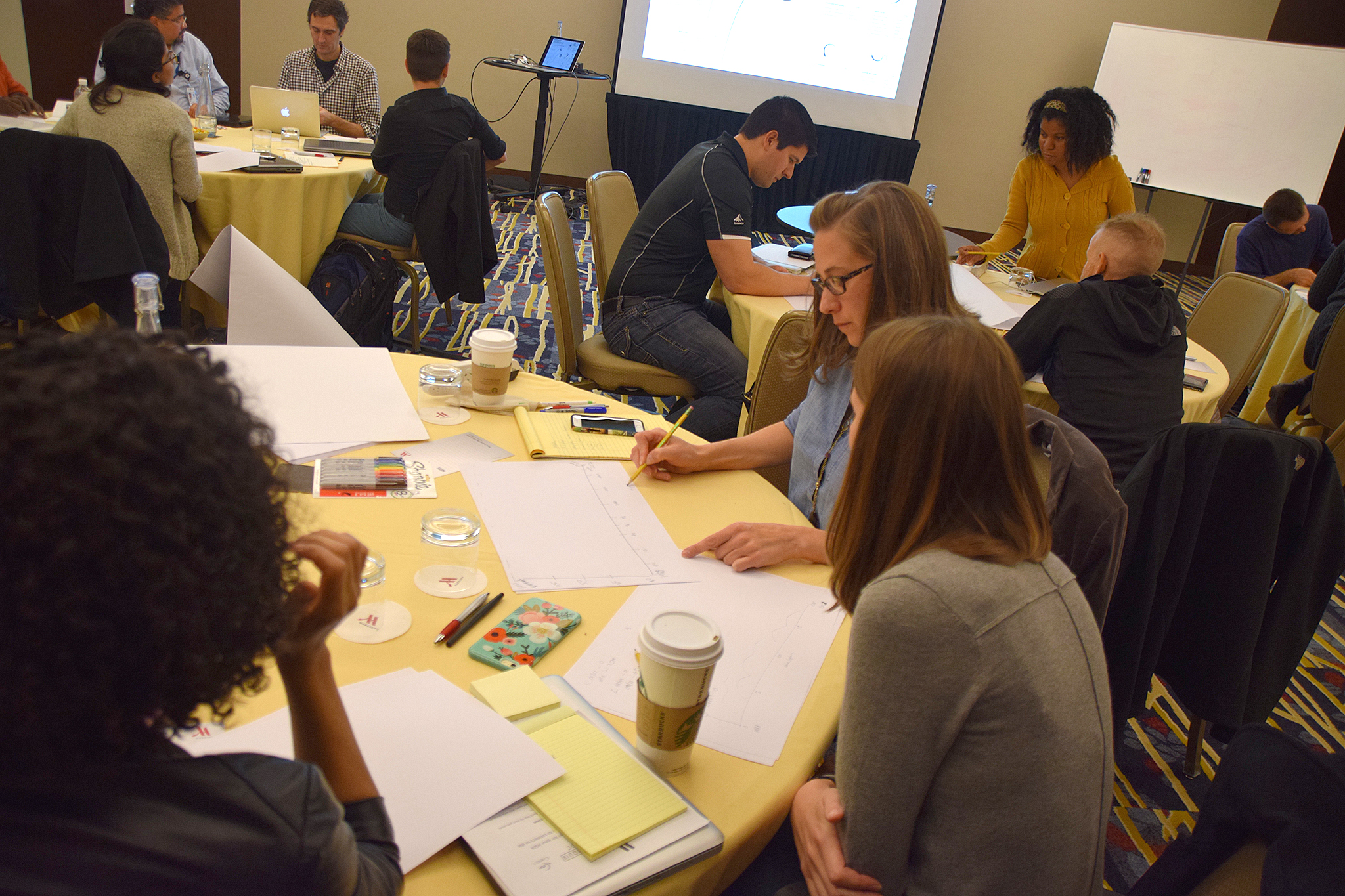
Amsterdam, June 2016 (hosted by Graphic Hunters)

Workshop2

Washington DC workshop, October 2016

Singapore, March 2016 (hosted by MaitreAllianz)

Singapore, March 2016 (hosted by MaitreAllianz)

  • Do I need any previous experience doing charts or infographics?

No. The workshop is definitely suitable for beginners and you don’t need any previous experience with infographics. It’s a broad introduction to infographics and data visualization where we’ll look at how to work with data, charts and mapping in print and online, and how to design complex infographics with multiple elements.

  • Do I need to know any software experience?

No. Most of our hands-on exercises will be done with hand sketching. We want to emphasize the process of making decisions about the source data, choosing between different visual alternatives to present it, and using color, hierarchy and typography to put it all together as a piece of visual storytelling. It’s about brainstorming, thinking visually, and making editorial and design decisions rather than software details, which would distract from the essence.

You’ll use a laptop (bring your own, optional) to do some general research (looking for source data and background information) for some of the exercises. And on the second day we’ll spend a couple of hours creating interactive data visualizations and maps with the free Tableau Public, for which you also don’t need previous experience. You won’t master the software but will get started and understand its potential.

  • Will I learn any Illustrator/PowerPoint/Coding tricks and skills?

This is not a software training class. We believe that learning the principles of data visualization and how to think and explain using visual concepts is different and more important than learning any particular tool. However, you’ll leave the workshop with a good knowledge about what tools are used today in the field, why, which ones may suit your needs, what they do, and how to expand your knowledge about them.

  • So I can start doing my own infographics right after the workshop?

We think so! If you have a minimal knowledge of Excel/PowerPoint and/or Adobe Illustrator you can be up and running armed with the practical knowledge on which types of charts/diagrams are best suited for your data, how to design your infographics/visualization and some key design guidelines. Plus you’ll be able to think visually in a way that gives you a new perspective on your content, and look critically at the infographics and data visualizations you encounter every day (so many bad ones surround us!)

  • What are the logistics” (venue, registration, lunches, cancellations, etc.)?

Please  our page http://www.5w-consulting.com and click on the “practical information” tab.

  • Will you give any handouts/materials?

Yes, we’ll give you a few summaries or “cheat sheets” of the content of the workshop to remember the main points, as well as the entire presentations (a wealth of great infographics examples and tips) as PDF or Keynote files, and a very comprehensive list of print and online resources to allow you to expand your knowledge about data presentation, mapping, infographics, etc. after the workshop. You’ll also obtain a diploma/certificate.

  • Can I reach you for additional questions?

Please do! Email us anytime at academy@5w-consulting.com

slideshow-5w-academy-washington

The power of cartograms and creating them easily

tilegrams_homepage

We love the power of cartograms to show thematic data maps because they overcome some of the problems of classic choropleth maps. And they can be beautiful. So it’s exciting to see a promising new tool to create nice cartogram hexmaps automatically. It’s called Tilegrams (for “tiled cartograms”) and it has been developed by Pitch Interactive in collaboration with Google News Labs. But let’s back up a little bit, since many people are not familiar with cartograms in the first place!

A cartogram is a map that actually functions as a chart by distorting the size of geographic areas (such as countries or states) in proportion to numerical values they represent. Here are two nice examples by John Tomanio, Director of Graphics at National Geographic. In the first map, each dot represents a specific number of people—2 million— living in a country. In the second map, each dot represents $20 billion in GDP for that country, as a proxy for consumption. The dramatic, yet entirely accurate data representation allows two different stories to emerge nicely as we see the relative weight of each country for that particular dataset. That’s the power of cartograms (the black circles here represent the same variables a few decades back, for a nice representation of growth over time).

untitled

You may say “ok, these look a little weird, why not represent these data in a choropleth map, or in other words using different shades of color in a “normal” map?”. Like the example below. Choroplet maps are ubiquitous and, while they are not incorrect, they are seen by many as misleading. They overrepresent the importance or large areas, and diminish the importance of small ones, just by virtue of their size in the page. If I plot GDP for different countries, for example, a large country with a medium value (say Brazil) “lights up” much more prominently than a country with a higher value such as Singapore, simply because Singapore is tiny and hard to see in the map. See a nice video from Vox here explaining the problem with choropleth maps.

Physician_practice_landscape_Final

One solution is to give all entities equal area and then use the choropleth technique (different shades of color represent different values). That’s more fair. But we can only show a few classes or “buckets” of data ranges, rather than precise values in each area.

equalarea

So it may be interesting to resize each area according to the number we want to represent. Some cartograms can be fairly abstract. Instead of using the approximate shapes of countries or states, they use squares, circles or other geometric shapes to represent quantities in highly stylized maps. See this map we did for Fortune, with the number of millionaire households by state in the U.S. (color here represents a second variable, the median household income).

5w-sample-054-america-millionaires1x2

I love this type of cartogram. Here is another one by John Tomanio, a few years ago, for Fortune.

tomanio

Cartograms can be really striking and powerful. Lately we have seen a comeback, and they were often used by different news organizations in the UK in the recent election cycles. A cartogram of the U.S. can be a nice way to represent that a small state in the East Coast may have many more electoral votes in the general election than a sparsely populated but large Midwest state. Here is the tilegram showing how much each state actually matters (how many electoral votes it holds) in the U.S. Much more telling than showing actual size in the context of election stories! Don’t be misled by how much blue or red you see in typical election maps.

electoralvotes

Complex cartograms have been done manually forever, for example in Adobe Illustrator, as in the case of the National Geographic maps. It’s a painstaking process, but human judgement is critical to make sure the composites of little shapes will still resemble the actual map of the area, which is entirely the point if we want to avoid confusion. You have to put them together as a jigsaw puzzle.

We have seen tools that create cartograms working in conjunction with other GIS software tools, but if you ask me, they produce grotesquely deformed maps that are a hard to decipher mess (with that strange fisheye lens effect. You have probably seen them around). I think these are useless:

cartogram_lens

Tilegrams is a really nice concept, still evolving. It plots U.S. maps using hexagon shapes, which are more versatile than squares to assemble them together in adjoining shapes with different configurations. You can use some preloaded maps (electoral votes, population, etc) or load your own data. Tilegrams allows you to show different levels of resolution. For example, the first map below shows U.S. population with 4 million people represented in each tile. The one below shows 300,000 people per tile. As you would expect, the higher resolution allows us to resemble the shape of the U.S. better (but remember states are meant to be oversized or undersized to represent the values, so the unusual proportions are to be expected.

lowres_hires

If the map starts looking a bit too weird you can drag hexagons to move them around. The tool tells the user about the statistical accuracy of each region’s surface area, as it tries to be both accurate and resemble the actual map in a difficult trade-off. You can export the map as a TopoJSON or as a SVG file, a wonderful option since it’s fully editable in Illustrator!

Pitch Interactive explains the tool here, and it continues to develop it. The company is now working on a U.S. county map. It sounds like a daunting task (there are over 3,000 counties in the U.S.). And hopefully one day we can show any country and their divisions in this simple way. I can’t wait to see what they come up with!


The new Atlas of Design

img_3766

The latest edition (Volume III) of the Atlas of Design is available for pre-order! The Atlas is an amazing compilation of cartographic design, selected in a worldwide competition by a panel of experts. The range of creative approaches in the 32 maps that make the book presents a wonderful picture of the broad scope of mapmaking styles as well as its challenges. Each map is accompanied by comments from the author, giving us insight about the conception and the ideas behind its creation.

img_3761

img_3767

The book is published every two years by the North American Cartographic Information Society (NACIS) a not-for-profit professional organization for mapmakers. In their words:

The Atlas aims to inspire readers both within the field of cartography and without toward new understandings of design, and of the power that a well-crafted map can have. In an age when more and more mapping tasks are being turned over to computers, the Atlas provides one more answer to the question: What do cartographers do?

I was honored to be asked to write an introductory essay for the book, which I ended noting: “This book is a formidable compilation of beautiful and informative cartography, from classically designed to bold and daring; from hand-drawn gems to multilayered interactive presentations. It is a collection of short stories about the world we live in, each as fascinating and unique as the cartographers who made them”.

When I was Art Director at National Geographic I was lucky to work with some of the best mapmakers in the world (including Ginny Mason, an active force behind the publication of this book), and I was in awe of their skill to achieve beautifully crafted and precise pieces of journalistic storytelling. The work in this compilation speaks to that great skill.

You can preorder the book here. And take a look at some of the work in the previous Volume I and Volume II.

img_3765

img_3760

Form left to right: Co-editors Marty Elmer and Sam Matthews, and assistant editor Ginny Mason


Our updated Pinterest and Instagram pages

It’s been a while since we last updated our samples online, so we thought this would be a good time to do it. Check out our Pinterest page for a more complete set of samples of our infographics (including recent ones). You’ll also find a few additional boards with other infographics and images we like.

pinterest5w2

pinterest5w

We also have a new account in Instagram (@5winfographics) where we plan to add not only our infographics but other images from our workshops, trips, process, etc.

To complete the roundup of our social media presence, you can follow us on Twitter (@5Winfographics), Facebook and Linkedin

As for our main site, we are planning to update the samples section in the next few weeks as well. If you are looking for news about our infographics / data visualization workshops and training, please visit our 5W Consulting page, or email us: contact@5wgraphics.com.

instagram

Our Infographics and Data Visualization Workshop in Washington D.C. (Dec 1-2)

dc

slideshow-5w-academy-washington

5W Academy is heading to Washington, D.C. soon for our next Infographics and Data visualization workshop in the US. It will be on December 1-2.

We received great feedback from our D.C. workshop back in October 2015. A combination of local and out-of-state participants from government agencies, design studios, NGOs and other organizations got together for two days.

Workshop2

Our previous workshop in Washington, D.C.

The two-day workshop is a comprehensive introduction to the creation of infographics and data visualization. With a mix of theory and practice, the workshop is aimed at professionals and students interested in developing the skills to produce engaging, insightful visual storytelling with their content. No previous experience with infographics or specialized software is required.

We will learn how to gather and prepare data, the Do’s and Dont’s of working with numerical information and charts, and the principles of visual hierarchy, color, typography, illustration, and narrative to create impactful infographics.

Attendees will sketch out infographics, storyboard motion graphics and create / publish their interactive data visualizations and web maps with the help of Tableau Public. The class will discuss award-winning projects and offer an overview of tools and strategies for creating infographics and data visualization.

Infographics are a universal language. Our most recent workshops in NYC (March), Amsterdam (June, hosted by Graphic Hunters) and Singapore (July, hosted by our friends at Methodology) were great experiences and it seems the demand keeps increasing.

Workshop n Amsterdam, June 2016

Workshop n Amsterdam, June 2016

Workshop in Singapore, July 2016

Workshop in Singapore, July 2016

Learn more about the instructors and schedule in our page or register directly here. We hope we’ll see you soon in DC!

The incredible map collection of David Rumsey

drumsey4

A map of the wondrous Isle of Manhattan, by Charles Vernon Farrow. 1926

Here is one of our favorite resources, a site you could browse for hours at a time and always discover something amazing. Over several decades, David Rumsey has patiently amassed the most impressive private collection of maps in the world, with around 150,000 historical maps and cartographic artifacts. The former real estate developer and investor, retired at the age of 50, has a passion for cartography and believes in making his collection available to the public as a free resource. He created a website, the David Rumsey Map Collection, that houses over 71,000 maps and images online (a bit less than half his collection). It’s an incredible resource (Click on any of the images in this post for a larger view).

Universale Descrittione Di Tutta la Terra Conosciuta Fin Qui, by Donato Bertelli. 1568

Universale Descrittione Di Tutta la Terra Conosciuta Fin Qui, by Donato Bertelli. 1568

drumsey2

Novissima, et Accuratissima Leoni Belgici. 1611. Claes Janszoon Visscher.

drumsey5

360 panorama from the summit of Gross Inselsberg peak, Germany. By Paul Ahrens. 1860.

San Francisco, the Exposition City, by the North American Press Association. 1912

San Francisco, the Exposition City, by the North American Press Association. 1912

drumsey7

Map of New York City for the Herald Square Hotel, by Richard Edes Harrison. 1932

drumsey1

Feltrino and Bellunese, by Heinrich Caesar Berann. 1936

The Collection covers cartography from rare 16th century maps to present. In addition to classic maps, it includes thousands of pictorial maps and other types of images including some charts and diagrams. For example, you can find over 100 beautiful timelines, ranging in date from 1770 to 1967.

drumsey3

The Histomap of Evolution, by John B. Sparks. 1942

Viewers have access to high resolution images of maps that are extensively cataloged, and free to use for non-commercial purposes (and for commercial use, typically is enough to email them, most files are in the public domain anyway). The site also has a tool for georeferencing (correlating points in different maps, which is useful to compare and even overlay old maps that were not standardized or entirely correct with new maps).

To digitize and display the maps at high resolution, Rumsey developed a new company, Luna Imaging. The company’s software, which offered a new way to display large images, is still used by libraries and museums around the world today.

Rumsey donated his entire physical and digital map collections to Standford University in 2009. Last April the David Rumsey Map Center opened at Stanford in the Bing Wing of the Green Library. The online library at www.davidrumsey.com continues to operate in parallel to and integrated with the resources available at the Stanford Rumsey Map Center.

david

David Rumsey

(All images from the David Rumsey Map Collection, www.davidrumsey.com)


Star Wars Episode IV: the 400-feet-long infographic

swanh-making-of-1

Sometimes you have to admire the amazing creativity and drive of some designers and infographics artists. You may have seen this amazing infographic around already since it’s been out for a while, but we thought it’s worth mentioning it again. It’s that incredible!

SWANH.NET is an adaptation of Star Wars: Episode IV – A New Hope (the iconic 1977 first movie of the series) as a really, really, really long scrolling infographic. It’s 123 meters long! (4,845 inches or over 400 feet). These images don’t make it justice, make sure to visit the site and scroll through it.

It was created with Adobe Illustrator CC in 2015-16 by Martin Panchaud, a graphic artist and Illustrator based in Zurich. Panchaud didn’t plan to plot the entire movie but once he started he couldn’t help himself, and we are glad. He included every single bit of dialogue and the positions of each character in screen for all the scenes, as well as the entire universe of spacecraft and locations. It took him about 1,000 hours to complete it as a personal project. Impressive work.

swanh-0

swanh-6

swanh-9

swanh-5

swanh-4

Vintage cutaways by Frank Soltesz

We love looking at vintage infographics, in particular cutaways and cross-sections (we are in fact working a book about them, we’ll keep you posted very soon!) One of the gems we have found lately is the work of Frank Soltesz. Born in Pennsylvania in 1912 and active from the 30’s to the 60’s, Soltesz was a versatile commercial illustrator who had a love for large cutaways. He spent part of his career working for the BBD&O advertising company.

Among his best work is a series of 29 advertising cross-sections published between 1947 and 1951 to show how the Armstrong Cork Co. company’s products were utilized. We show some of them here. These illustrations appeared in the Saturday Evening Post and show lavishly detailed images of buildings and factories with their walls partially removed. The more you look at the scenes and the tiny human figures as they move about, the more engaging they become. Each illustration has an inset with the key. They had a drawn frame and title and readers could request 21 by 22 inch copy suitable for framing or even a free booklet with some of the illustrations.

soltesz3b

soltesz4 soltesz6 soltesz8 soltesz9 soltesz7

There is remarkable lack of biographical detail about Soltesz. He was a member of the American Watercolor Society as late as 1981. In addition to his commercial work for Armstrong Cork Co., Soltesz worked with accounts of other companies such as TWA (an example below), General Electric, General Motors, Goodyear Tire and Rubber, etc.  Apart from the Saturday Evening Post, his work appeared in many of the great periodicals of his time like Life, Colliers, Esquire, Sports Illustrated, Forbes, Fortune, Time, Business Week, U.S. News and World Report.

soltesz16