
One of the most prestigious design awards, the GOOD DESIGN Grand Award from Japan, was awarded a few days ago to something quite unexpected: a new world map projection. The winning projection is called AutaGraph and its creator is Japanese designer and architect Hajime Narukawa, who leads a company with the same name. Here is his site.
The new projection (it’s actually over a decade old, but the prize has brought it to fame) is being labeled by news organizations as “the most accurate ever” or “finally faithful” with great hyperbole.
- Projections
The representation of the world on a flat surface is a problem that has always challenged cartographers. It’s impossible to project a spherical object accurately on a flat surface and every single projection in existence has to make some trade-offs. The ubiquitous Mercator projector, created by Gerardus Mercator in 1569 is very accurate in the representation of shapes and small-area angles (this is what we call a conformal projection) so it was widely used by explorers and sea merchants. But as you move towards the poles areas are greatly distorted. Greenland appears larger than Brazil when it’s several times smaller in reality. It’s an old and inaccurate projection but a variation of it, the Web Mercator is actually the de facto standard for Web mapping applications as it keeps north up, and meridians are equally spaced vertical lines, preserving shapes and angles well. It’s what you want when you zoom into small areas like you would do in a city map with Google Maps or similar tools.

Mercator Projection
Many other projections more accurate than Mercator are used today. The Mollweide protection, for instance, is a well balanced one. In 1998, the Winkel Triple projection replaced the Robinson projection as the standard projection for world maps made by the National Geographic Society.

Winkel Triple Proction
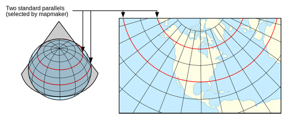
Using the right projections is always important. Smaller areas often require different projections that are most accurate for that view. Official United States maps, for instance, are often represented with the Albers equal-area projection. It’s used by the United States Geological Survey, the Census Bureau and many good news organizations. It’s a conic, equal-area map projection (equal-area projections are those where areas are well preserved) that works well for extended areas in mid-latitudes.
In a conic map we choose two lines that frame the area of interest. It’s derived from the projection of the globe onto a cone placed over it. The cone intersects the globe at the standard lines (parallels) Distortion is minimal between the standard parallels, but increases away from them.

Albers Projection
From GISlounge.com
- How AutaGraph was made
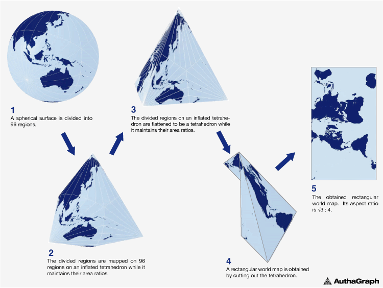
Going back to the AutaGraph map, it was made by equally dividing a sphere into 96 triangles, transferring it to an inflated tetrahedron while maintaining areas proportions and unfolding it to the rectangle. Here is the step-by-step process:
And a TED Talk where Narukawa explains it:
The Autograph projection resembles the Dymaxion map invented in 1946 by Buckmisnter Fuller. The shapes and sizes of continents are fairly accurate, but the oceans are interrupted.

Dymaxion Projection
“AuthaGraph faithfully represents all oceans and continents including the neglected Antarctica,” says Narukawa. “These fit within a rectangular frame with no interruptions. The map can be tessellated without visible seams.”
Although conceptually it’s in the category of equal-area maps, Narukawa admits it needs more work (further subdivisions) to be a true equal-area map. According to his website, the mapping projection was selected by the Japanese National Museum of Emerging Science and innovation (Miraikan) as it official mapping tool and is used in official Japanese high school text books.
- Our take
If the accuracy claims are true (no way these humble bloggers can verify it) it’s a remarkable achievement. As Narukawa points out, it’s less western centric and calls more attention to the poles in light of global warming and future issues like the exploration of Arctic resources, a major geopolitical concern.
But… It’s not a map we can expect will be widely used in the future. We wouldn’t. The orientation and shape is simply too unfamiliar and any thematic content you may display on it would be obscured by the distraction. Among other oddities, the gridlines take odd changes in direction, some shapes (such as Brazil or Alaska’s) seem severely distorted, and Australia appears to be as far from Antarctica as it is from Europe. Good information design is always the one where the content holder (the base map, in this case) recedes and remains invisible to bring forward the content with greater clarity.

