G.H. Davis: a Master of the Cutaway

G.H. Dvis.jpg

In our new book LOOK INSIDE, dedicated to cutaway infographics, there are only two examples (due to space constrains) of the work of one of the most prolific cutaway artists of all time, and perhaps the first to concentrate most of his efforts in this particular kind of explanation graphics: George Horace Davis. Regrettably, he is almost completely forgotten today, and we feel he deserves to be better known.

G.H. Davis was born in London in 1881. He received a formal art education and was already working as a freelance artist before World War I. He served on the Royal Air Force putting his talent to good use creating aerial diagrams for pilot training. After the war he continued his career as a freelance artist specialized on military subjects, and in 1923 he started his 40-year collaboration with the Illustrated London News. By his own estimate he created more than 2,500 pages of illustrations over a 40-year span, many of them consisting of very detailed technical cutaways of military planes, ships, submarines, and tanks.

image-1

image-5

A British mine-laying submarine: detailed drawings of a boat of the Rorqual Class, in use during the Second World War. It carried out a specialised and dangerous task in enemy waters. Date: 1944

A British mine-laying submarine: detailed drawings of a boat of the Rorqual Class, in use during the Second World War. It carried out a specialised and dangerous task in enemy waters. Date: 1944

Most of his illustrations for ILN are black and white paintings, occupying  a full-page or a spread, and sometimes a four-page gatefold. During World War II he created hundreds of paintings revealing the inner workings of about every single plane, ship and tank used by both sides during the conflict.

Besides his work in ILN he collaborated with other British magazines such as Flight and Modern Wonders. In the U.S. Popular Mechanics published his work regularly. He died at age 82 in 1963, and many of his original pieces are preserved in the Imperial War Museum, in London.

image-4

A British mine-laying submarine: detailed drawings of a boat of the Rorqual Class, in use during the Second World War. It carried out a specialised and dangerous task in enemy waters. Date: 1944

A British mine-laying submarine: detailed drawings of a boat of the Rorqual Class, in use during the Second World War. It carried out a specialised and dangerous task in enemy waters. Date: 1944

There is not a lot of information about Davis online. There are good articles about him  here and here. For those interested, It is still possible to find original copies of his illustrations for ILN in Ebay.

LOOK INSIDE will be released this month in the U.S. In Europe it can be ordered already on Gestalten, and in the U.S. can be preordered in Amazon.

The power of cartograms and creating them easily

tilegrams_homepage

We love the power of cartograms to show thematic data maps because they overcome some of the problems of classic choropleth maps. And they can be beautiful. So it’s exciting to see a promising new tool to create nice cartogram hexmaps automatically. It’s called Tilegrams (for “tiled cartograms”) and it has been developed by Pitch Interactive in collaboration with Google News Labs. But let’s back up a little bit, since many people are not familiar with cartograms in the first place!

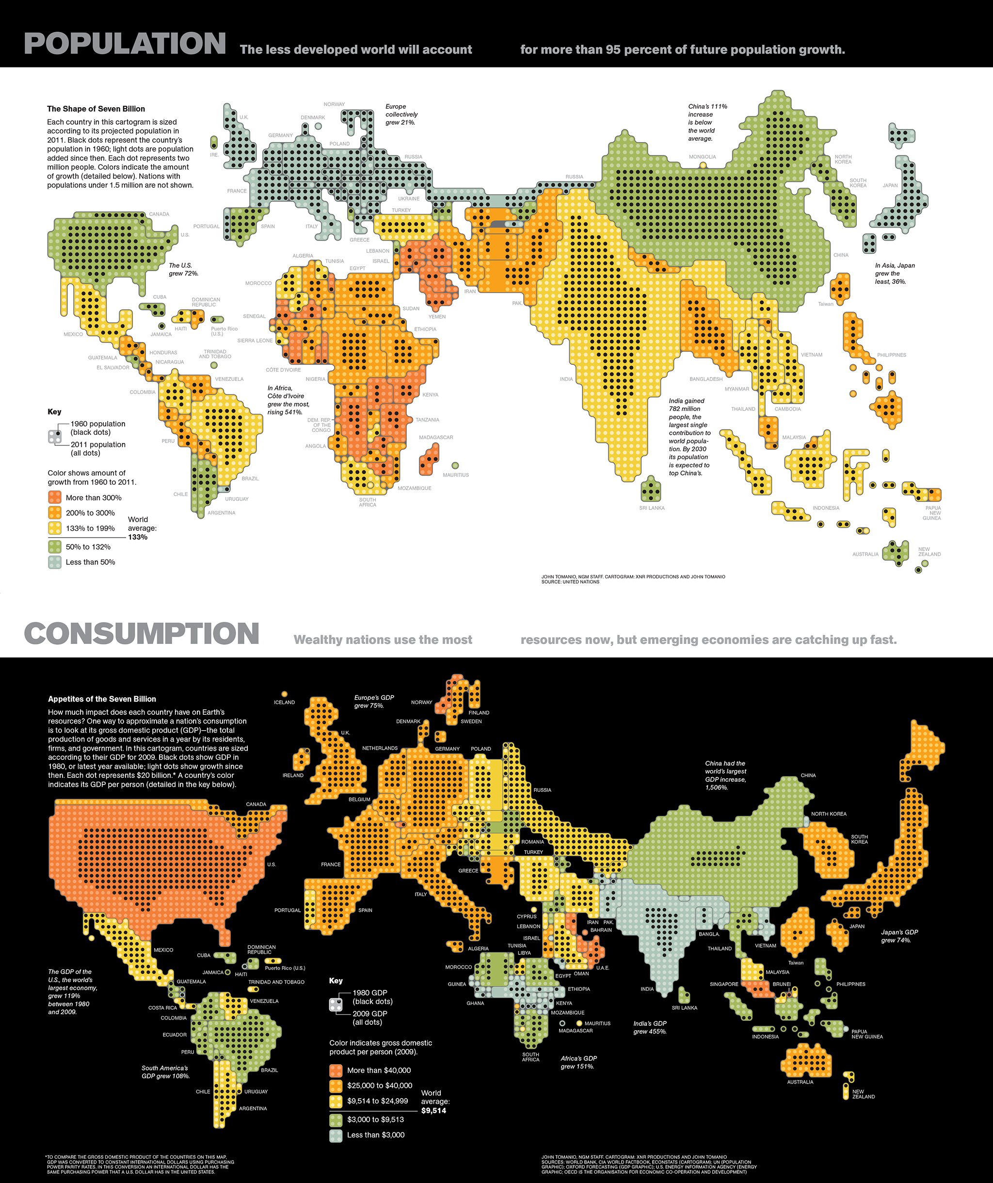
A cartogram is a map that actually functions as a chart by distorting the size of geographic areas (such as countries or states) in proportion to numerical values they represent. Here are two nice examples by John Tomanio, Director of Graphics at National Geographic. In the first map, each dot represents a specific number of people—2 million— living in a country. In the second map, each dot represents $20 billion in GDP for that country, as a proxy for consumption. The dramatic, yet entirely accurate data representation allows two different stories to emerge nicely as we see the relative weight of each country for that particular dataset. That’s the power of cartograms (the black circles here represent the same variables a few decades back, for a nice representation of growth over time).

untitled

You may say “ok, these look a little weird, why not represent these data in a choropleth map, or in other words using different shades of color in a “normal” map?”. Like the example below. Choroplet maps are ubiquitous and, while they are not incorrect, they are seen by many as misleading. They overrepresent the importance or large areas, and diminish the importance of small ones, just by virtue of their size in the page. If I plot GDP for different countries, for example, a large country with a medium value (say Brazil) “lights up” much more prominently than a country with a higher value such as Singapore, simply because Singapore is tiny and hard to see in the map. See a nice video from Vox here explaining the problem with choropleth maps.

Physician_practice_landscape_Final

One solution is to give all entities equal area and then use the choropleth technique (different shades of color represent different values). That’s more fair. But we can only show a few classes or “buckets” of data ranges, rather than precise values in each area.

equalarea

So it may be interesting to resize each area according to the number we want to represent. Some cartograms can be fairly abstract. Instead of using the approximate shapes of countries or states, they use squares, circles or other geometric shapes to represent quantities in highly stylized maps. See this map we did for Fortune, with the number of millionaire households by state in the U.S. (color here represents a second variable, the median household income).

5w-sample-054-america-millionaires1x2

I love this type of cartogram. Here is another one by John Tomanio, a few years ago, for Fortune.

tomanio

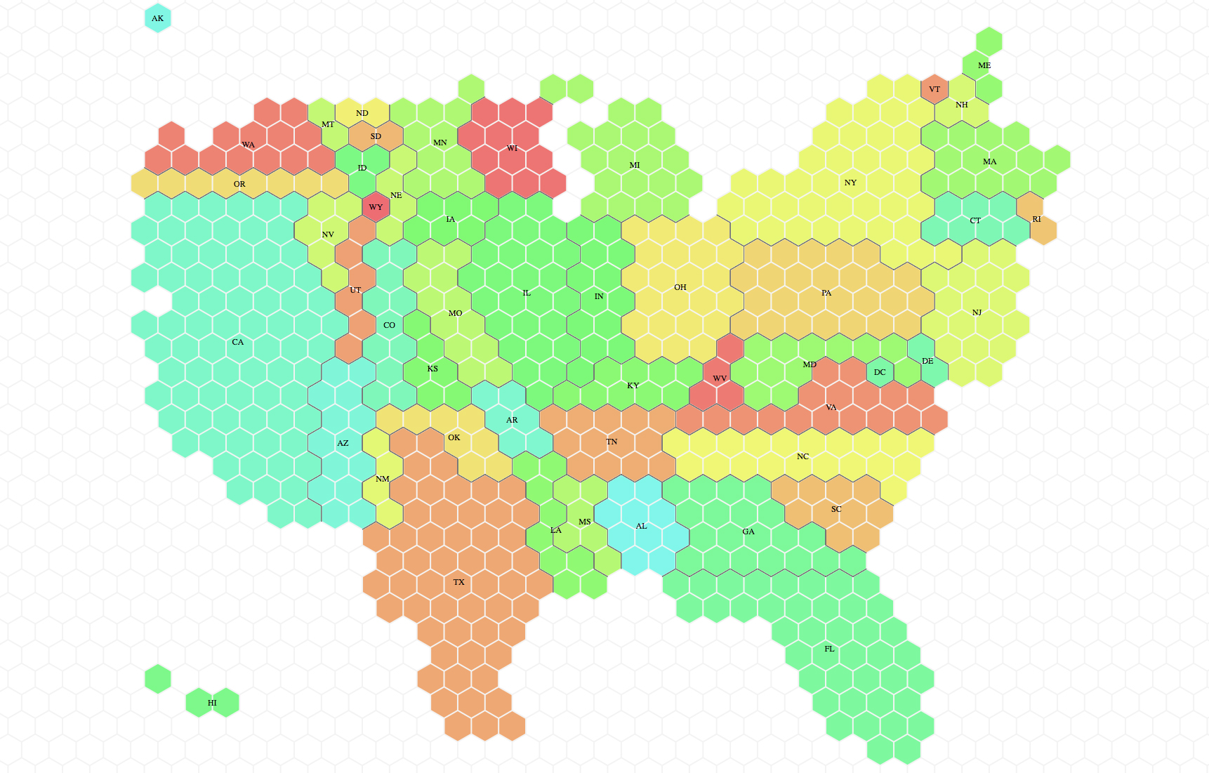
Cartograms can be really striking and powerful. Lately we have seen a comeback, and they were often used by different news organizations in the UK in the recent election cycles. A cartogram of the U.S. can be a nice way to represent that a small state in the East Coast may have many more electoral votes in the general election than a sparsely populated but large Midwest state. Here is the tilegram showing how much each state actually matters (how many electoral votes it holds) in the U.S. Much more telling than showing actual size in the context of election stories! Don’t be misled by how much blue or red you see in typical election maps.

electoralvotes

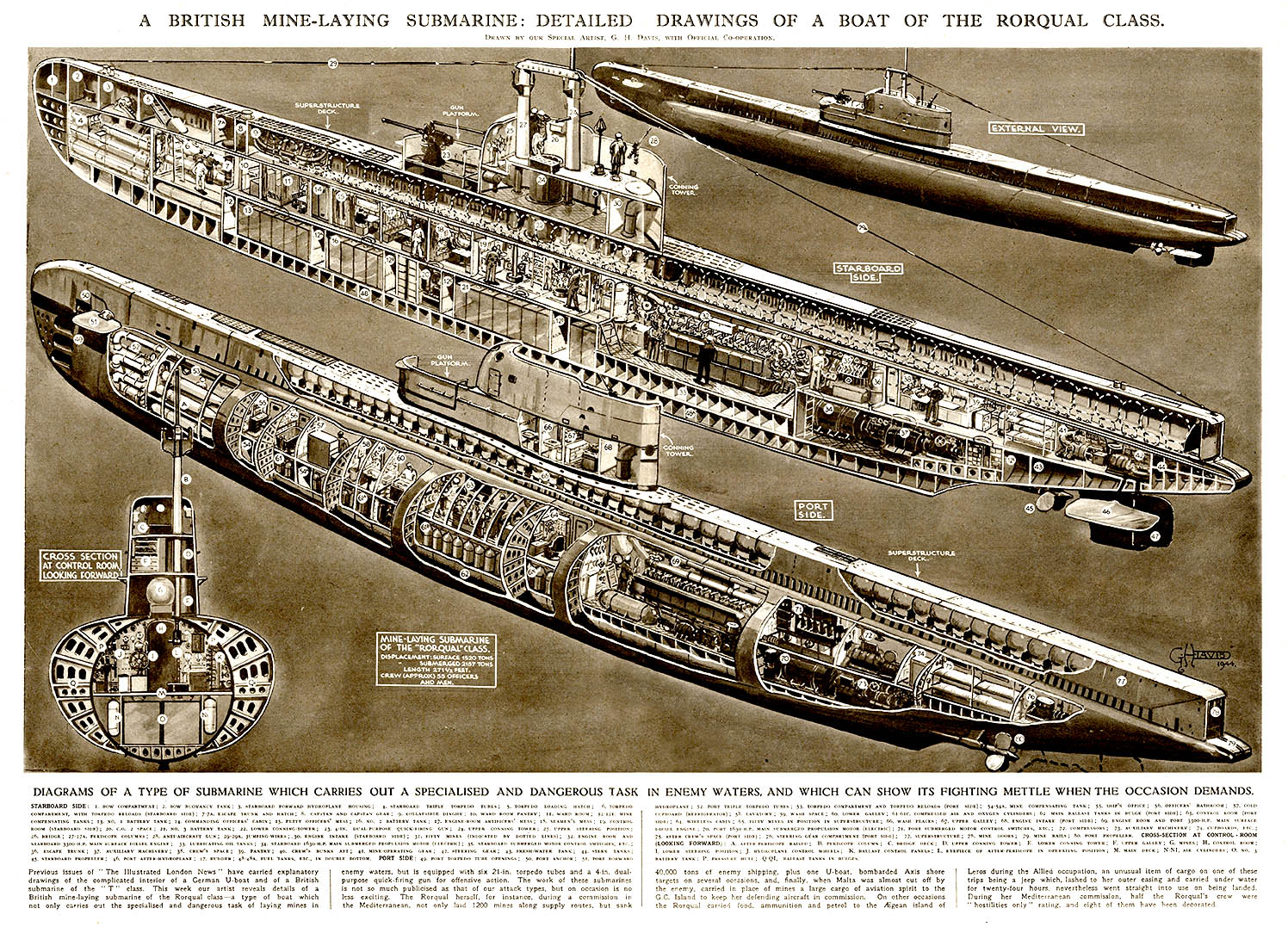
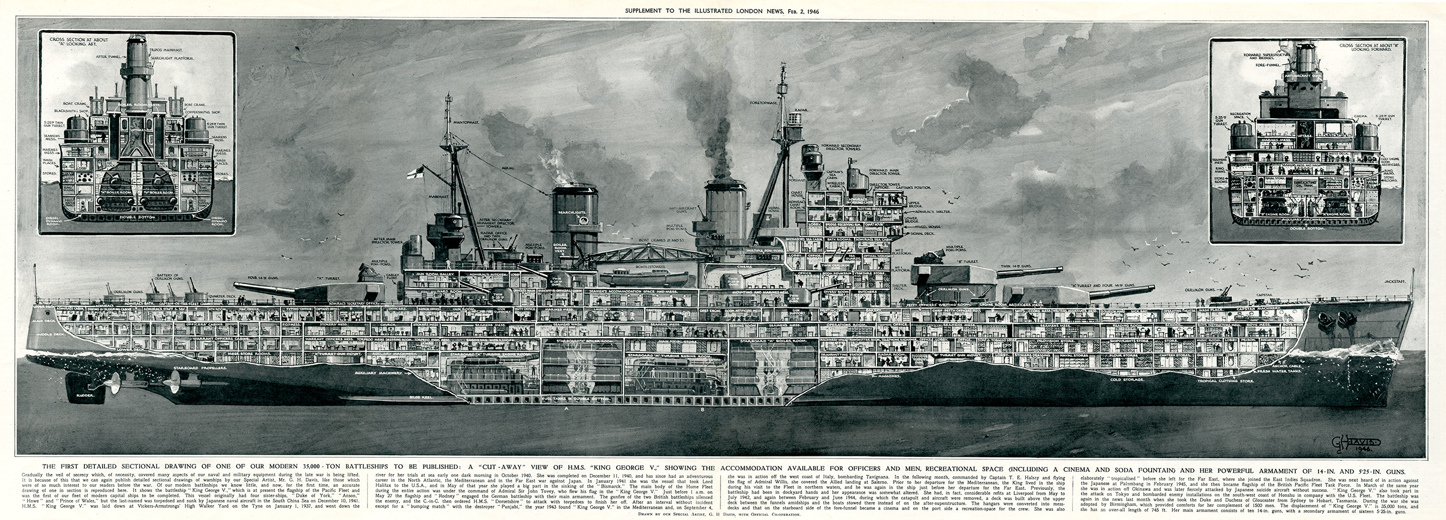
Complex cartograms have been done manually forever, for example in Adobe Illustrator, as in the case of the National Geographic maps. It’s a painstaking process, but human judgement is critical to make sure the composites of little shapes will still resemble the actual map of the area, which is entirely the point if we want to avoid confusion. You have to put them together as a jigsaw puzzle.

We have seen tools that create cartograms working in conjunction with other GIS software tools, but if you ask me, they produce grotesquely deformed maps that are a hard to decipher mess (with that strange fisheye lens effect. You have probably seen them around). I think these are useless:

cartogram_lens

Tilegrams is a really nice concept, still evolving. It plots U.S. maps using hexagon shapes, which are more versatile than squares to assemble them together in adjoining shapes with different configurations. You can use some preloaded maps (electoral votes, population, etc) or load your own data. Tilegrams allows you to show different levels of resolution. For example, the first map below shows U.S. population with 4 million people represented in each tile. The one below shows 300,000 people per tile. As you would expect, the higher resolution allows us to resemble the shape of the U.S. better (but remember states are meant to be oversized or undersized to represent the values, so the unusual proportions are to be expected.

lowres_hires

If the map starts looking a bit too weird you can drag hexagons to move them around. The tool tells the user about the statistical accuracy of each region’s surface area, as it tries to be both accurate and resemble the actual map in a difficult trade-off. You can export the map as a TopoJSON or as a SVG file, a wonderful option since it’s fully editable in Illustrator!

Pitch Interactive explains the tool here, and it continues to develop it. The company is now working on a U.S. county map. It sounds like a daunting task (there are over 3,000 counties in the U.S.). And hopefully one day we can show any country and their divisions in this simple way. I can’t wait to see what they come up with!


The Cutaway Illustrations of Fred Freeman

Collier 3.22.1952-p.30-31-Space Station.jpg
During the two-year research
for our book LOOK INSIDE we discovered many amazing illustrations and artists that, for one reason or another, did not make it into the final version of the book. It would be a pity to leave these forgotten on a drawer, so during the next few weeks we will present here some of these masters of the cutaway.

A while ago we wrote here about Frank Soltesz, an American illustrator active from the 30’s to the 60’s, and author of a marvelous series of architectural cutaways appeared in the Saturday Evening Post. Today we want to pay homage to another artist of the same epoch: Fred Freeman.

Fred Freeman started his career in the 30’s. By this time cutaway illustrations were becoming a tool that popular magazine would often use to covey to their readers detailed information about technical topics. Commercial illustrator were often asked to produce cross-sections and cutaways for various publications, sometimes with striking results.

collier-3-7-1953-p61-training-simulated-space-station-copy

Collier 3.14.1953-Cover-Emergency in space travel.jpg

Fred Freeman was an accomplished American illustrator who designed and illustrated books on naval history, space exploration and other technical subjects. What impressed us most during our research was the wonderful series of cutaway illustrations he created for Collier’s magazine between 1952 and 1954, all of them for the series “Man Will Conquer Space Soon”. The spectacular, full color, spread or full-page illustrations depict in stunning detail cutaways of space stations, spacecraft, space emergency devices, and other aspects of the future of space exploration. The images illustrate the ideas of the then director of the Marshall Space Flight Center, at NASA, Wernher von Braun, a space travel visionary who was already insisting by then on a manned mission to Mars.

It is surprising and disappointing how little information is out there about such a wonderful artist as Fred Freeman. Please let us know if you have any more information about him and we will publish it as an update here.

Collier 3.14.1953-p.43-Emergency in space travel.jpg

Collier 10.18.1952-p57-Spaceship for he Moon-2.jpg

Collier 6.27.1953-p.35-Monkeys in Space.jpg.jpg

Collier 3.7.1953-p62-Training simulated space station.jpg


The new Atlas of Design

img_3766

The latest edition (Volume III) of the Atlas of Design is available for pre-order! The Atlas is an amazing compilation of cartographic design, selected in a worldwide competition by a panel of experts. The range of creative approaches in the 32 maps that make the book presents a wonderful picture of the broad scope of mapmaking styles as well as its challenges. Each map is accompanied by comments from the author, giving us insight about the conception and the ideas behind its creation.

img_3761

img_3767

The book is published every two years by the North American Cartographic Information Society (NACIS) a not-for-profit professional organization for mapmakers. In their words:

The Atlas aims to inspire readers both within the field of cartography and without toward new understandings of design, and of the power that a well-crafted map can have. In an age when more and more mapping tasks are being turned over to computers, the Atlas provides one more answer to the question: What do cartographers do?

I was honored to be asked to write an introductory essay for the book, which I ended noting: “This book is a formidable compilation of beautiful and informative cartography, from classically designed to bold and daring; from hand-drawn gems to multilayered interactive presentations. It is a collection of short stories about the world we live in, each as fascinating and unique as the cartographers who made them”.

When I was Art Director at National Geographic I was lucky to work with some of the best mapmakers in the world (including Ginny Mason, an active force behind the publication of this book), and I was in awe of their skill to achieve beautifully crafted and precise pieces of journalistic storytelling. The work in this compilation speaks to that great skill.

You can preorder the book here. And take a look at some of the work in the previous Volume I and Volume II.

img_3765

img_3760

Form left to right: Co-editors Marty Elmer and Sam Matthews, and assistant editor Ginny Mason


Our book LOOK INSIDE in Wired.com

Screen Shot 2016-10-18 at 10.02.41 AM.png©Nick Kaloterakis / Collected


Margaret Rhodes has written a great review of our book LOOK INSIDE at Wired.com, and we can’t be more pleased with it. The article, titled LOOK INSIDE: A SPECTACULAR COLLECTION OF CUTAWAY INFOGRAPHICS, includes a nice gallery of images from the book.

Margaret called us a few days ago and we talked a few minutes about the book:

“From the beginning the idea was to make not only a collection of scientific infographics, but show the whole range of how different artists are using these types of illustrations,” says designer Juan Velasco, who curated the book with his brother, Samuel. (The two also co-founded information design studio 5W Infographics.) Together, the pair began collecting visualizations for the book two years ago, after realizing no such compilation existed.

The result is an exquisite assortment of cross sectional, transparent, and exploded-view cutaways that crisscrosses both history and subject matter. The book traces the earliest evidence of the genre to the Arnhem Land region in northern Australia. There, 28,000 years ago, Aboriginal inhabitants painted diagrams of humans and animals on cave walls, deconstructing their subjects into bones, organs, and muscles. “They are most certainly the first cutaway illustrations ever created,” the Velascos write.

BOOK IMAGE.jpg©Gestalten


Screen Shot 2016-10-18 at 9.41.31 AM.png©Nychos


Screen Shot 2016-10-18 at 9.42.01 AM.png
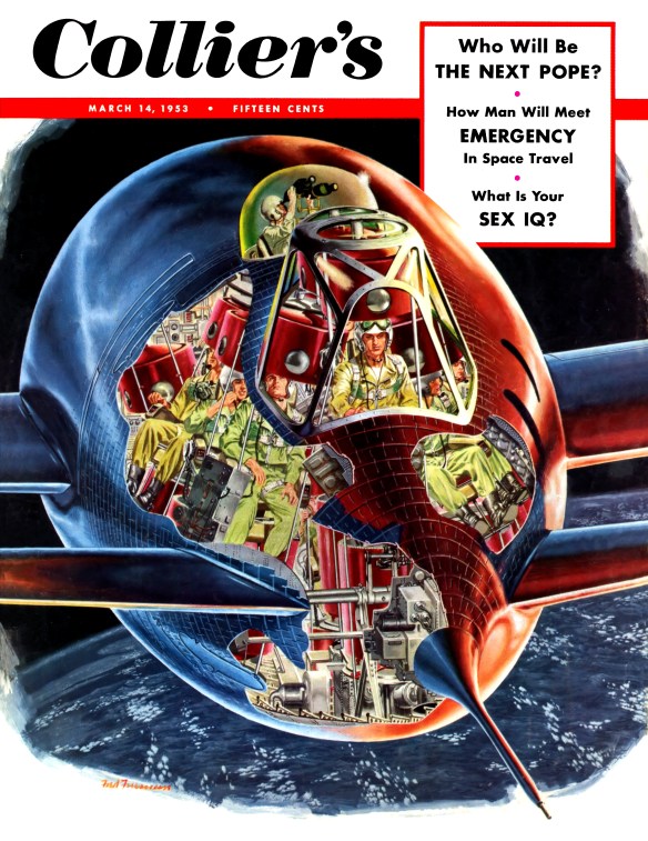
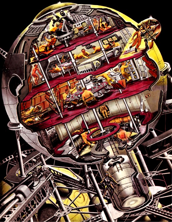
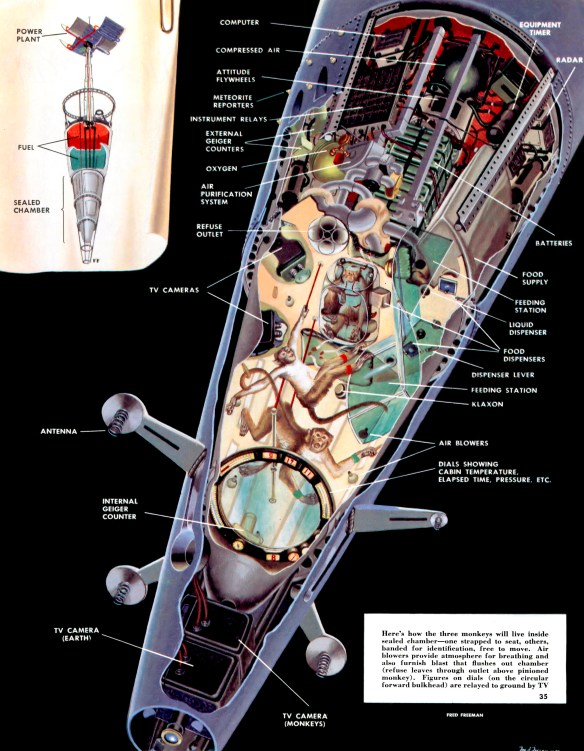
©National Geographic


LOOK INSIDE  is ready to ship in Europe in the Gestalten’s website. It will be available in the U.S. in November 21 and can be preordered already in Amazon.com.

Thanks Margaret!

Our updated Pinterest and Instagram pages

It’s been a while since we last updated our samples online, so we thought this would be a good time to do it. Check out our Pinterest page for a more complete set of samples of our infographics (including recent ones). You’ll also find a few additional boards with other infographics and images we like.

pinterest5w2

pinterest5w

We also have a new account in Instagram (@5winfographics) where we plan to add not only our infographics but other images from our workshops, trips, process, etc.

To complete the roundup of our social media presence, you can follow us on Twitter (@5Winfographics), Facebook and Linkedin

As for our main site, we are planning to update the samples section in the next few weeks as well. If you are looking for news about our infographics / data visualization workshops and training, please visit our 5W Consulting page, or email us: contact@5wgraphics.com.

instagram

Our new book: “LOOK INSIDE” coming out this month


Cover.jpg

Two years ago, we had the idea of putting together a book about cutaway illustrations, one of our favorite kind of infographics. It would be a showcase of the best, most beautiful and fascinating cutaway illustrations ever created, from historical times to now. It would include not only cutaways, but also cross sections, and exploded views. We pitched the idea to Gestalten, a leading international publisher of graphic books in Germany. We had contributed with a few infographics to some of their books before, and we thought they may be interested. They loved the idea!. We have been working together with Gestalten for the last two years putting together this book. Its title is “LOOK INSIDE: Cutaway Illustrations and Visual Storytelling“, and we are proud to announce it will be released this month in Europe, and in November in the U.S. It is, we believe, the first of its kind, showcasing exclusively cutaways, cross sections and exploded views.

lookinside4Cross Section of the SS Bessemer


Lookinside1.pngFender Jaguar, exploded view, by Vladimir Andreev


Lookinside2.png
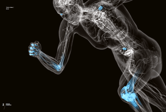
Bionic Woman, by Bryan Christie


Lookinside3.pngFeline Anatomy, by Raymond Biesinger

All images from Look Inside, Copyright Gestalten 2016


Gestalten did a fantastic design job and the book itself looks great. It is a large (9.6 x 13 inches) hardcover volume, 256 pages long, choke-full of gorgeous illustrations, and includes several spectacular gatefolds. As for the contents, the book celebrate cutaways in all their variety and richness, from the renaissance engravings of the mystic-scientist Athanasius Kircher, to today’s 3D, X-Ray-like anatomical views of Bryan Christie. Cutaways, exploded views, and cross sections, are explored across a wide range of applications and disciplines. Architectural renderings, anatomical illustrations, machine diagrams, and even fantasy illustrations are just a few of the various subjects presentes in this compilation.

We are so excited about this! We hope you have as much fun with this book as we had making it. The book will be ready for preorder in a few days in Gestalten’s website.