Working with ProPublica

Although this is a belated post, we didn’t want to forget mentioning our recent collaboration with ProPublica. If you haven’t heard about them, ProPublica define themselves as a “non-profit newsroom that produces investigative journalism in the public interest”. Founded in 2007, it was the first online news source to win a Pulitzer Prize in 2010 (they won another in 2011). The quality of their reporting is superb. Propublica often partners with major news organizations, offering their stories for free.

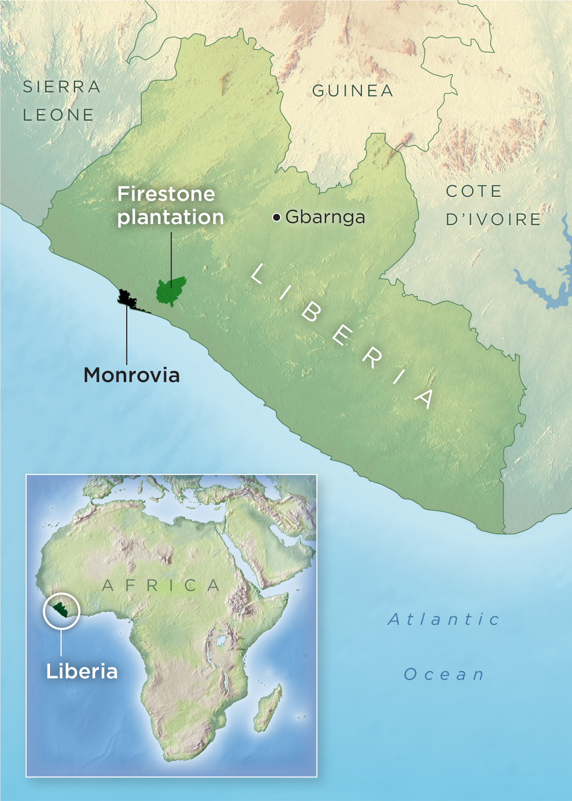
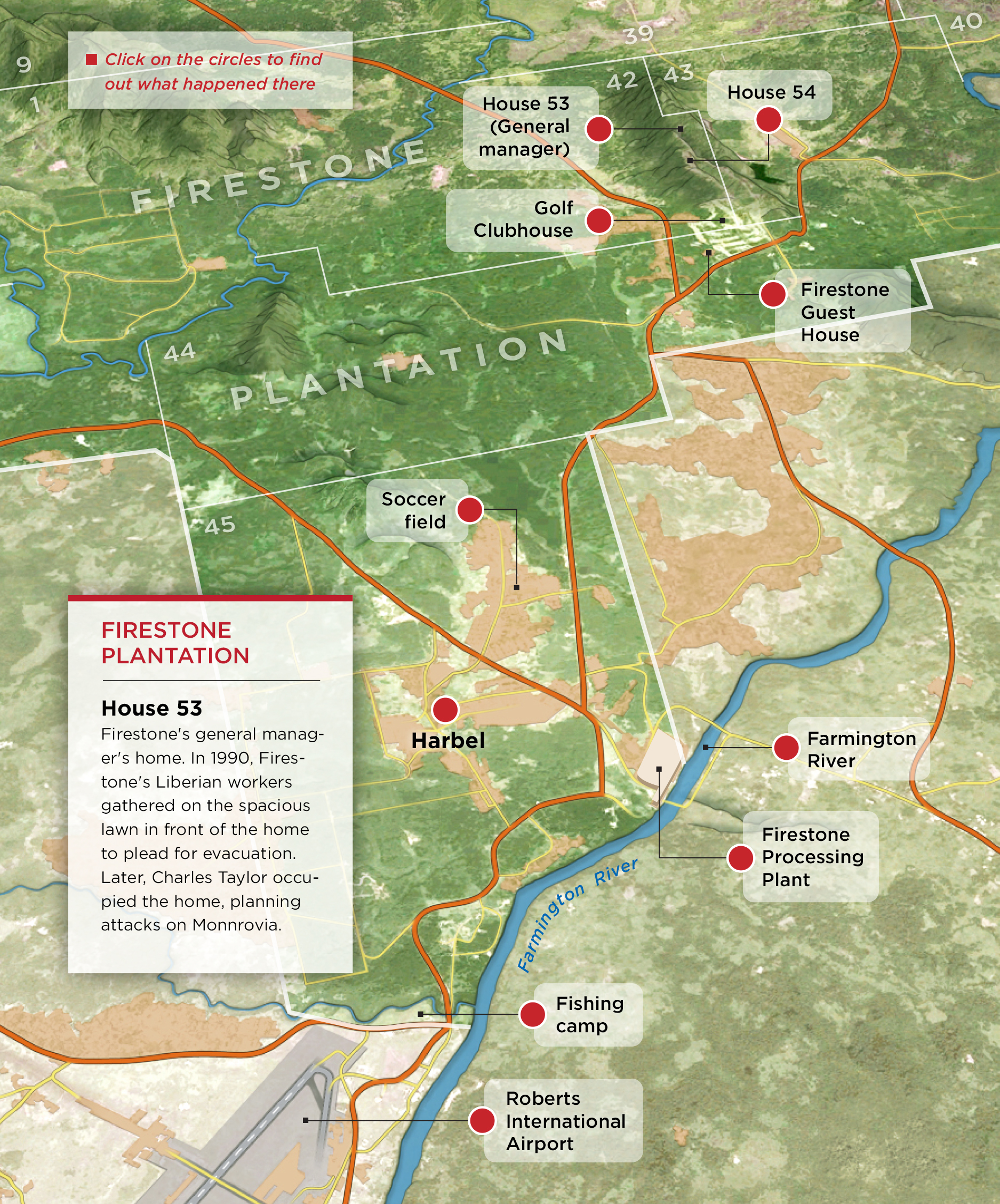
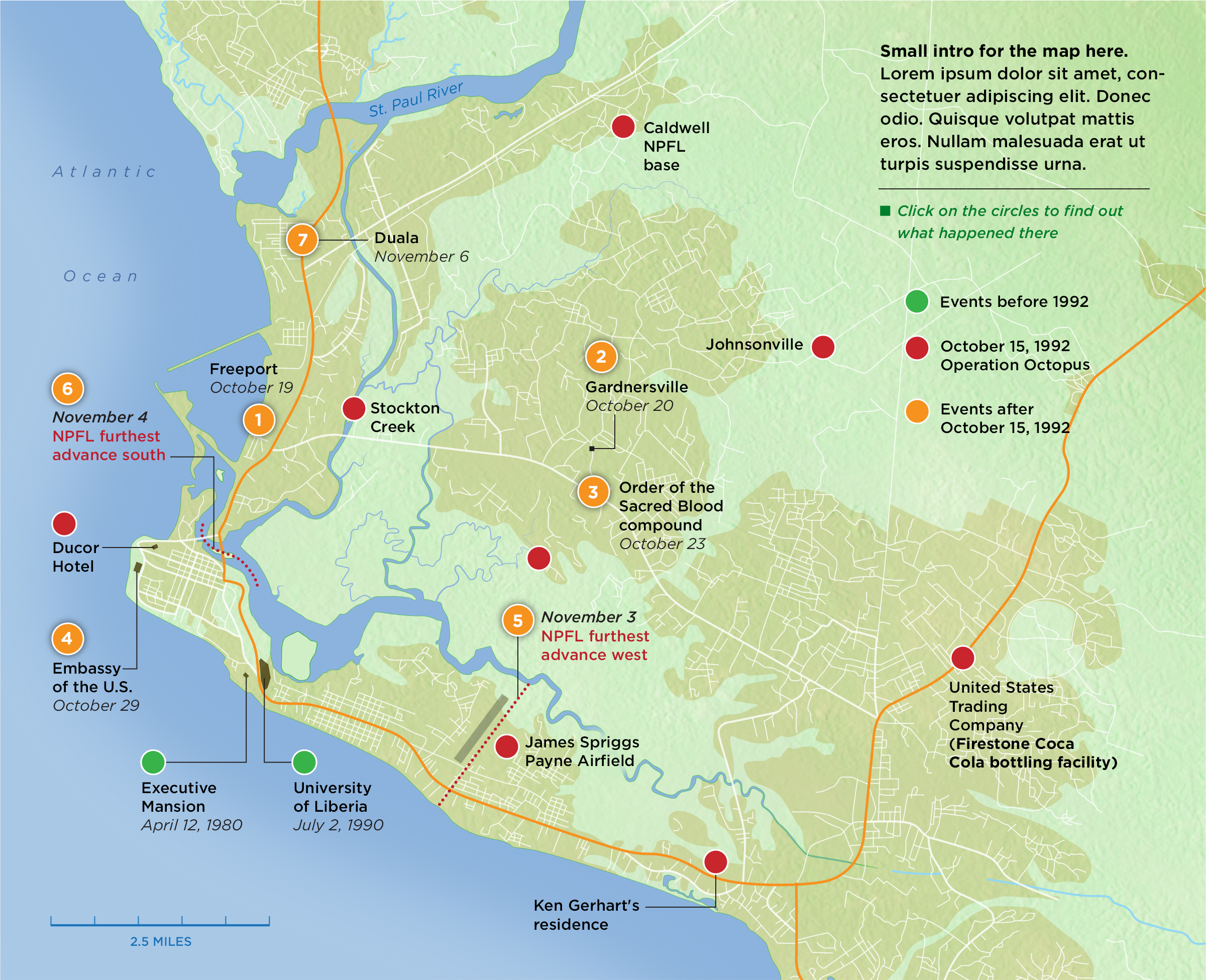
Last November they published one of their most ambitious stories to date: Firestone and the Warlord is an investigation report on the unexamined role of an iconic American company in the rise to power of Charles Taylor, a murderous politician in one of Africa’s most volatile and vulnerable countries. Firestone, owner of the largest rubber plantation in the world in Liberia, provided Taylor with resources and international legitimacy in exchange for his protection and safeguarding of the plantation. In 2003, Taylor was indicted by an international tribunal to 50 years in prison for crimes against humanity.

Opener_article

PrintThe story was written by T. Christian Miller and Jonathan Jones and took several years to report, including over 200 interviews. It’s as good as long-form investigative reporting gets.

We did four maps for the story, including a locator and three interactive maps: The Firestone plantation and two detailed maps showing Charles Taylor’s rebel army attack on Monrovia from the plantation (best viewed with Chrome).


Mapa Liberia

Print

Silueta mapa Monrovia

ProPublica has created great multimedia visualizations before (see Alberto Cairo’s article on their Louisiana coastline project here) and they are definitely an organization to follow closely.

Workshop in Chennai, India

Vadapalani_Murugan_Temple_Chennai_18204

I’ll be teaching an information graphics workshop in Chennai, India, on January 22 and 23. It will be a hands-on event for designers, editors, and anyone interested in information design and data visualization. The workshop is organized by WAN-IFRA, the World Association of Newspapers and News Publishers. This is our first venture in India, a vibrant market where dailies (especially the popular vernacular press in Hindi, Malayalam, Marathi and Telugu) are growing strongly, proving the newspaper crisis is far from universal. The Times of India, an English language newspaper, has a circulation of over 3.3 million copies daily. However, the transition to digital is being quite slow, and even more so in the case of infographics. I’m curious to see the situation first-hand. I’ll report back!

Out now: Understanding the World, The Atlas of Infographics

Taschen’s new large format book on infographics has been out in the U.S. for a few days. The luxurious volume, by Sandra Rendgen and editor Julius Wiedemann, follows the same format as the Information Graphics volume published in 2012. The new book includes 280 contemporary and vintage visualizations, including seven fold-out spreads.

Cover 2

The book is structured in several chapters

index

We are proud Sandra (whom I had the pleasure to meet a couple of times in Washington and in Berlin) chose our “Cosmic Journeys” graphic for National Geographic as one of the 4-page foldouts. The graphic has been showcased and reprinted numerous times but we gasped in awe when we saw it at this size, and in such fantastic paper!

Unfolded space

Personally, I was also also happy to see a piece I did a few years ago at National Geographic. It’s an infographic explaining the latest science on how memory works. A lot of research went into it. Bruce Morser created the amazing art.

Memory 2

The introduction of the book features an interesting new graphic by Nigel Holmes. In his classic style of clean illustration and excellent step-by-step explanation, Nigel looks at the history of information visualization and the changing data landscape, and attempts to bring some light to an always murky issue: what are the differences between information graphics and data visualization?

Nigel Holmes graphic 2

The selection in the book and the top quality production of Understanding the World make it an essential addition to any infographics library.

5W in the pages of Nature

We just finished a new infographic for Nature. The London-based weekly, interdisciplinary scientific journal is the most cited and surely one of the most respected scientific journals in the world. The nirvana of scientists trying to publish their peer-reviewed research articles. Needless to say, at 5W we had always wanted to work with Nature’s team, and we were thrilled to receive an assignment from Kelly Krause, the Creative Director.

nature cover

The graphic is about the loss of biodiversity in the world. We visualized threatened species as well as how many species exist and how many are already extinct. More than 90% of the species that have populated Earth during the past four billion years are gone, many of them in mass extinctions. So what remains? A story difficult to visualize due to the extreme uncertainty associated with much of the available data.

Samuel at 5W worked with Kelly and with editor Rich Monastersky. As expected, Nature standards for the quality and accuracy of the research are at the absolute top, and we went through multiple sketches trying to balance the gaps and uncertainties in the data (for instance, the range of estimates for number of species alive and threatened shows huge variation) with the need for high visual impact.

Here is the finished graphic (click for a full resolution image):

NatureThreatenedSpecies

And the interactive version (scroll down in this page):

Thhreatened Species interactive

Nature has a fantastic blog called Nature Graphics. Kelly and her team explain the creative process, background and design challenges behind their information graphics. A must follow for anyone interested in how data, research, design and graphics come together. Their newest entry explains a bit more about our graphic.

Nature blog

By the way, I just discovered this cool Pinterest board with a great selection Nature covers:

Nature Pinterest

Five infographics workshops in South East Asia

South East Asian newspapers

I have recently spent over three weeks teaching five infographics workshops in South East Asia in association with WAN-IFRA, the World Association of Newspapers and News Publishers. Quite a trip!

Below the Petronas Towers

The schedule included in-house training for the staff of several news organizations (The Bangkok Post newspaper, The Manila Bulletin newspaper and Astro Awani, a major television and online organization based in Kuala Lumpur, Malaysia). I also had two public workshops in Singapore (which included staff from The Straits Times) and in Jakarta, Indonesia.

At the Manila workshop

At the Manila workshop

Some hand sketching in Manila

Hand-sketching smarthpone graphics in Manila

Most of the workshops focused on interactive graphics, data visualization and the print-to-web challenge, but there was also a lot of content on print infographics and even print layout design. Luckily, in most cases the attendee list included chief editors from the media organizations. The reality at a global scale is that most editors still assign graphics as decorative elements to make pages “pretty”. They often need a better understanding of how data visualization, process diagrams, or smart thematic mapping can elevate the journalistic quality of their publication while making it more visually engaging. Graphics departments are little more than service sections receiving assignments and not being used as visual journalists that generate and research infographics ideas.

Group Photo at Astro Awani

Group Photo at Astro Awani

I took the opportunity to better understand the media landscape in the region (where print newspapers are often still growing) and the status of infographics. The Bangkok Post is one of the two major English-language newspapers in Bangkok, and the Manila Bulletin is the largest and oldest newspaper in the Philippines. Both publications have very skilled artists but they are still trying to find their way in the creation of good data-driven infographics.

I would say the biggest surprise was Kompas, the leading newspaper of Indonesia (the surprise only reveals my previous ignorance). The design of this daily (both Mario Garcia and Roger Black made redesigns in the past) is every bit as good as any of the major European newspapers, and so are the excellent graphics. I also liked The Straits Times from Singapore, but that wasn’t a surprise as I had seen their good graphics before.

Next January, 5W will be conducting new workshops with WAN-IFRA in India and coming back to Singapore in association with German publishers Gestalten and local design think tank Methodology. In the meantime, I need some rest after visiting 5 countries in 23 days!

A rent vehicle in Manila... and driver

A vehicle for rent in Manila… and driver


RevSquare interviews us

RevSquare Interview

Our friends at RevSquare interviewed us about the state of the infographics industry, future trends, and our own personal involvement with this fascinating field. You can read the interview on their site and, while you are there, check out the amazing job these guys are doing. Thanks Rebecca! Thanks Jeff!

New Book: Infographic Designers’ Sketchbook

Heller-book-1
A few months ago I got an email from the great Steven Heller. He was preparing a new book (not really a surprise!) for his sketchbooks series. He has already published sketchbooks books for typography, graphics design, and comics. This time the book was going to be about the sketches of Infographic artists, and he would like to include some of my own, and of other members of 5W. I felt very honored. I never thought much of my own sketches, and often I get rid of them after a job is finished. But I got to work, found a few I did not dislike too much, and sent them to Steven.
 
The book, titled Infographic Designer’s Sketchbooks, by Steven Heller and Rick Landers, has just been published. It is a magnificent large tome, 350 pages long, lavishly illustrated with the most beautiful graphics and, to my surprise and delight, it dedicates six pages to us (see pictures below). It showcases  the sketches and finished work of more than 70 infographic artists from the U.S., Italy, Germany, U.K., France, The Netherlands, Ireland, Spain, Slovenia, and South Korea. It includes classics such as John Grimwade, Nigel Holmes and Massimo Vignelli. 
 
Browsing through this book is the closest thing to be inside an Infographic artist’s head. Artists sketches are the immediate, unadulterated product of the act of creation, and looking and these you can almost hear the creativity cranking up. 
 
This book will be agreat addition to your infographics book collection. 
Heller-book-2
Heller-book-3
Heller-book-4

Odd visualization: 3D crowd simulation

This is cool, fascinating, hilarious, and oddly hypnotic, all at the same time; therefore we are compelled to share it. It is a short movie created by Dave Fothergill to test a software called Miarmy. Miarmy is used, together with a 3D animation platform (Maya, in this case) to generate animated crowds (remember the zombies in World War Z?). Would’t this be useful for a visualization of the behaviors of crowds under different circumstances?


Three out of 310 million people, visualized

The Washington Post ran a very surprising infographic yesterday. See it here. Visual comparisons of different amounts are always an effective tool. I’ve seen dot density graphics (or however you may want to call them) representing large amounts, but I don’t think I’ve seen anyone trying to visualize 310 million individual shapes (the whole population of the United States).

The goal of the graphic is to challenge the reader to find the three people infected with Ebola in the country (two nurses that tended to Thomas Eric Duncan and were infected by him, and Duncan himself, killed by the virus). Here you can see a tiny portion. You’ll need a coffee, snacks and a robust finger to scroll through the entire thing.

Washington_Post Ebola

At first I found myself irritated by the endless scrolling and the inability to find the three red dots. I also didn’t think it was a good idea to establish a comparison without being able to visualize the whole dataset at once rather than parts of it as you scroll (I wonder what they did in print). But then I thought not finding the dots regardless of how much you scroll was precisely the point the Post is trying to make: to show Ebola in the U.S. is a non-issue. A good response to the hysterical media coverage we have seen so far. By the way, here is an article from Vox.com ranking threats to Americans by actual threat rather than media hype (a highly un-scientific ranking, as they admit).

So now I kind of like the Post graphic! What do you think?


Found graphics: Starbucks

Starbucks wall chartWhen confronted with all the varieties of coffees offered at Starbucks I was always confused (and unwilling to carry out any serious research on the topic) about which one is bolder or milder, and how they stand with respect each other. Not any more. This morning, our local branch solved all my doubts with… a wall chart! Thank you, Starbucks.