Reclaiming the word “Infographics”, once again

Infographic elements

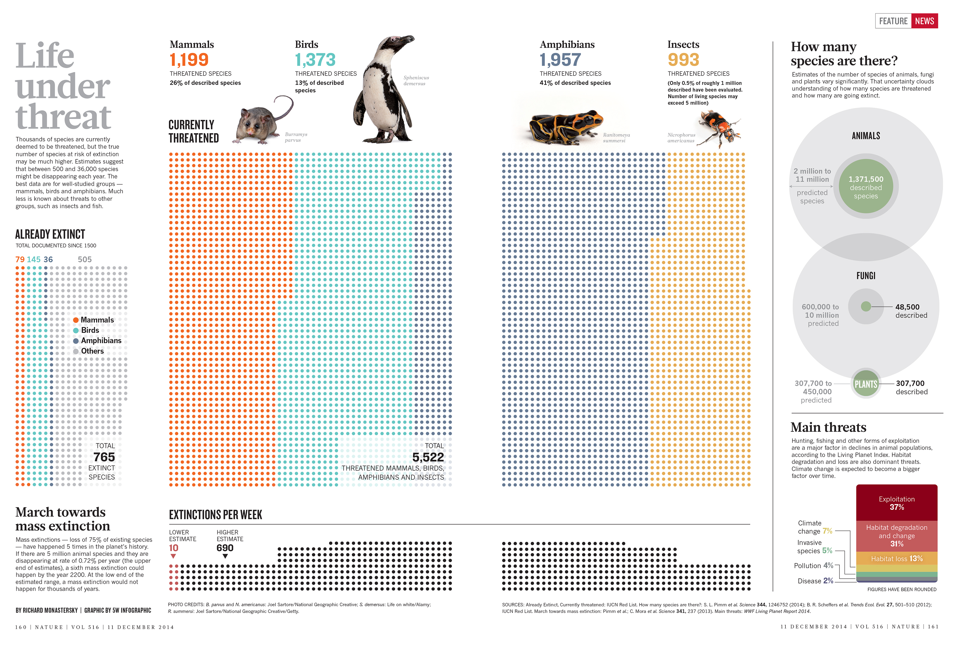
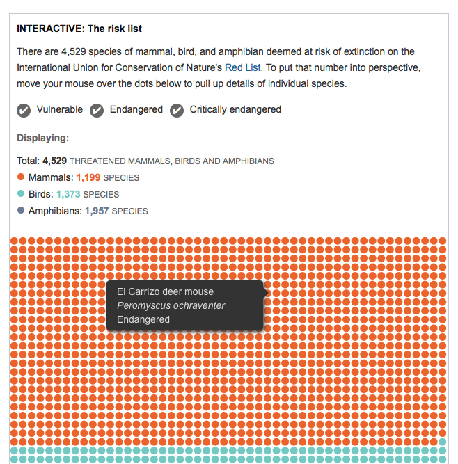
Recently I rediscovered an old entry in Alberto Cairo’s blog titled “Reclaiming the word “Infographics””. It resonates strongly with my own thoughts on the matter. I have been creating infographics for 25 years now, and the word has always meant to me a blend of information, design and illustration, in which the graphic part’s (the design and the illustration) mission is to convey the information in a more illuminating and revealing way than words alone could accomplish. It is fundamentally a branch of journalism. The work that The New York Times, National Geographic, or Scientific American, among many others, are doing in this respect are prime examples of splendid infographics.

In the last few years “the term “infographics” has been hijacked”, as Cairo puts it. Instead of denoting a branch of journalism, the word is now used more and more often to refer to graphic displays that serve not journalism, but marketing. These “infographics” are often created with the (foolish) declared goal of becoming “viral” online, and, as a rule, the images are used not to convey information, but to decorate. They use graphic resources typical of the more serious, journalistic infographics, such as charts, arrows, and maps, to decorate information often chosen randomly with the only purpose to justify the presence of that very chart, arrow, or map.

You can find online thousands of “infographic elements” packs, collections of predesigned “infographic looking” graphic elements, that allow you to put together an “infographic” with minimal effort. You can (perhaps) find some information later to squeeze into your graphic. This is, almost exactly, the opposite of what I call an infographic. They represent a complete trivialization of the exacting and fascinating craft I have been practicing for many years.

SND Digital Awards and upcoming conferences

Print

The Society for News Design (SND) has just announced some of the winners of their “Best of Digital Design” competition. Stay tuned for a complete database of winners and the nominations for the World’s Best awards (the winners will be announced on April 11 at the SND’s annual workshop in Washington, D.C.

Here is a partial list with the Gold and Silver medals. All the usual suspects are represented, with awards going to The New York Times, ProPublica, National Geographic, Los Angeles Times, NPR and more.

We haven’t had a chance to look at all the winners, but we were really happy to see one of our favorite pieces of the year has been awarded. It was illustrator Christoph Niemann’s very original story on the Brazil World Cup and the famous “Curse of Maracaná” of the 1950 tournament, for The New York Times.

CurseMaracana

We’ll be involved in the judging of the parallel Student Society of News Design competition.

Other important events in media design, graphics and data storytelling are coming up in the next few weeks:

The Tapestry Data Storytelling Conference is a one day event by invitation only in Athens, Georgia. It will take place on March 4. Here are the attendees (they like to keep it to about 100 people) and a link to request an invitation.

The main event in the world of infographics is also just a few days away. The 23rd Malofiej infographics conference and awards will take place at the University of Navarra in Pamplona (Spain) on March 18-20. The conference is preceded by the Show Don’t Tell workshop, led by instructors John Griwmade, Alberto Cairo and Geoff McGhee (I won’t be an instructor this year).

OpenVis, a highly recommended web data visualization conference takes place on April 6-7 in Boston. I was the closing keynote speaker in 2013 and really enjoyed the event.

Finally, the Asian Media Awards 2015 will take place on April 28-30, in Bangkok. They are organized by The World Association of Newspapers and News Publishers (WAN-IFRA). We’ll follow this one closely as we are working more and more with Asian media, and we’ll be involved in the judging as well.


Working with ProPublica

Although this is a belated post, we didn’t want to forget mentioning our recent collaboration with ProPublica. If you haven’t heard about them, ProPublica define themselves as a “non-profit newsroom that produces investigative journalism in the public interest”. Founded in 2007, it was the first online news source to win a Pulitzer Prize in 2010 (they won another in 2011). The quality of their reporting is superb. Propublica often partners with major news organizations, offering their stories for free.

Last November they published one of their most ambitious stories to date: Firestone and the Warlord is an investigation report on the unexamined role of an iconic American company in the rise to power of Charles Taylor, a murderous politician in one of Africa’s most volatile and vulnerable countries. Firestone, owner of the largest rubber plantation in the world in Liberia, provided Taylor with resources and international legitimacy in exchange for his protection and safeguarding of the plantation. In 2003, Taylor was indicted by an international tribunal to 50 years in prison for crimes against humanity.

Opener_article

PrintThe story was written by T. Christian Miller and Jonathan Jones and took several years to report, including over 200 interviews. It’s as good as long-form investigative reporting gets.

We did four maps for the story, including a locator and three interactive maps: The Firestone plantation and two detailed maps showing Charles Taylor’s rebel army attack on Monrovia from the plantation (best viewed with Chrome).


Mapa Liberia

Print

Silueta mapa Monrovia

ProPublica has created great multimedia visualizations before (see Alberto Cairo’s article on their Louisiana coastline project here) and they are definitely an organization to follow closely.

Out now: Understanding the World, The Atlas of Infographics

Taschen’s new large format book on infographics has been out in the U.S. for a few days. The luxurious volume, by Sandra Rendgen and editor Julius Wiedemann, follows the same format as the Information Graphics volume published in 2012. The new book includes 280 contemporary and vintage visualizations, including seven fold-out spreads.

Cover 2

The book is structured in several chapters

index

We are proud Sandra (whom I had the pleasure to meet a couple of times in Washington and in Berlin) chose our “Cosmic Journeys” graphic for National Geographic as one of the 4-page foldouts. The graphic has been showcased and reprinted numerous times but we gasped in awe when we saw it at this size, and in such fantastic paper!

Unfolded space

Personally, I was also also happy to see a piece I did a few years ago at National Geographic. It’s an infographic explaining the latest science on how memory works. A lot of research went into it. Bruce Morser created the amazing art.

Memory 2

The introduction of the book features an interesting new graphic by Nigel Holmes. In his classic style of clean illustration and excellent step-by-step explanation, Nigel looks at the history of information visualization and the changing data landscape, and attempts to bring some light to an always murky issue: what are the differences between information graphics and data visualization?

Nigel Holmes graphic 2

The selection in the book and the top quality production of Understanding the World make it an essential addition to any infographics library.

5W in the pages of Nature

We just finished a new infographic for Nature. The London-based weekly, interdisciplinary scientific journal is the most cited and surely one of the most respected scientific journals in the world. The nirvana of scientists trying to publish their peer-reviewed research articles. Needless to say, at 5W we had always wanted to work with Nature’s team, and we were thrilled to receive an assignment from Kelly Krause, the Creative Director.

nature cover

The graphic is about the loss of biodiversity in the world. We visualized threatened species as well as how many species exist and how many are already extinct. More than 90% of the species that have populated Earth during the past four billion years are gone, many of them in mass extinctions. So what remains? A story difficult to visualize due to the extreme uncertainty associated with much of the available data.

Samuel at 5W worked with Kelly and with editor Rich Monastersky. As expected, Nature standards for the quality and accuracy of the research are at the absolute top, and we went through multiple sketches trying to balance the gaps and uncertainties in the data (for instance, the range of estimates for number of species alive and threatened shows huge variation) with the need for high visual impact.

Here is the finished graphic (click for a full resolution image):

NatureThreatenedSpecies

And the interactive version (scroll down in this page):

Thhreatened Species interactive

Nature has a fantastic blog called Nature Graphics. Kelly and her team explain the creative process, background and design challenges behind their information graphics. A must follow for anyone interested in how data, research, design and graphics come together. Their newest entry explains a bit more about our graphic.

Nature blog

By the way, I just discovered this cool Pinterest board with a great selection Nature covers:

Nature Pinterest

RevSquare interviews us

RevSquare Interview

Our friends at RevSquare interviewed us about the state of the infographics industry, future trends, and our own personal involvement with this fascinating field. You can read the interview on their site and, while you are there, check out the amazing job these guys are doing. Thanks Rebecca! Thanks Jeff!

New Book: Infographic Designers’ Sketchbook

Heller-book-1
A few months ago I got an email from the great Steven Heller. He was preparing a new book (not really a surprise!) for his sketchbooks series. He has already published sketchbooks books for typography, graphics design, and comics. This time the book was going to be about the sketches of Infographic artists, and he would like to include some of my own, and of other members of 5W. I felt very honored. I never thought much of my own sketches, and often I get rid of them after a job is finished. But I got to work, found a few I did not dislike too much, and sent them to Steven.
 
The book, titled Infographic Designer’s Sketchbooks, by Steven Heller and Rick Landers, has just been published. It is a magnificent large tome, 350 pages long, lavishly illustrated with the most beautiful graphics and, to my surprise and delight, it dedicates six pages to us (see pictures below). It showcases  the sketches and finished work of more than 70 infographic artists from the U.S., Italy, Germany, U.K., France, The Netherlands, Ireland, Spain, Slovenia, and South Korea. It includes classics such as John Grimwade, Nigel Holmes and Massimo Vignelli. 
 
Browsing through this book is the closest thing to be inside an Infographic artist’s head. Artists sketches are the immediate, unadulterated product of the act of creation, and looking and these you can almost hear the creativity cranking up. 
 
This book will be agreat addition to your infographics book collection. 
Heller-book-2
Heller-book-3
Heller-book-4

Odd visualization: 3D crowd simulation

This is cool, fascinating, hilarious, and oddly hypnotic, all at the same time; therefore we are compelled to share it. It is a short movie created by Dave Fothergill to test a software called Miarmy. Miarmy is used, together with a 3D animation platform (Maya, in this case) to generate animated crowds (remember the zombies in World War Z?). Would’t this be useful for a visualization of the behaviors of crowds under different circumstances?


Three out of 310 million people, visualized

The Washington Post ran a very surprising infographic yesterday. See it here. Visual comparisons of different amounts are always an effective tool. I’ve seen dot density graphics (or however you may want to call them) representing large amounts, but I don’t think I’ve seen anyone trying to visualize 310 million individual shapes (the whole population of the United States).

The goal of the graphic is to challenge the reader to find the three people infected with Ebola in the country (two nurses that tended to Thomas Eric Duncan and were infected by him, and Duncan himself, killed by the virus). Here you can see a tiny portion. You’ll need a coffee, snacks and a robust finger to scroll through the entire thing.

Washington_Post Ebola

At first I found myself irritated by the endless scrolling and the inability to find the three red dots. I also didn’t think it was a good idea to establish a comparison without being able to visualize the whole dataset at once rather than parts of it as you scroll (I wonder what they did in print). But then I thought not finding the dots regardless of how much you scroll was precisely the point the Post is trying to make: to show Ebola in the U.S. is a non-issue. A good response to the hysterical media coverage we have seen so far. By the way, here is an article from Vox.com ranking threats to Americans by actual threat rather than media hype (a highly un-scientific ranking, as they admit).

So now I kind of like the Post graphic! What do you think?


Found graphics: Starbucks

Starbucks wall chartWhen confronted with all the varieties of coffees offered at Starbucks I was always confused (and unwilling to carry out any serious research on the topic) about which one is bolder or milder, and how they stand with respect each other. Not any more. This morning, our local branch solved all my doubts with… a wall chart! Thank you, Starbucks.