Unknown's avatar

About 5wgraphicsblog

Founder and Creative Director of The 5W Velasco Design Group

The interactive graphics of The New York Times and The Guardian, in one place

Graphics_collection

Here is a really useful resource I found some time ago, and that I visit often: a site with most of the interactive graphics by The New York Times and The Guardian together. The page was started as a thesis project by Marije Rooze, a Dutch web designer working in information and interaction design, data visualization and coding.

The compilation starts from 2000. It hasn’t been updated very recently, but I’m hopeful it will be because it’s an amazing place to find inspiration from two newspapers that are among the very best in interactive graphics. You can filter by topic, visual form, data type, participation (social data, reader generated, etc), and other useful variables.

By the way, we can expect great new things from The Guardian since they just added Xaquín Gonzalez (ex-NY Times and Nat Geo) to their talented team as Editor of Visuals.


The failing promise of GIS mapping in news (and some free maps)

In 1992 the Miami Herald first introduced GIS mapping to journalism in a significant way with their Pulitzer-winning reporting on the damage caused by Hurricane Andrew. A new era in investigative news mapping was beginning… However, fast forward (23 years!) and very few news organizations are taking advantage of modern cartography.

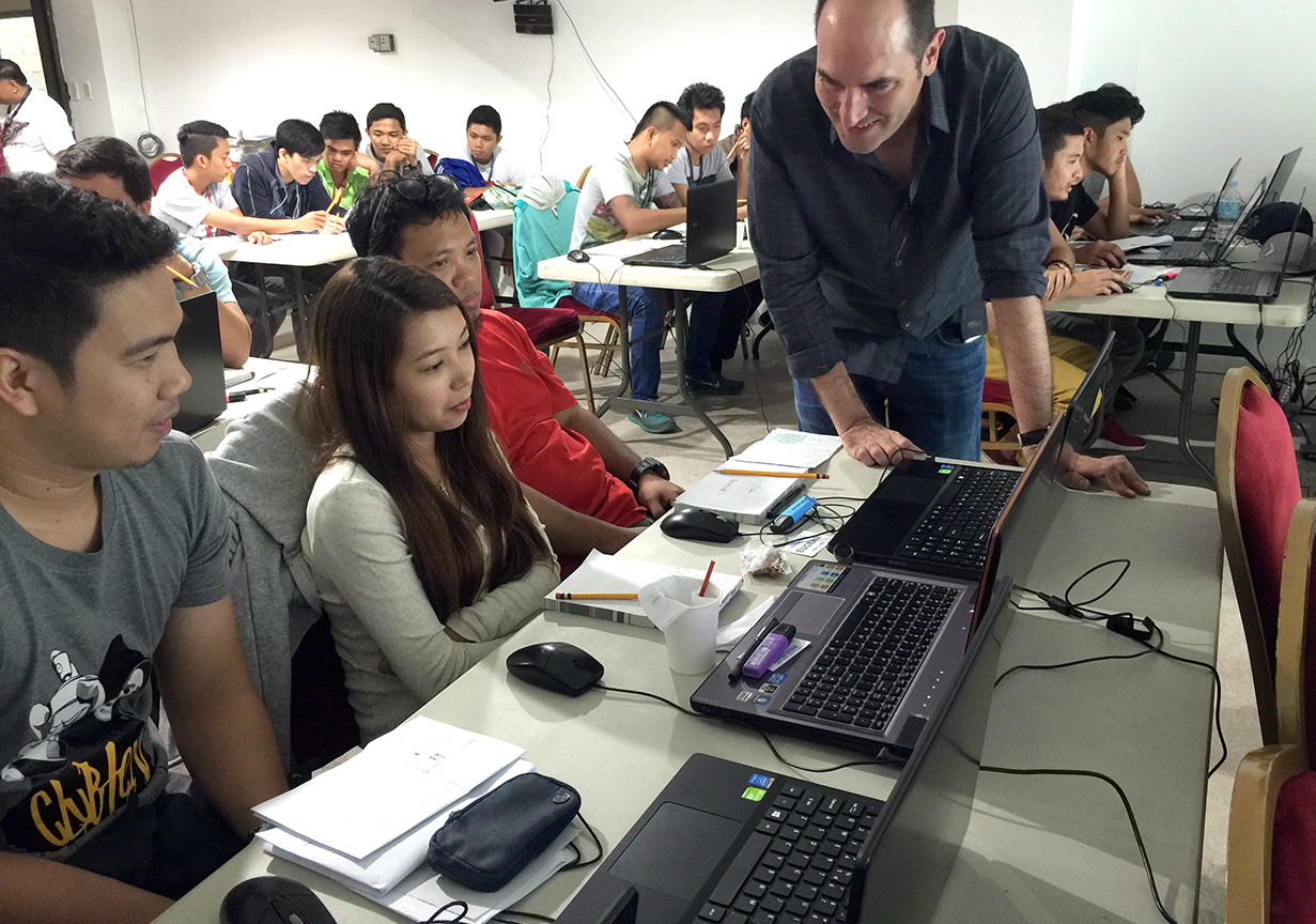
During ten years at National Geographic I was lucky to work with an amazing cartographic department that is highly skilled at using GIS software to produce detailed spatial analysis and (largely) automated mapping. GIS (Geographic Information System) software links location information in the form of databases with latitude and longitude coordinates to different types of information: demographic data to census tracts or divisions, election results to provinces, land use to natural or urban areas, etc. The user decides what layers (which may come from government or private sources) are going to be combined in order to visualize, analyze, and interpret the data to show relationships, patterns, and trends.

All oil and gas platforms, pipelines, leases, wetlands and protected area in the Guld of Mexico, made with GIS layered data. Copyright National Geograpic Society


A dismal state of affairs
During recent workshops in different countries I have been shocked to discover that 95% (if not more) of newspapers and magazines (particularly out of the US) still produce maps at a fairly basic level by taking screen grabs from Google Maps and painstakingly retracing them in Illustrator. Line by line, one push of the mouse after another. This procedure is the general standard today. These are of course simple geographic maps (large areas or cities) rather than the kind of thematic/data mapping that can bring visual insight to a story in a powerful way. I’ve been to a few newspapers that are the leaders in their respective countries and have never even heard the term GIS.

Why is GIS not ubiquitous in journalism in general and graphics departments in particular, as it is in many other industries? (disclaimer: I’m not a GIS user myself but I think it should be part of the skill set of any graphics department).

GIS packages such as ArcGIS or the Illustrator plugin MAPublisher are quite expensive, and the learning curve is high. There are free options such a QGIS (see a terrific tutorial by LA Times’ Len De Groot here), but newspapers rarely commit to diving in or understand its power. It’s amazing since there is so much to gain from GIS to uncover patterns though spatial analysis.


Are web mapping tools the new “GIS”?
Today, free web mapping tools like Tableau Public and Google Fusion Tables allow for easy and free data mapping. In many ways, these tools have somehow replaced the usage of GIS for journalists seeking to simply layer datasets to visualize spatial patterns. The Guardian and other major organizations have used them deftly in the past. But they don’t give the same analytical depth or access to GIS datasets.

D3.js can create nice interactive mapping as well (but you’ll need programming skills). TileMill from Mapbox, CartoDB are good online mapping tools, and you’ll also need some specialized skills.


Free maps!
In any case, for the “99%” out there (the occasional mapper or graphics departments that for whatever reason just need some base maps and can’t use GIS or even pay), here are three useful map sources:

Indiemapper. You can generate vector maps (physical or political), re-center and reproject them (let’s say from a flat world map centered in Europe to a globe centered in Asia) and export them as SVG files that you can open in Adobe Illustrator. Very useful! It can also importing KML (from Google Earth) and Shapefile formats.

Indiemapper

Natural Earth is a fantastic open source raster and vector map dataset at three different scales created by volunteer NACIS members and cartographers around the globe. Nathaniel Vaughn Kelso and Tom Patterson led the effort. In his fantastic Shaded Relief website, Tom Patterson (Chief Cartographer at the U.S. Park Service) offers some nice globes free to download and use (you can overlay the boundaries in Photoshop with a “multiply” effect). But of course, proper GIS software is what you would need to create your own customized visualizations and projections. These globes were create with Natural Scene Designer, a great package (and not that expensive) that is a favorite among National Geographic staff,

OpenStreetMap is less known that I would have expected in newspapers: It’s an open source collaborative effort with really detailed maps down to the street level for most locations in the world. The Wikipedia of mapping, if you will. It’s a fantastic source and free to use (but do give proper attribution), but the export process to Adobe Illustrator is quite cumbersome, with additional software and plugins needed. You’ll need a fair amount of work to fix the ways masks layers and polygons get exported.

Your local government cartographic institutions may be just a click or phone call away with nice vector maps if you try them. If you download from the Internet, remember you can open PDF and SVG files in Illustrator, but make you sure you have the permission/rights to use what you find.

There are many free vector maps sources around that you can use (just Google them) and well as paid collections such as Mountain High Maps Plus, but none that I would recommend without a detailed review.

Note: I don’t endorse any particular program or intend to create a comprehensive review here. The mentioned software are just a few samples and I’m sure there are many other competent mapping solutions out there.


SND Digital Awards and upcoming conferences

Print

The Society for News Design (SND) has just announced some of the winners of their “Best of Digital Design” competition. Stay tuned for a complete database of winners and the nominations for the World’s Best awards (the winners will be announced on April 11 at the SND’s annual workshop in Washington, D.C.

Here is a partial list with the Gold and Silver medals. All the usual suspects are represented, with awards going to The New York Times, ProPublica, National Geographic, Los Angeles Times, NPR and more.

We haven’t had a chance to look at all the winners, but we were really happy to see one of our favorite pieces of the year has been awarded. It was illustrator Christoph Niemann’s very original story on the Brazil World Cup and the famous “Curse of Maracaná” of the 1950 tournament, for The New York Times.

CurseMaracana

We’ll be involved in the judging of the parallel Student Society of News Design competition.

Other important events in media design, graphics and data storytelling are coming up in the next few weeks:

The Tapestry Data Storytelling Conference is a one day event by invitation only in Athens, Georgia. It will take place on March 4. Here are the attendees (they like to keep it to about 100 people) and a link to request an invitation.

The main event in the world of infographics is also just a few days away. The 23rd Malofiej infographics conference and awards will take place at the University of Navarra in Pamplona (Spain) on March 18-20. The conference is preceded by the Show Don’t Tell workshop, led by instructors John Griwmade, Alberto Cairo and Geoff McGhee (I won’t be an instructor this year).

OpenVis, a highly recommended web data visualization conference takes place on April 6-7 in Boston. I was the closing keynote speaker in 2013 and really enjoyed the event.

Finally, the Asian Media Awards 2015 will take place on April 28-30, in Bangkok. They are organized by The World Association of Newspapers and News Publishers (WAN-IFRA). We’ll follow this one closely as we are working more and more with Asian media, and we’ll be involved in the judging as well.


Working with ProPublica

Although this is a belated post, we didn’t want to forget mentioning our recent collaboration with ProPublica. If you haven’t heard about them, ProPublica define themselves as a “non-profit newsroom that produces investigative journalism in the public interest”. Founded in 2007, it was the first online news source to win a Pulitzer Prize in 2010 (they won another in 2011). The quality of their reporting is superb. Propublica often partners with major news organizations, offering their stories for free.

Last November they published one of their most ambitious stories to date: Firestone and the Warlord is an investigation report on the unexamined role of an iconic American company in the rise to power of Charles Taylor, a murderous politician in one of Africa’s most volatile and vulnerable countries. Firestone, owner of the largest rubber plantation in the world in Liberia, provided Taylor with resources and international legitimacy in exchange for his protection and safeguarding of the plantation. In 2003, Taylor was indicted by an international tribunal to 50 years in prison for crimes against humanity.

Opener_article

PrintThe story was written by T. Christian Miller and Jonathan Jones and took several years to report, including over 200 interviews. It’s as good as long-form investigative reporting gets.

We did four maps for the story, including a locator and three interactive maps: The Firestone plantation and two detailed maps showing Charles Taylor’s rebel army attack on Monrovia from the plantation (best viewed with Chrome).


Mapa Liberia

Print

Silueta mapa Monrovia

ProPublica has created great multimedia visualizations before (see Alberto Cairo’s article on their Louisiana coastline project here) and they are definitely an organization to follow closely.

Workshop in Chennai, India

Vadapalani_Murugan_Temple_Chennai_18204

I’ll be teaching an information graphics workshop in Chennai, India, on January 22 and 23. It will be a hands-on event for designers, editors, and anyone interested in information design and data visualization. The workshop is organized by WAN-IFRA, the World Association of Newspapers and News Publishers. This is our first venture in India, a vibrant market where dailies (especially the popular vernacular press in Hindi, Malayalam, Marathi and Telugu) are growing strongly, proving the newspaper crisis is far from universal. The Times of India, an English language newspaper, has a circulation of over 3.3 million copies daily. However, the transition to digital is being quite slow, and even more so in the case of infographics. I’m curious to see the situation first-hand. I’ll report back!

Out now: Understanding the World, The Atlas of Infographics

Taschen’s new large format book on infographics has been out in the U.S. for a few days. The luxurious volume, by Sandra Rendgen and editor Julius Wiedemann, follows the same format as the Information Graphics volume published in 2012. The new book includes 280 contemporary and vintage visualizations, including seven fold-out spreads.

Cover 2

The book is structured in several chapters

index

We are proud Sandra (whom I had the pleasure to meet a couple of times in Washington and in Berlin) chose our “Cosmic Journeys” graphic for National Geographic as one of the 4-page foldouts. The graphic has been showcased and reprinted numerous times but we gasped in awe when we saw it at this size, and in such fantastic paper!

Unfolded space

Personally, I was also also happy to see a piece I did a few years ago at National Geographic. It’s an infographic explaining the latest science on how memory works. A lot of research went into it. Bruce Morser created the amazing art.

Memory 2

The introduction of the book features an interesting new graphic by Nigel Holmes. In his classic style of clean illustration and excellent step-by-step explanation, Nigel looks at the history of information visualization and the changing data landscape, and attempts to bring some light to an always murky issue: what are the differences between information graphics and data visualization?

Nigel Holmes graphic 2

The selection in the book and the top quality production of Understanding the World make it an essential addition to any infographics library.

5W in the pages of Nature

We just finished a new infographic for Nature. The London-based weekly, interdisciplinary scientific journal is the most cited and surely one of the most respected scientific journals in the world. The nirvana of scientists trying to publish their peer-reviewed research articles. Needless to say, at 5W we had always wanted to work with Nature’s team, and we were thrilled to receive an assignment from Kelly Krause, the Creative Director.

nature cover

The graphic is about the loss of biodiversity in the world. We visualized threatened species as well as how many species exist and how many are already extinct. More than 90% of the species that have populated Earth during the past four billion years are gone, many of them in mass extinctions. So what remains? A story difficult to visualize due to the extreme uncertainty associated with much of the available data.

Samuel at 5W worked with Kelly and with editor Rich Monastersky. As expected, Nature standards for the quality and accuracy of the research are at the absolute top, and we went through multiple sketches trying to balance the gaps and uncertainties in the data (for instance, the range of estimates for number of species alive and threatened shows huge variation) with the need for high visual impact.

Here is the finished graphic (click for a full resolution image):

NatureThreatenedSpecies

And the interactive version (scroll down in this page):

Thhreatened Species interactive

Nature has a fantastic blog called Nature Graphics. Kelly and her team explain the creative process, background and design challenges behind their information graphics. A must follow for anyone interested in how data, research, design and graphics come together. Their newest entry explains a bit more about our graphic.

Nature blog

By the way, I just discovered this cool Pinterest board with a great selection Nature covers:

Nature Pinterest

Five infographics workshops in South East Asia

South East Asian newspapers

I have recently spent over three weeks teaching five infographics workshops in South East Asia in association with WAN-IFRA, the World Association of Newspapers and News Publishers. Quite a trip!

Below the Petronas Towers

The schedule included in-house training for the staff of several news organizations (The Bangkok Post newspaper, The Manila Bulletin newspaper and Astro Awani, a major television and online organization based in Kuala Lumpur, Malaysia). I also had two public workshops in Singapore (which included staff from The Straits Times) and in Jakarta, Indonesia.

At the Manila workshop

At the Manila workshop

Some hand sketching in Manila

Hand-sketching smarthpone graphics in Manila

Most of the workshops focused on interactive graphics, data visualization and the print-to-web challenge, but there was also a lot of content on print infographics and even print layout design. Luckily, in most cases the attendee list included chief editors from the media organizations. The reality at a global scale is that most editors still assign graphics as decorative elements to make pages “pretty”. They often need a better understanding of how data visualization, process diagrams, or smart thematic mapping can elevate the journalistic quality of their publication while making it more visually engaging. Graphics departments are little more than service sections receiving assignments and not being used as visual journalists that generate and research infographics ideas.

Group Photo at Astro Awani

Group Photo at Astro Awani

I took the opportunity to better understand the media landscape in the region (where print newspapers are often still growing) and the status of infographics. The Bangkok Post is one of the two major English-language newspapers in Bangkok, and the Manila Bulletin is the largest and oldest newspaper in the Philippines. Both publications have very skilled artists but they are still trying to find their way in the creation of good data-driven infographics.

I would say the biggest surprise was Kompas, the leading newspaper of Indonesia (the surprise only reveals my previous ignorance). The design of this daily (both Mario Garcia and Roger Black made redesigns in the past) is every bit as good as any of the major European newspapers, and so are the excellent graphics. I also liked The Straits Times from Singapore, but that wasn’t a surprise as I had seen their good graphics before.

Next January, 5W will be conducting new workshops with WAN-IFRA in India and coming back to Singapore in association with German publishers Gestalten and local design think tank Methodology. In the meantime, I need some rest after visiting 5 countries in 23 days!

A rent vehicle in Manila... and driver

A vehicle for rent in Manila… and driver


Three out of 310 million people, visualized

The Washington Post ran a very surprising infographic yesterday. See it here. Visual comparisons of different amounts are always an effective tool. I’ve seen dot density graphics (or however you may want to call them) representing large amounts, but I don’t think I’ve seen anyone trying to visualize 310 million individual shapes (the whole population of the United States).

The goal of the graphic is to challenge the reader to find the three people infected with Ebola in the country (two nurses that tended to Thomas Eric Duncan and were infected by him, and Duncan himself, killed by the virus). Here you can see a tiny portion. You’ll need a coffee, snacks and a robust finger to scroll through the entire thing.

Washington_Post Ebola

At first I found myself irritated by the endless scrolling and the inability to find the three red dots. I also didn’t think it was a good idea to establish a comparison without being able to visualize the whole dataset at once rather than parts of it as you scroll (I wonder what they did in print). But then I thought not finding the dots regardless of how much you scroll was precisely the point the Post is trying to make: to show Ebola in the U.S. is a non-issue. A good response to the hysterical media coverage we have seen so far. By the way, here is an article from Vox.com ranking threats to Americans by actual threat rather than media hype (a highly un-scientific ranking, as they admit).

So now I kind of like the Post graphic! What do you think?


Workshops in Singapore

singapore

Onwards to South Asia! 5W is going on a tour. For the next few weeks (October 21 to November 14) 5W’s Creative Director Juan Velasco will be leading workshops in Bangkok, Singapore, Manila, Kuala Lumpur and Jakarta.

The events are organized by WAN-IFRA, the World Association of Newspapers and News Publishers. Some of them will be in-house training for local media organizations, but the Singapore and Jakarta events are public.

WAN-IFRA is a global organization representing more than 18,000 publications, 15,000 online sites and over 3,000 companies in more than 120 countries. It annually organizes the two major meetings of the global newspaper and news publishing industry: the World Publishing Expo and World Newspaper Congress. WAN-IFRA is unique among global industry organizations as its first objective is the defense and promotion of press freedom and the economic independence of newspapers. It is also the industry’s leading “think tank” for new strategies, business models, and operational improvements.

There will be two workshops in Singapore, focused on interactive graphics, data visualization and the print-to-web challenge. October 28-29 will focus on newspapers and October 30-31 on magazines. The second one is still open for registration. See the details here (newspapers) and here (magazines).

WAN-IFRA Interactive Graphics nd Data Visualization in Mag-3 1 WAN-IFRA Interactive Graphics nd Data Visualization in Mag-3 2