 The Data Viz Project is a new online catalog of different types of charts created by Ferdio, an infographics studio in Denmark. It’s a useful resource to help decide appropriate types of visualization for any given dataset (another thing is to decide which one will be the most insightful and revealing when you have multiple options). You can view and sort by type, function or shape.
Each type of chart includes a description, a good gallery of real-life examples, and a very simple description of the type of data input needed to create that type of chat, in a table format (what you would input in Excel, for instance).
The Data Viz Project is the latest of many efforts to classify and catalog different ways of visualizing data. Another excellent online resource is the Data Visualization Catalogue, developed by Severino Ribecca, which we often show in our workshops.

Ribecca teamed up with Jon Schwabish in another project to create the Graphic Continuum, a nicely designed poster taxonomy of different types of charts, and how they all relate to each other. You can read more about it here.

And here is yet another similar effort by Andrew Abela, which shows different possibilities depending on your purpose when showing the data.

Here is one by Anna Vital that is not strictly about charts but is interesting because it looks at visual analogies and metaphors that can help us think of ideas to visualize information.
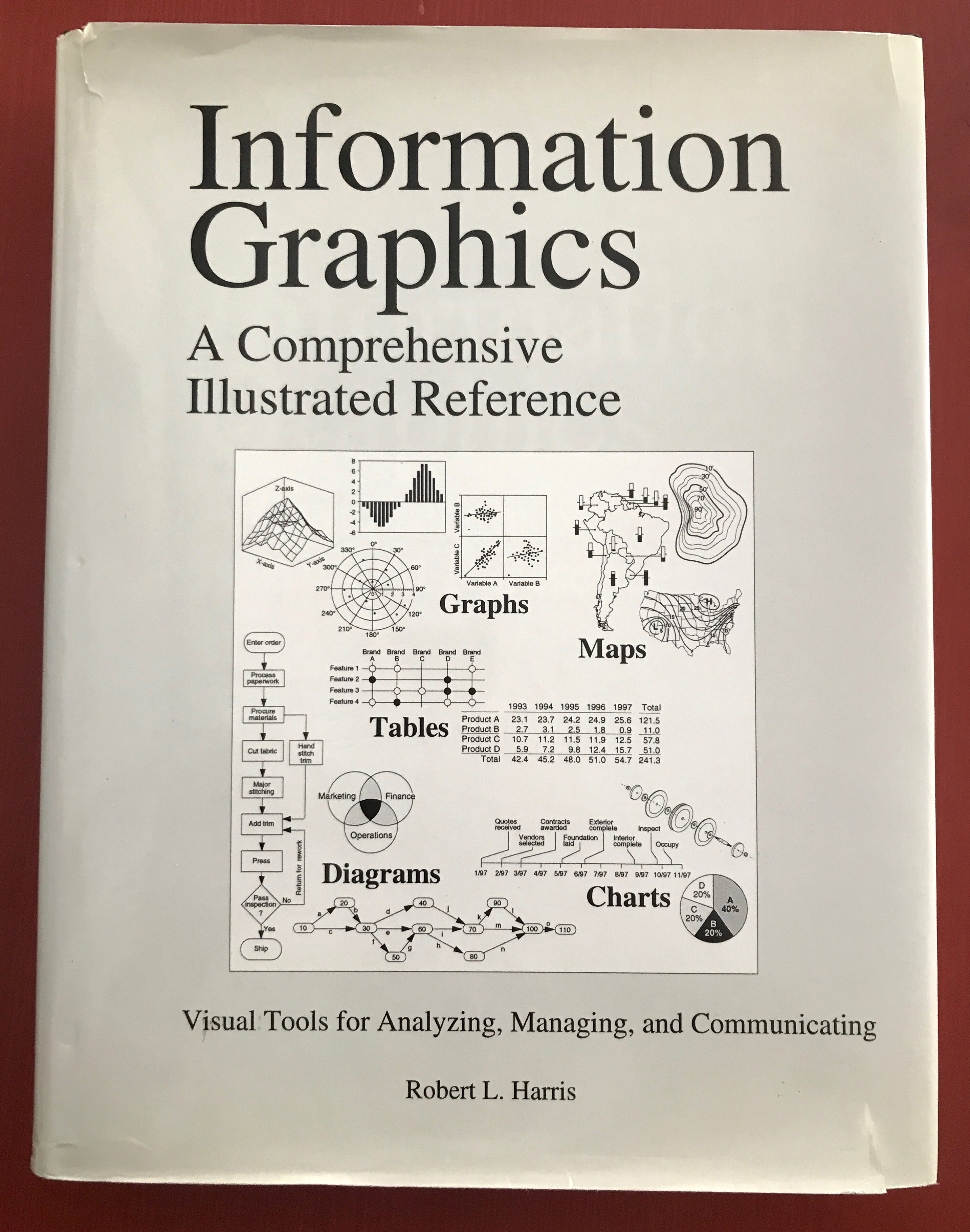
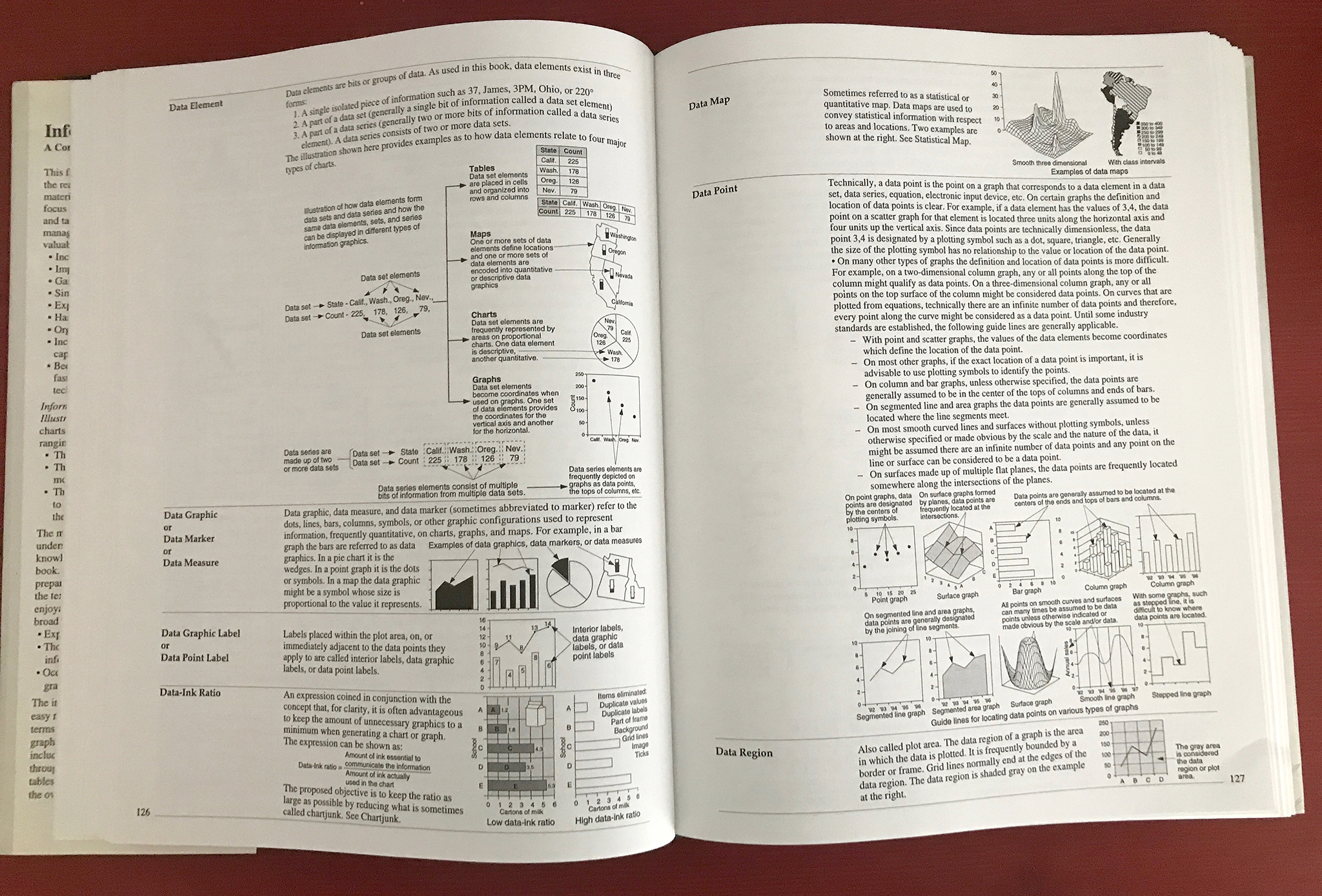
If you are looking for a truly comprehensive reference guide on different types of visualization with charts and maps, our hands-down favorite is still the book Information Graphics: A Comprehensive Illustrated Reference, by Robert L. Harris. The 450-pages book is a massive reference encyclopedia with hundreds of entries, examples and cross-references about different chart, map and diagram types, as well as statistical and visualization methods. The latest edition is from 2000 but it’s still the “Bible” of reference on visualization.