I have recently spent over three weeks teaching five infographics workshops in South East Asia in association with WAN-IFRA, the World Association of Newspapers and News Publishers. Quite a trip!

The schedule included in-house training for the staff of several news organizations (The Bangkok Post newspaper, The Manila Bulletin newspaper and Astro Awani, a major television and online organization based in Kuala Lumpur, Malaysia). I also had two public workshops in Singapore (which included staff from The Straits Times) and in Jakarta, Indonesia.

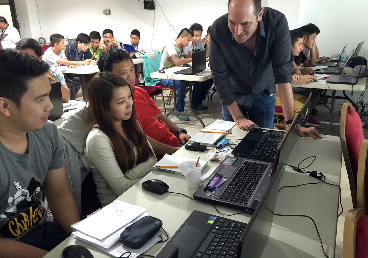
At the Manila workshop

Hand-sketching smarthpone graphics in Manila
Most of the workshops focused on interactive graphics, data visualization and the print-to-web challenge, but there was also a lot of content on print infographics and even print layout design. Luckily, in most cases the attendee list included chief editors from the media organizations. The reality at a global scale is that most editors still assign graphics as decorative elements to make pages “pretty”. They often need a better understanding of how data visualization, process diagrams, or smart thematic mapping can elevate the journalistic quality of their publication while making it more visually engaging. Graphics departments are little more than service sections receiving assignments and not being used as visual journalists that generate and research infographics ideas.

Group Photo at Astro Awani
I took the opportunity to better understand the media landscape in the region (where print newspapers are often still growing) and the status of infographics. The Bangkok Post is one of the two major English-language newspapers in Bangkok, and the Manila Bulletin is the largest and oldest newspaper in the Philippines. Both publications have very skilled artists but they are still trying to find their way in the creation of good data-driven infographics.
I would say the biggest surprise was Kompas, the leading newspaper of Indonesia (the surprise only reveals my previous ignorance). The design of this daily (both Mario Garcia and Roger Black made redesigns in the past) is every bit as good as any of the major European newspapers, and so are the excellent graphics. I also liked The Straits Times from Singapore, but that wasn’t a surprise as I had seen their good graphics before.
Next January, 5W will be conducting new workshops with WAN-IFRA in India and coming back to Singapore in association with German publishers Gestalten and local design think tank Methodology. In the meantime, I need some rest after visiting 5 countries in 23 days!
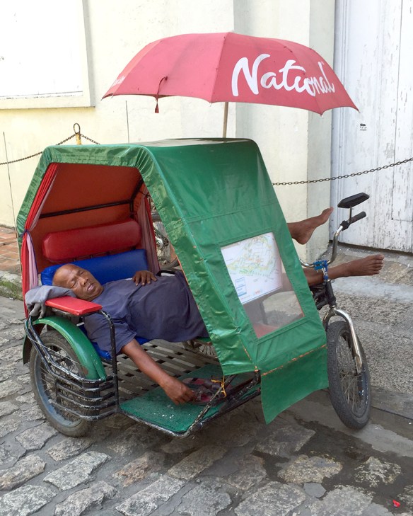
A vehicle for rent in Manila… and driver